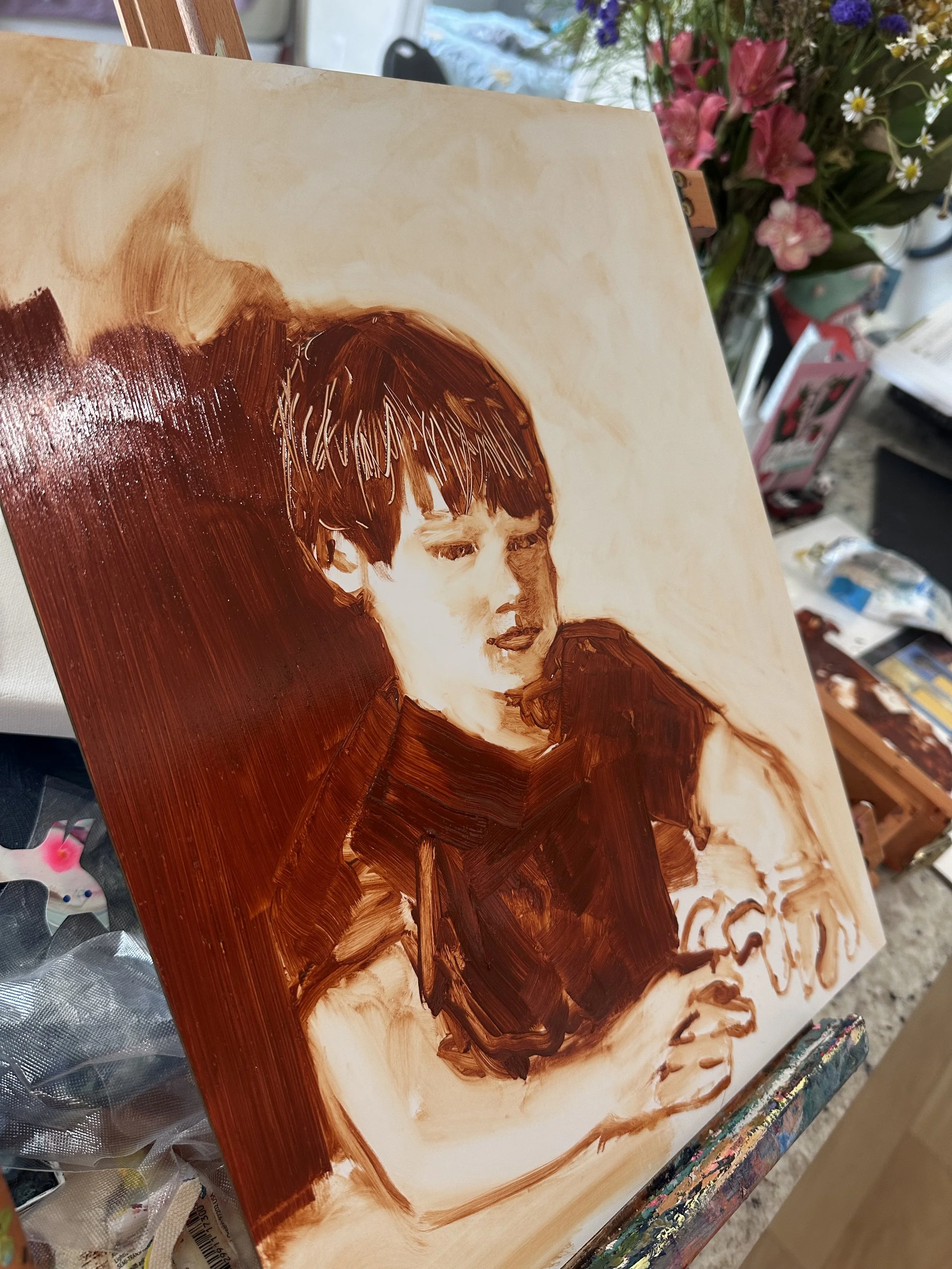
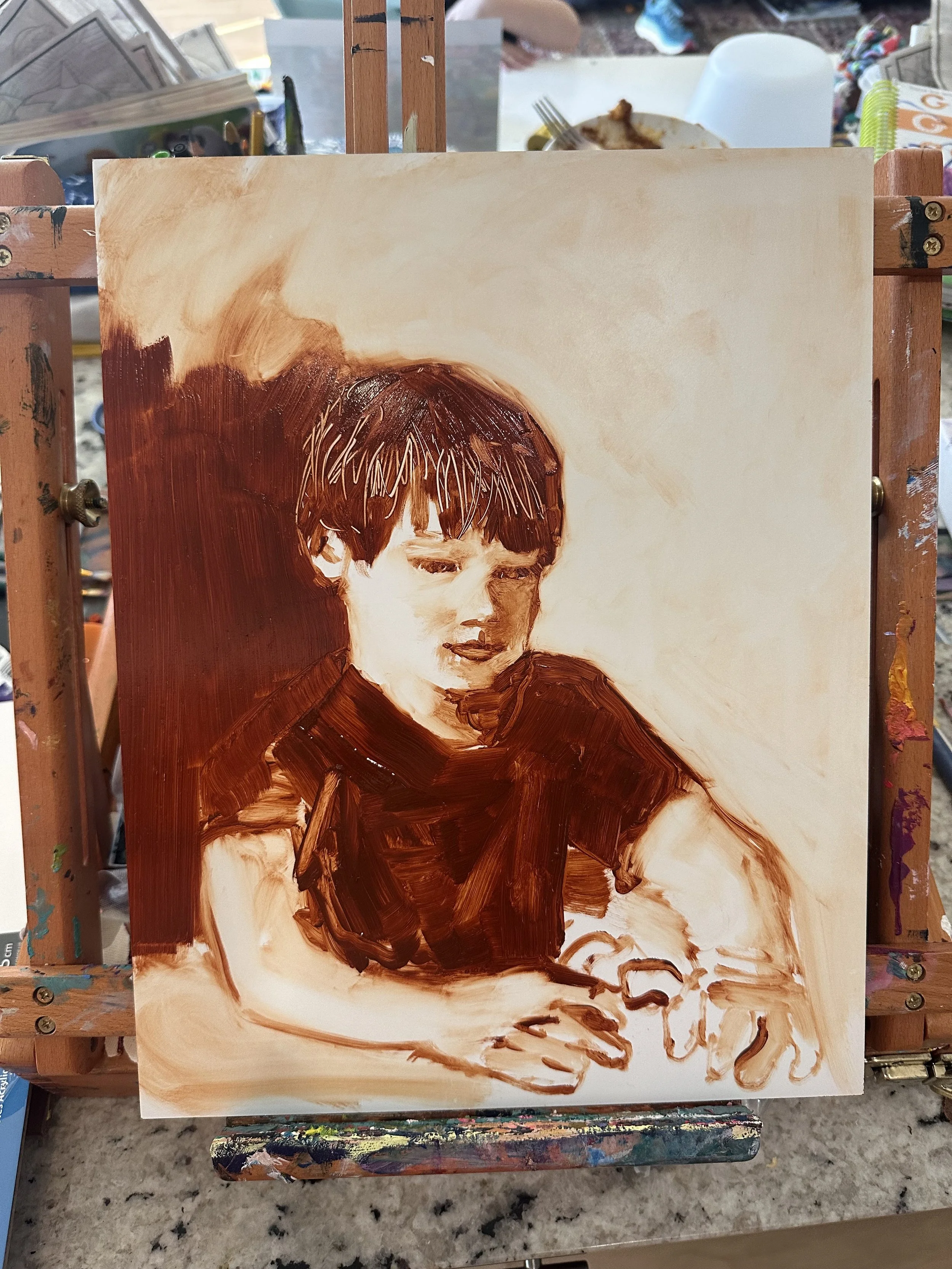
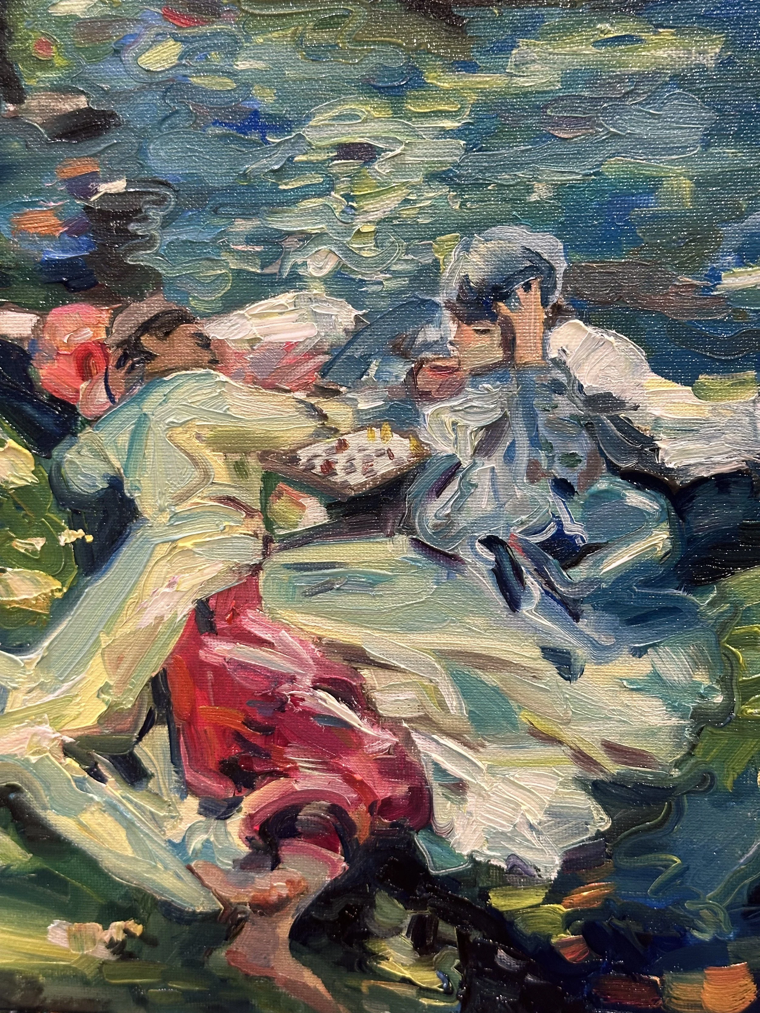
Lately I finished up a study of John Singer Sargent’s “The Chess Game”.
The study is about 50% of the size of the original at 11 x 14 inches. The original painting is pretty fascinating to me. For a while, it was owned by Paul Allen until he passed away.
The painting depicts Sargent’s long-term friend and art assistant Nicola, as well as Sargent’s niece, Rose-Marie Ormond, both dressed in Turkish clothes, playing chess.
Nicola is an interesting person to me because he lived with Sargent for something like 25 years and would do everything from cleaning brushes to hiking to scout out painting locations for Sargent, as well as posing in paintings like this one.
To make this painting I looked at a couple source photos of the original. A quick Google search revealed photographs of the painting that were both quite light or pale, as well as some photos and other reproductions where the colors were very high-key or highly saturated. I approached this painting doing a mix of both, I made it fairly saturated and less washed out. But I followed the general value distribution in the pale photographs, which revealed the darkest areas of the painting and the lightest.
As I was working on this painting, I realized that I hadn’t seen many European or western “oriental” or orientalist paintings featuring people near water. Usually there’s more canvas space given to buildings or desert scenes. The painting is a lot like a Monet in that it features water and water vegetation, and it gave Sargent a place to flourish because it featured people in traditional Turkish clothes. Anything silky or with a sheen seemed to suit Sargent very well.
The water is a good choice for a backdrop. It’s still water, yet it seems to flow, a lot like the clothing of each figure in the painting. The clothing seems to flow, yet it is still as the two people are engrossed in their chess game.
I think it’s also interesting that each person’s clothing overlaps a little bit. The imagery matches what a chess game is, two people who affect each other and move around each other’s spaces. It’s romantic in every way imaginable.
I like this painting by Sargent because it looks like an engaging and relaxing time. Neither player seems too aggressive or too pensive. The setting is highly loveable to me.
I also liked all of the surprises that I saw in the painting - the chess pieces seem to be yellow and red. There are singular little flecks of orange and violet here and there in the painting, right where I didn’t expect them - in the water, in the bottom right corner of the painting. The more I looked at the source painting, the more of these that I discovered.
I did a pencil sketch of The Chess Game as a first step before taking a crack at the oil painting.
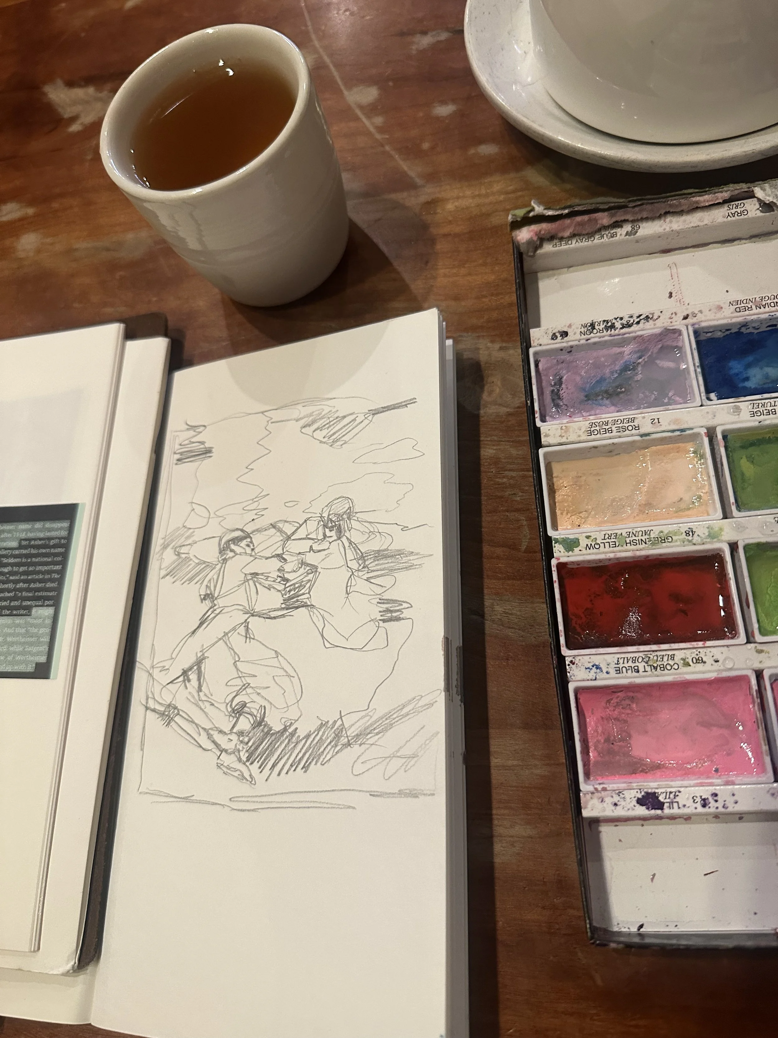
After sketching out the scene I filled it in with watercolors/ gouache. I realized I didn’t have any yellow in my watercolor set on this day, so that limited me a bit in the preliminary sketch.
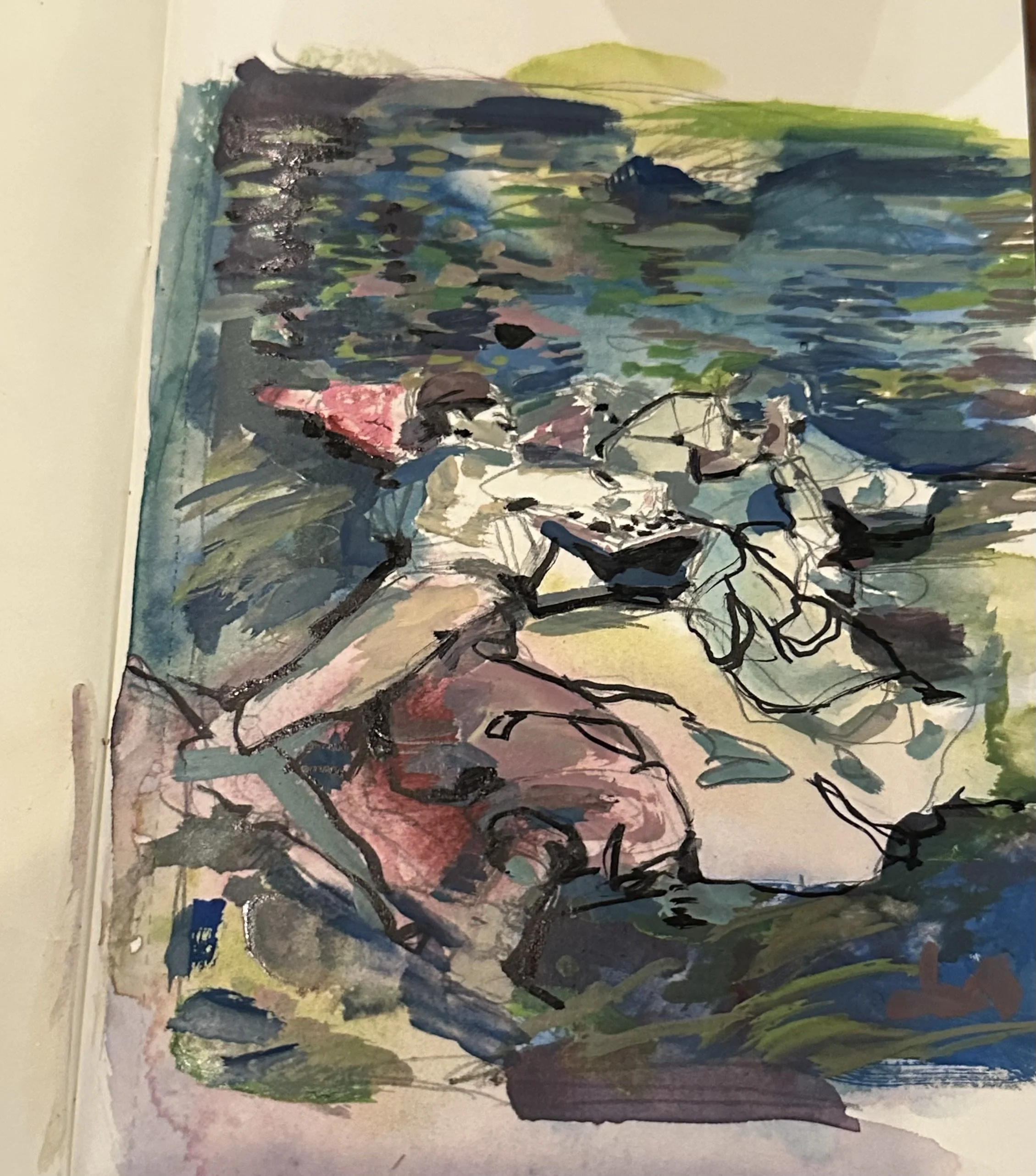
I tried to focus on the lines that I saw and how to remember that in the painting later on. The sketch isn’t my favorite but I learned a lot from it, so it served its purpose.
Since this painting was about half the size of the original, my next step is to make a true to size copy and see how it goes. I really like how this one turned out. I think Sargent’s people and faces were his best work, but in working with this painting, I realize what a master he is at everything else too, such as clothing and vegetation. I’ll continue to work with other Sargent paintings too.
Further reading/ sources
The Grand Affair: John Singer Sargent in His World - Paul Fisher
Family Romance: John Singer Sargent and the Wertheimers - Jean Strouse