The TourBox Elite Plus is my favorite addition to my studio this year - I’ll get into some details here.
Setting up the TourBox with my 12.9 inch iPad Pro was very easy - I downloaded the app and installed the Clip Studio Paint presets and I was off to the races.
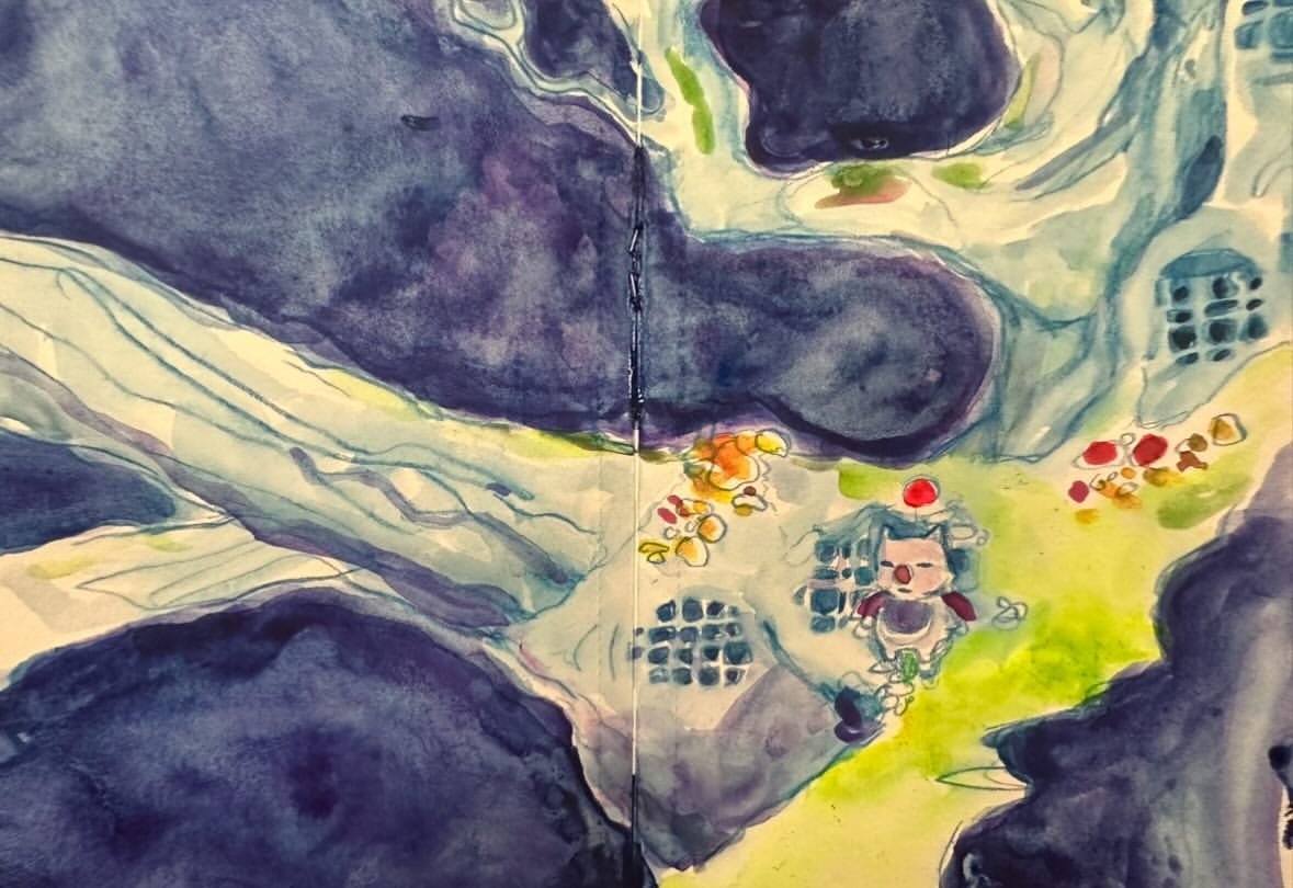
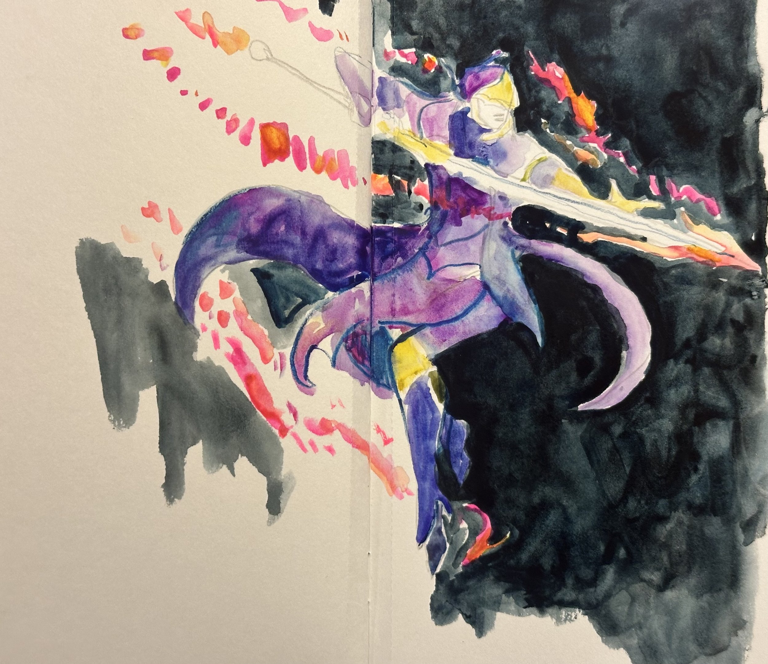
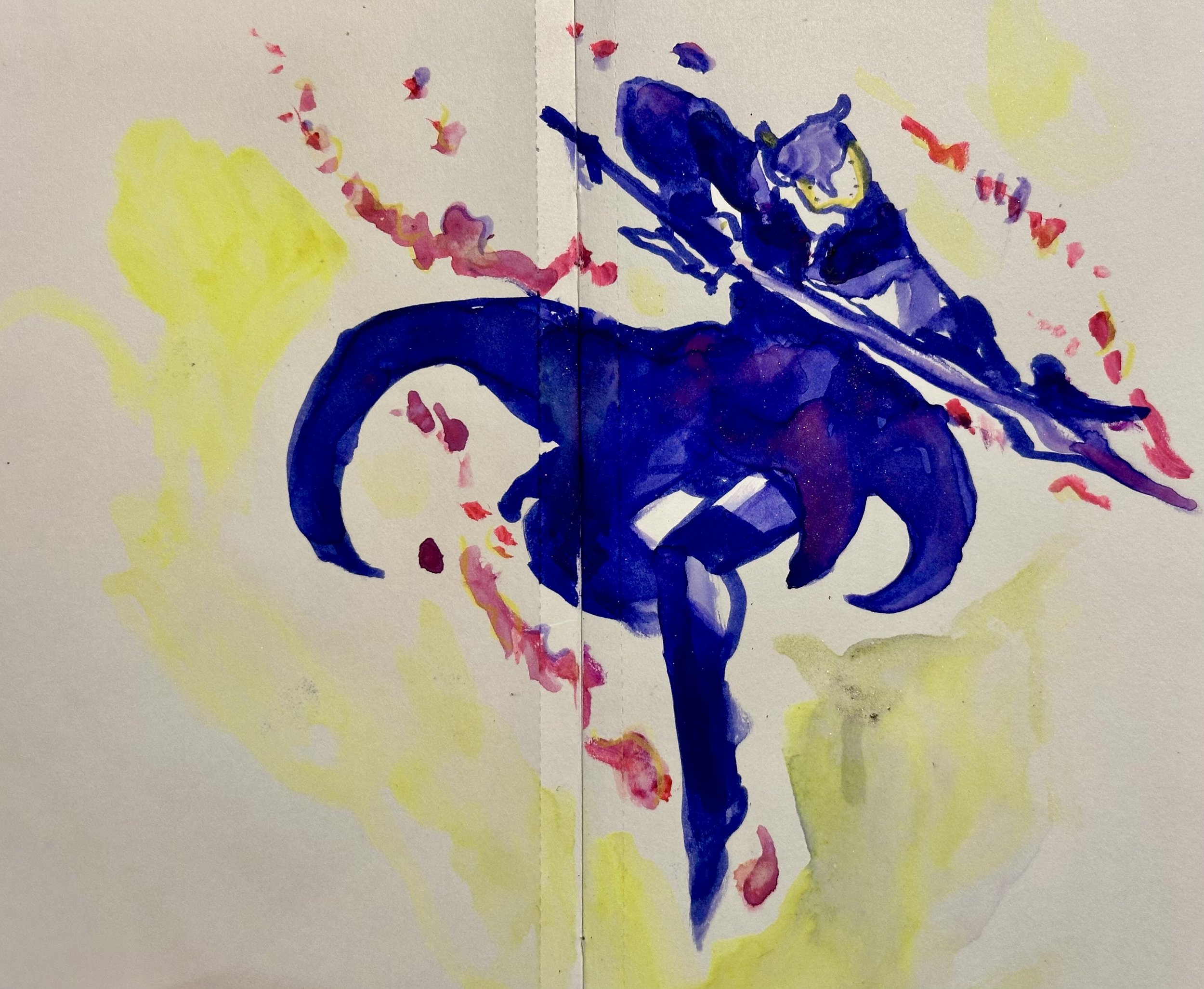
The workflow of using the TourBox was really great for my brain. The key word certainly is ‘flow’. Everything just cruises along with the TourBox. It saved quite a bit of time by eliminating how much reaching I did with my right hand while drawing in Clip Studio Paint.
Before trying the TourBox, using only the Apple Pencil for tool selection and zooming was ‘okay’ - I’d rate it about a 3 out of 5. After using the TourBox, I now see that I was wasting a lot of time and brain energy by reaching from the middle of the screen to the left side of the screen to select and choose new tools. I also have some of my Clip Studio tools aligned on the right side of my screen, so I was technically reaching left and right to select new tools and new layers.
I can hear what some might be thinking right now:
“But Becky - isn’t reaching for a different sized brush the same thing you’d do with a real brush?” Or maybe even “It’s just a few inches of reaching over to select a different tool, why are you worried about a split second?”
Which I do understand, but, I will also say that I appreciate an aggregate bank of split seconds. The aggregate bank of seconds matters, and the flow matters just as much.
For my creative lifestyle right now in 2025, the TourBox is just what I needed. As a busy mom of a toddler, I typically have naptimes and late evenings to make creative work on my iPad. I’m writing this blog right now with my little dude on my lap, and every now and then we take a break to enact a play scenario where Pikachu goes to an art store and buys Play-Doh. So, my free time can be anywhere from as much as 4 hours in a block of naptime, or a few minutes here and there.
Since I work in traditional media as well as digital media, my studio time each day might also be split into working on an oil painting for 1 hour and working on the iPad for something like 30 minutes. On most days, I feel I am a pretty easy-going, relaxed person, but at the same time, I also admit that I operate within considerable time limits. If I want to get something done, I have to move.
Happily, the TourBox strikes me as a sturdy piece of hardware. It has an healthy weight to it and I like that about it - it doesn’t strike me as something that will break easily if Little Dude gets a hold of it. This is important for my Art Mom lifestyle specifically because it seems like only height can keep things away from my kid. My parenting maxim that I’ve adopted over the years is “If it can happen, it will.” The best defense against something breaking by being dropped, thrown, or smushed, is choosing a high-quality, sturdy item. The weight of the TourBox Elite Plus is nice because it sticks on my desk or on my Cintiq and it doesn’t move easily. For instance, if I brush it with my sleeve or elbow, it stays in the same place. It feels like a permanent part of the studio, like my DMC embroidery box or like the Cintiq itself.
After using the Tourbox for one session, I found myself not really “thinking” in order to use it, because it was intuitive. For me it was a lot like playing a Mario game, where it’s easy to remember which button makes Mario jump and which one makes him shoot a fireball. I didn’t realize it would be so intuitive! After installing the CSP preset, I wasn’t sure how I was best going to learn all the buttons. Sometimes I am a kinetic learner, sometimes it seems I learn well by reading. Put in other words, I’m kind of a nerd. To cover my learning style bases, I took a screenshot of which button on the TourBox corresponded to which CSP tool, and I printed it and I put the printout on my desk next to my iPad, but it turned out I didn’t need the printout at all.
After trying the default Clip Studio Paint preset in the TourBox console, I added a couple things to the existing CSP Preset - I configured the half-moon button to correspond to the fill tool and I made the tall buttons into panel-drawing tools. I found it pretty easy to customize to my unique workflow styles.
I think it’s worth saying too that the TourBox just kept working well with multiple systems and software that I tried. Since it worked so seamlessly with my iPad, I set up the TourBox with my Cintiq for Clip Studio Paint. It worked instantly and perfectly. I did it again when I downloaded the early-access version of Rebelle 8 for my Mac. I downloaded the TourBox file for Rebelle 7 and it accomplished more than what I was expecting - zooms and brush switches got done. That’s more than what I was expecting, since Rebelle 8 is so brand new. So, the TourBox Elite not only helped my established workflow in Clip Studio Paint, it also made my foray into a brand new software more fun.
The most definitive thing I can say about the TourBox Elite Plus is that I do not want to go back to how life was without it. That would be a real step backwards for me and my workflow. If I was on a trip somewhere with my iPad and I forgot to bring my TourBox, I’d be super bummed. To frame this more positively, I’m really grateful to have learned that the TourBox exists. It was so easy to use that I was a little stunned. It helped me finish work faster, and it just felt nicer in my head while I worked on everything.
TLDR: The TourBox Elite Plus worked well to streamline my workflow in Clip Studio Paint on the iPad Pro. It operated so well with my iPad Pro that I also started using it on my Cintiq. I also tried it with Rebelle 8, which is brand new as of this writing, and it worked well using software for Rebelle 7.