Art production on the iPad was once bit of a gimmick.
Making art on the iPad used to be like what painting in VR is now: fun to do if you’re as established as David Hockney, great for a lark as a hobbyist, but not so useful if you have a project to deliver on, or an especially needy client. The iPad just wasn’t the place to create, ugh, sneer, quality digital assets.
Some of David Hockney's iPad paintings
Procreate, an app created by a team of seven out of Australia, changes this entire dynamic. Of all the tools I've tried, the best tool for making detailed illustrative art on an iPad is Procreate.
Simple, yet versatile, Procreate helps artists of any level create beautiful work. It's so popular that it has become essential. It even found it's way into this Apple advertisement for the iPad Pro:
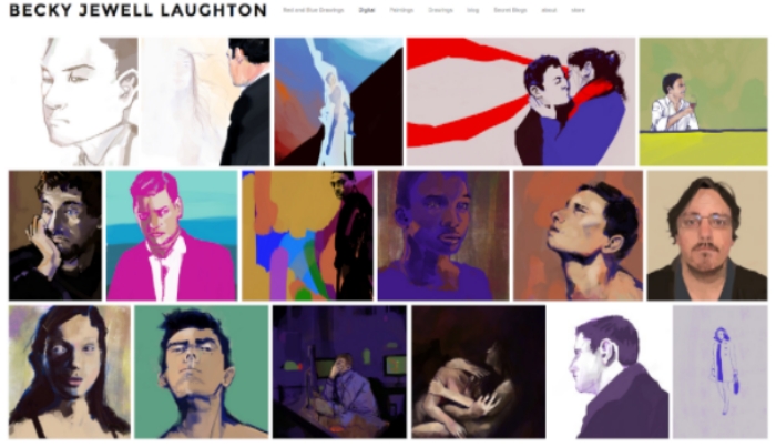
Working in Procreate has been a blast. Everything digital that I have made in the past year has been made in Procreate.
I've pinned my traditional charcoal drawings up against drawings made in Procreate and few can tell the difference in media. It's a nice feeling to see digital art achieving the same respect as traditional art. It doesn't matter how it was made - the fact is that both forms of art take the same level of skill.
At this point in history however, I'd still argue that creating commendable digital art is more difficult than creating commendable traditional art. Non-artists often see digital works as somehow 'easier' to make, and therefore less valuable, but this isn't always true. A few reasons why:
Despite all of the offerings of Procreate, drawing on the iPad Pro can be a challenge for artists working in traditional mediums for a surprising reason: it is physically too easy.
There is no resistance on the surface of an iPad. It's like painting on glass. Meanwhile, a Wacom tablet has a bit of a matte finish to its drawing surface – just like paper. This is where the iPad Pro gets weird for artists – drawing on an iPad is like sending a rocket through space with no resistance, no gravity, no fuel cost. It’s awesome, but… is it too awesome?
To combat the resistance problem of the iPad Pro, Procreate has a simple way to customize brushes, making them 'slower' or more grainy - however you want your art to feel! I made a brush in Procreate with some 'stickiness' to it – it is meant to behave a bit like Illustrator’s LiveTrace, straightening out imperfect curves, and also slowing down the speedy glide of the Apple Pencil. I had my helpful assistant, Marc, try both a normal brush and the Sticky Brush in Procreate:
You may like it or you may hate it. To download and try it, go here.
I've stored the Sticky Brush online partly to share it, and partly for backup. The last update of Procreate that I ran wiped out my previous custom brush settings. Hopefully this doesn’t happen in future updates, but just in case it does, it pays to have customized tools saved externally.
One minor drawback of Procreate is it’s one-way support for Photoshop. Procreate will be happy to export your files, layers included, to Photoshop, but it cannot successfully ingest and display a fully layered Photoshop file. It will accept the file and flatten the layers. This is one key reason why Procreate is a good starting point, but unfortunately, heavy Photoshop users may find they can’t finish work in Procreate.
But with Procreate costing a flat fee of $5.99, who could possibly care about such a thing or call it a shortcoming? Does anybody really want Procreate to be Photoshop on an iPad? Hell no - Procreate is too much of a UI treasure. That said, the development team has also expressed an interest in creating a Photoshop-to-Procreate import feature, which is exciting, and surely an undertaking.
From http://procreate.si/faq/
Medium Moment recap:
1. Procreate is the most badass platform for making art on an iPad Pro.
3. Brush quickness may be something to modify for a more realistic feel
4. You might find yourself finishing work in Photoshop
5. Be excited about software updates, but be prepared/backup
7. Blog about the iPad Pro and Apple Pencil


