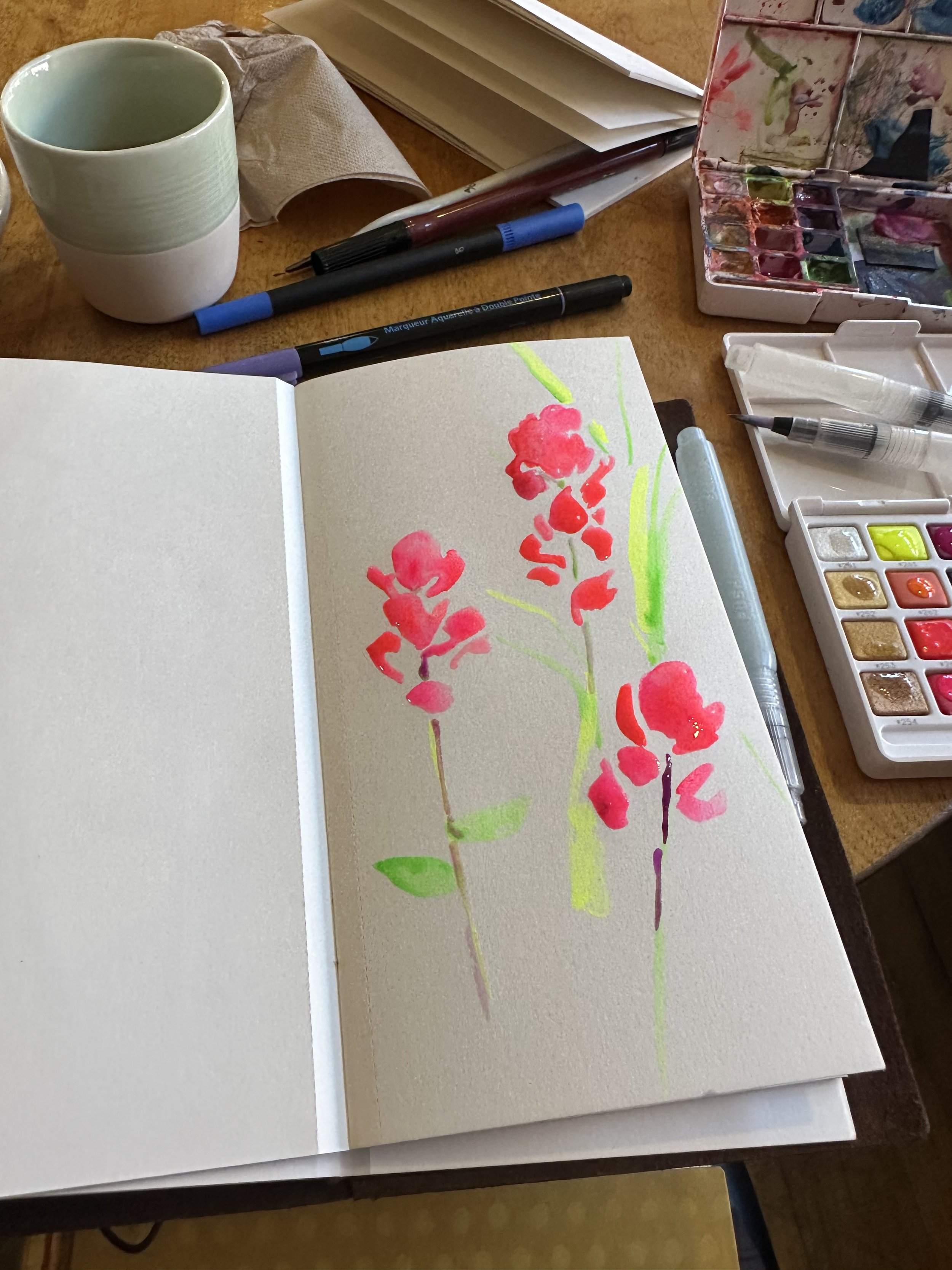
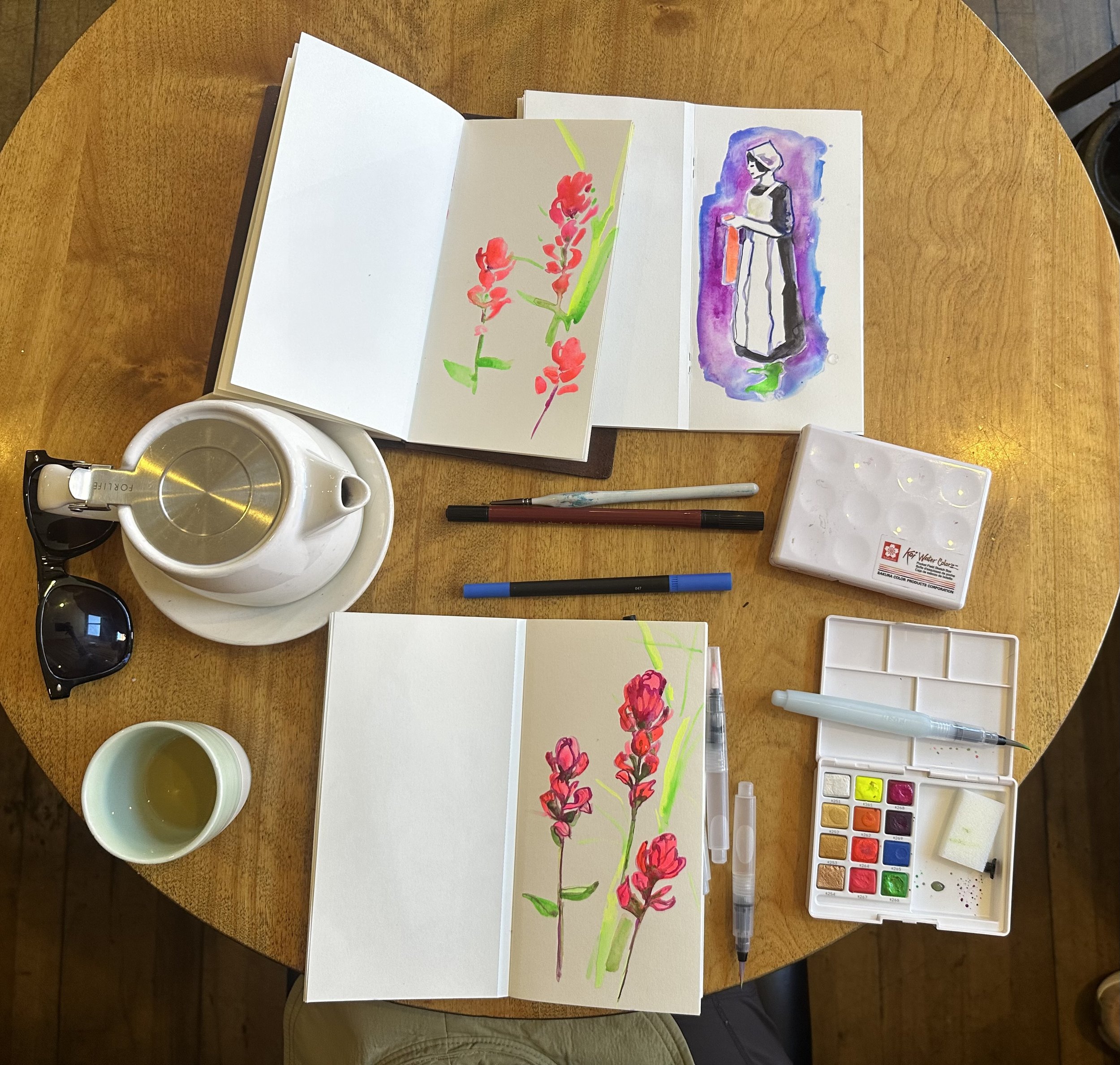
I enjoyed this set so much I bought it twice. With only 12 colors, I felt like I was getting everything I needed from this vibrant set.
Let’s talk about the tennis-ball yellow color. This color is gorgeous. Like many neons, it can run the risk of being too much, but combined with the other colors, it fits quite well.
The purple is the darkest-valued color in the set.
The color I use the least of is the sparkling white color in the upper left corner. I wasn’t sure what to do with this color. It may be a different story if I give it a try on dark paper sometime instead of white paper.
I found that after some time with my initial set, the sparkling copper and gold colors looked better and better as they were subtly mixed in with the other colors. Many of the drawings in this post have a sparkly sheen when tilted in sunlight.
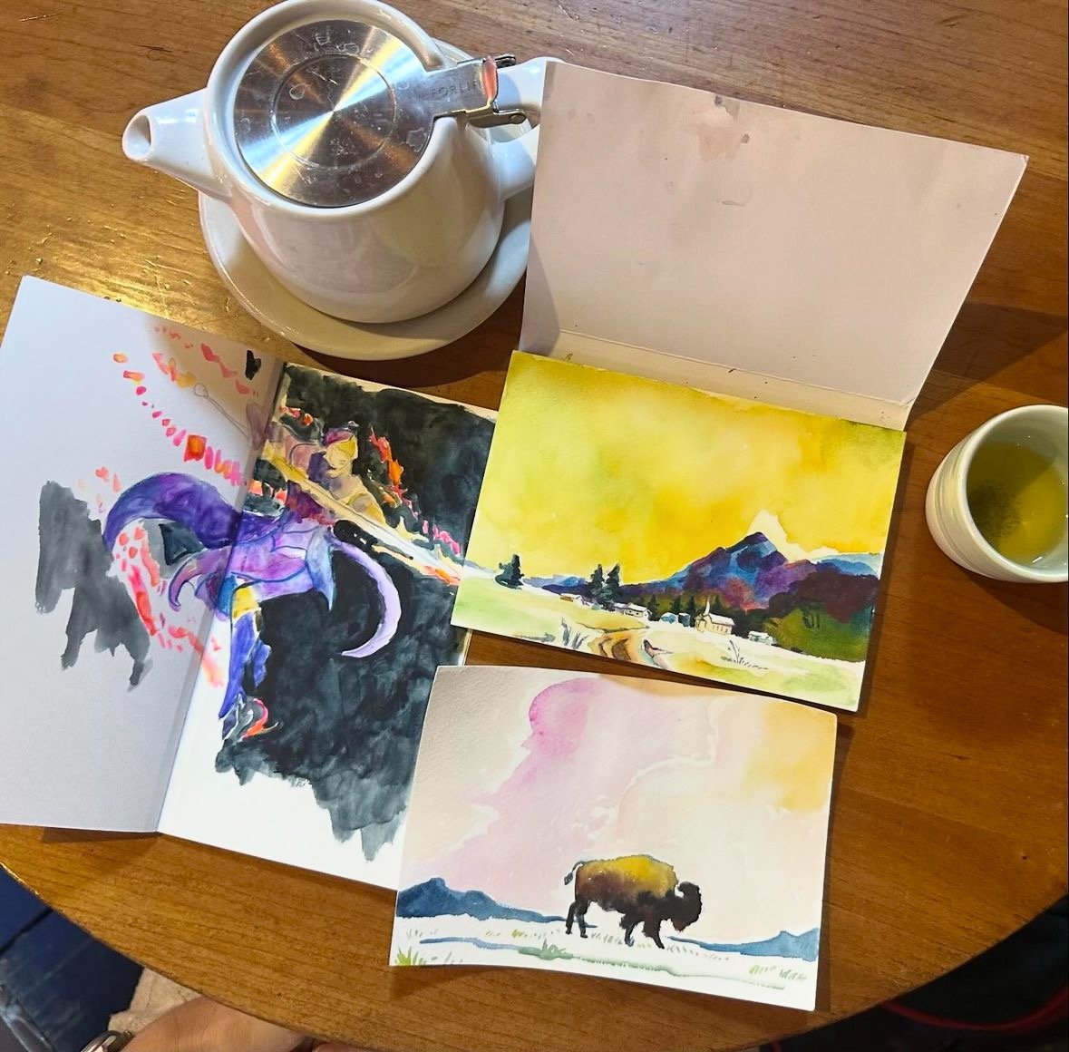
I like working with this set in series - I will paint a couple normal-hue watercolors and then do a neon version when it seems right, like this mountain goat with a neon background:
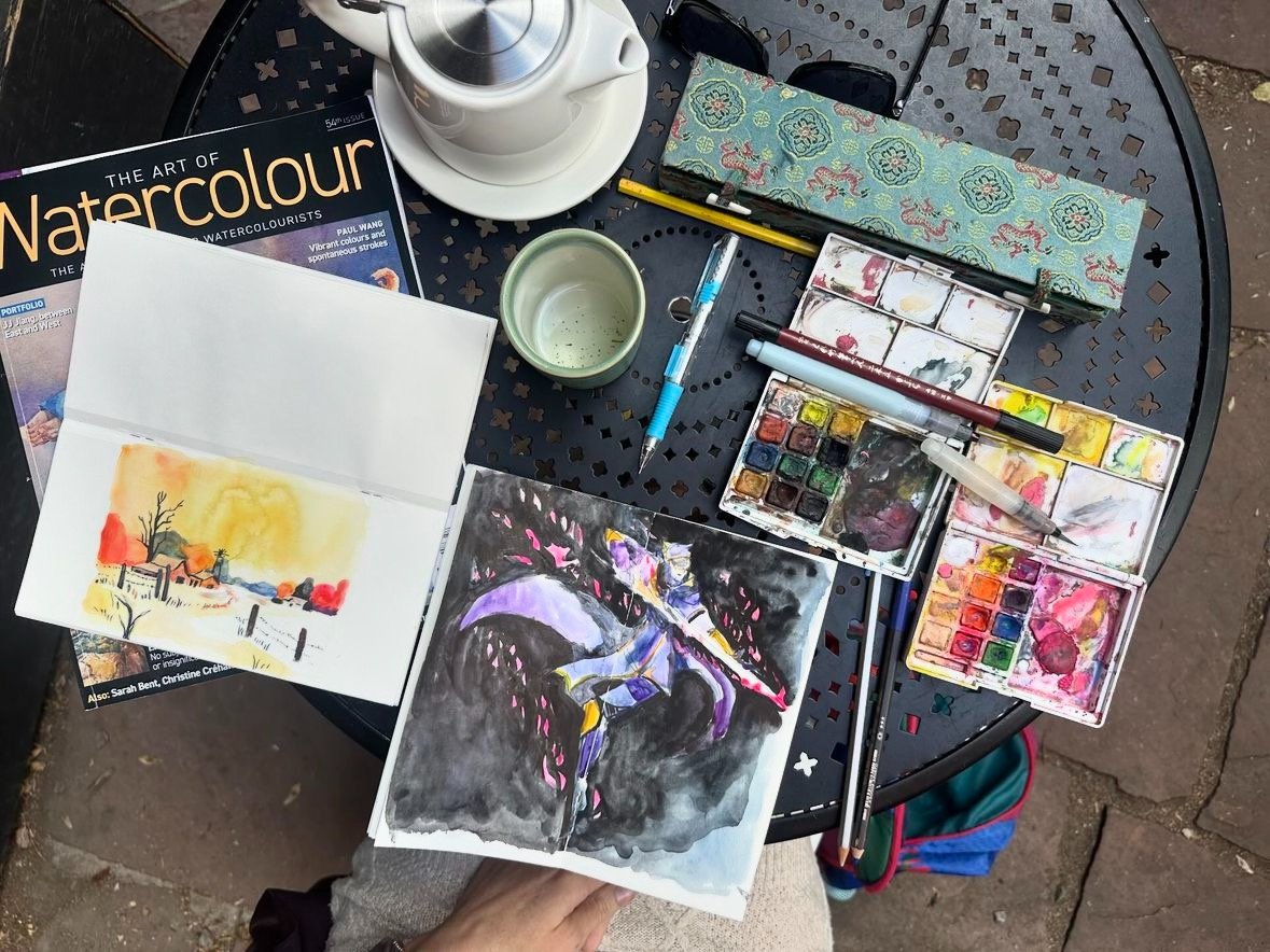
I found myself combining this set with the other Sakura set and it working quite well, like in this image of Pinnacle Rocks from Final Fantasy IX. I loved this area of the game and it seemed like a place that only gets passed through for a couple moments. So I wanted to make a watercolor of it that brought out how vibrant it felt.
^ I usually have two sketchbooks open at once so why not two color pallets anyways?
The colors also make nice tones when watered down and placed into backgrounds, like the sunset behind the buffalo above.
These colors are a little hard to get in other places. I didn’t even know such a tennis-ball yellow was a thing I could get before buying this set. It also seems hard to find iridescent watercolors at such an inexpensive rate or included in a set. This is a set that has everything fun in it - bright colors and iridescent hues combined. If you’re looking for something bright, I loved this set and I continue to use it almost every day.


