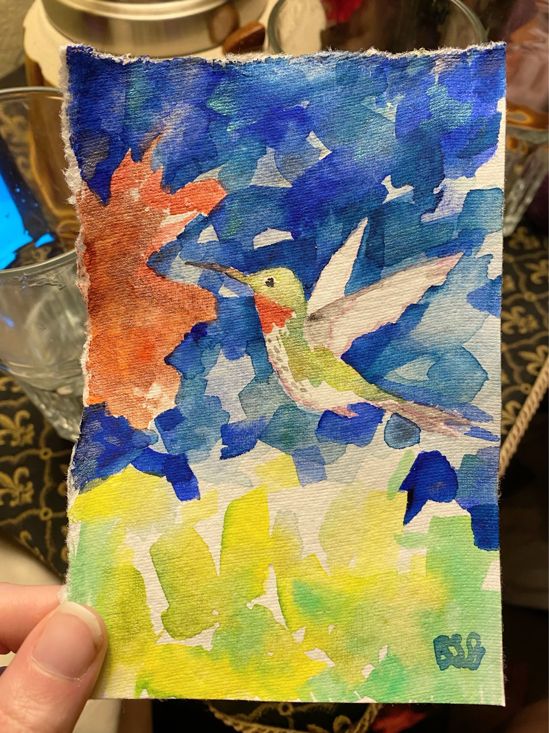
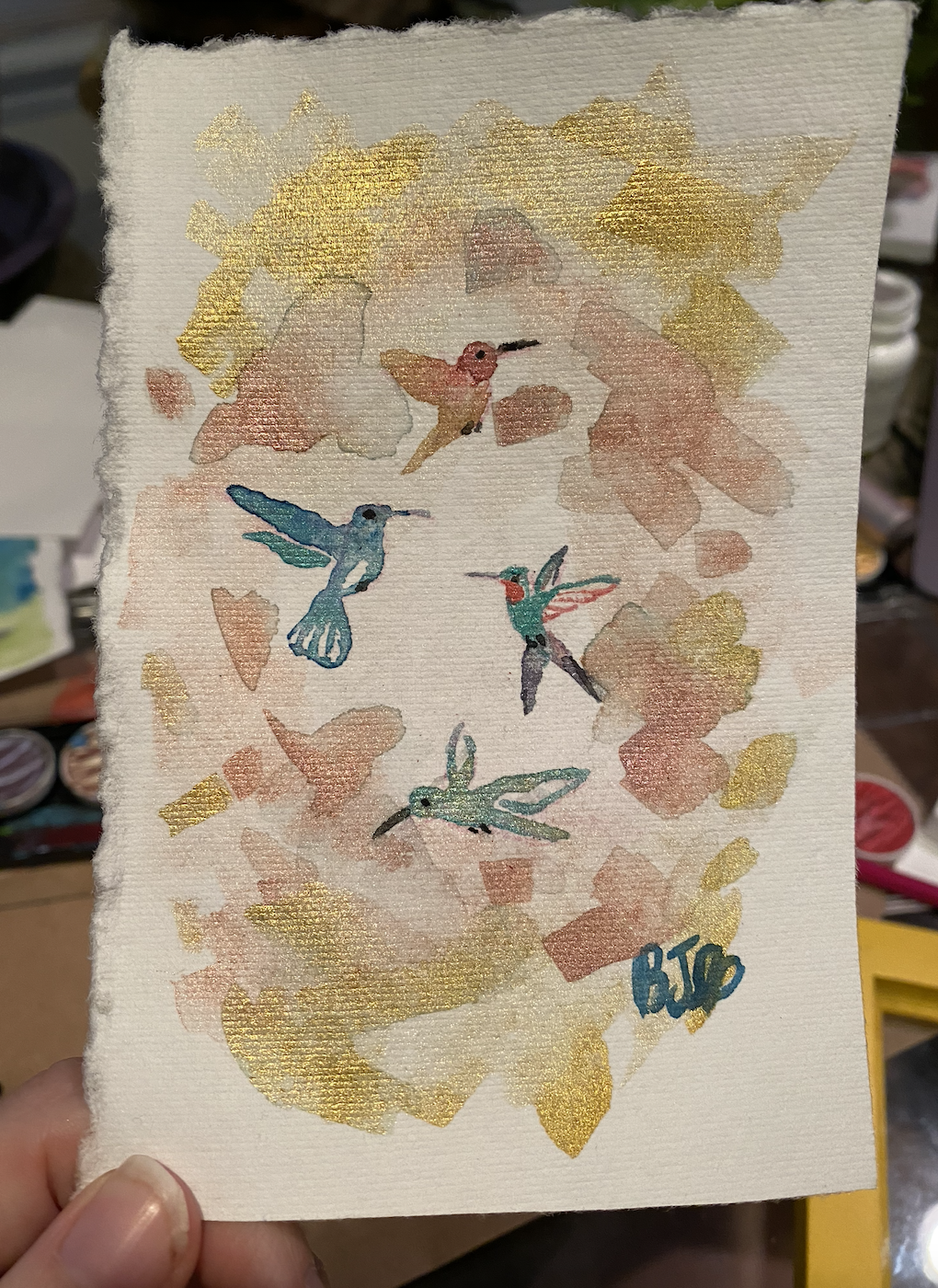
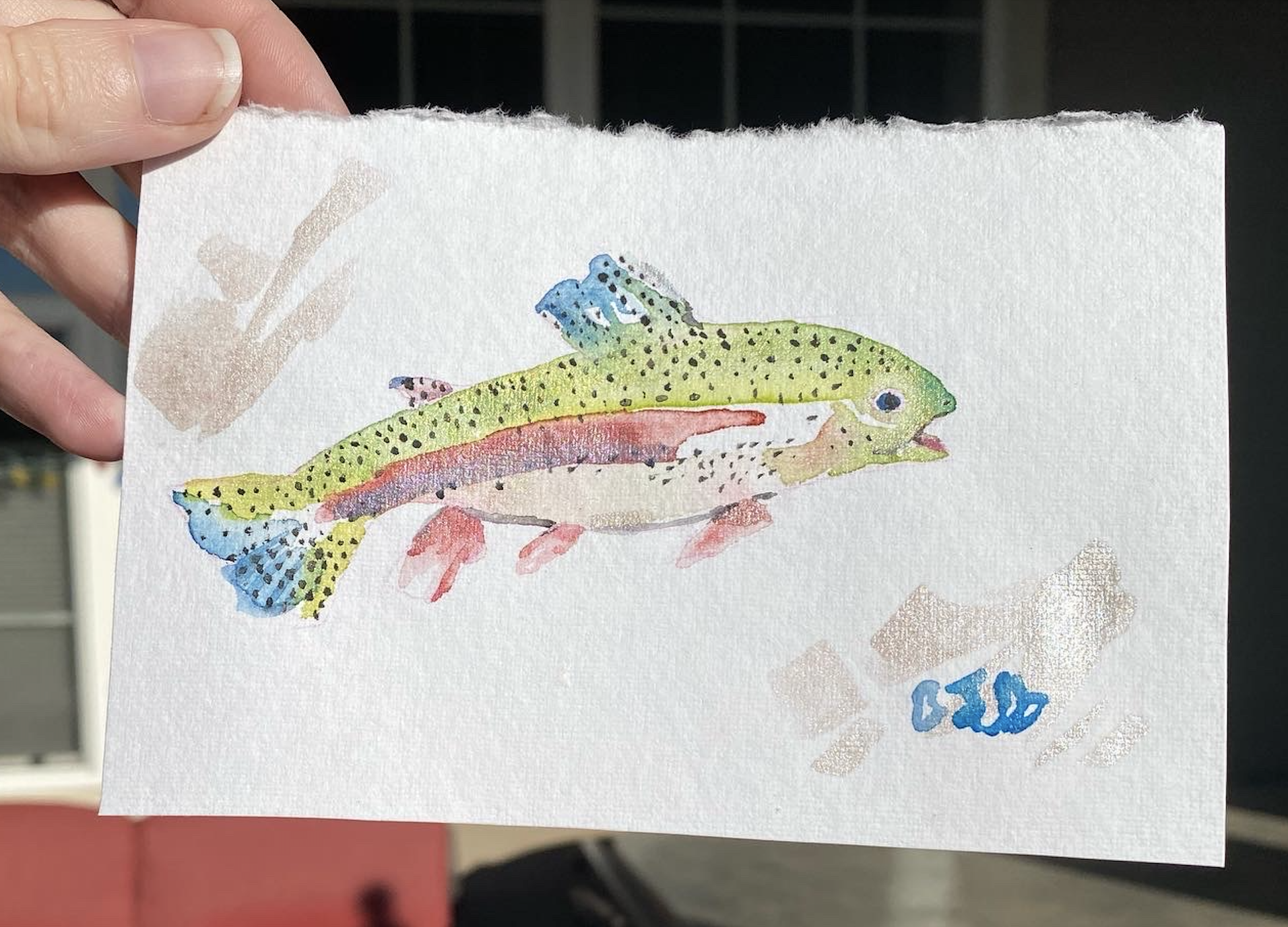
To get started with using these iridescent watercolors, I thought about different animals that had iridescence in their plumage or scales. The animals I decided to paint first were hummingbirds and also fish - each creature has a kind of shine to it that matches the properties of the medium.
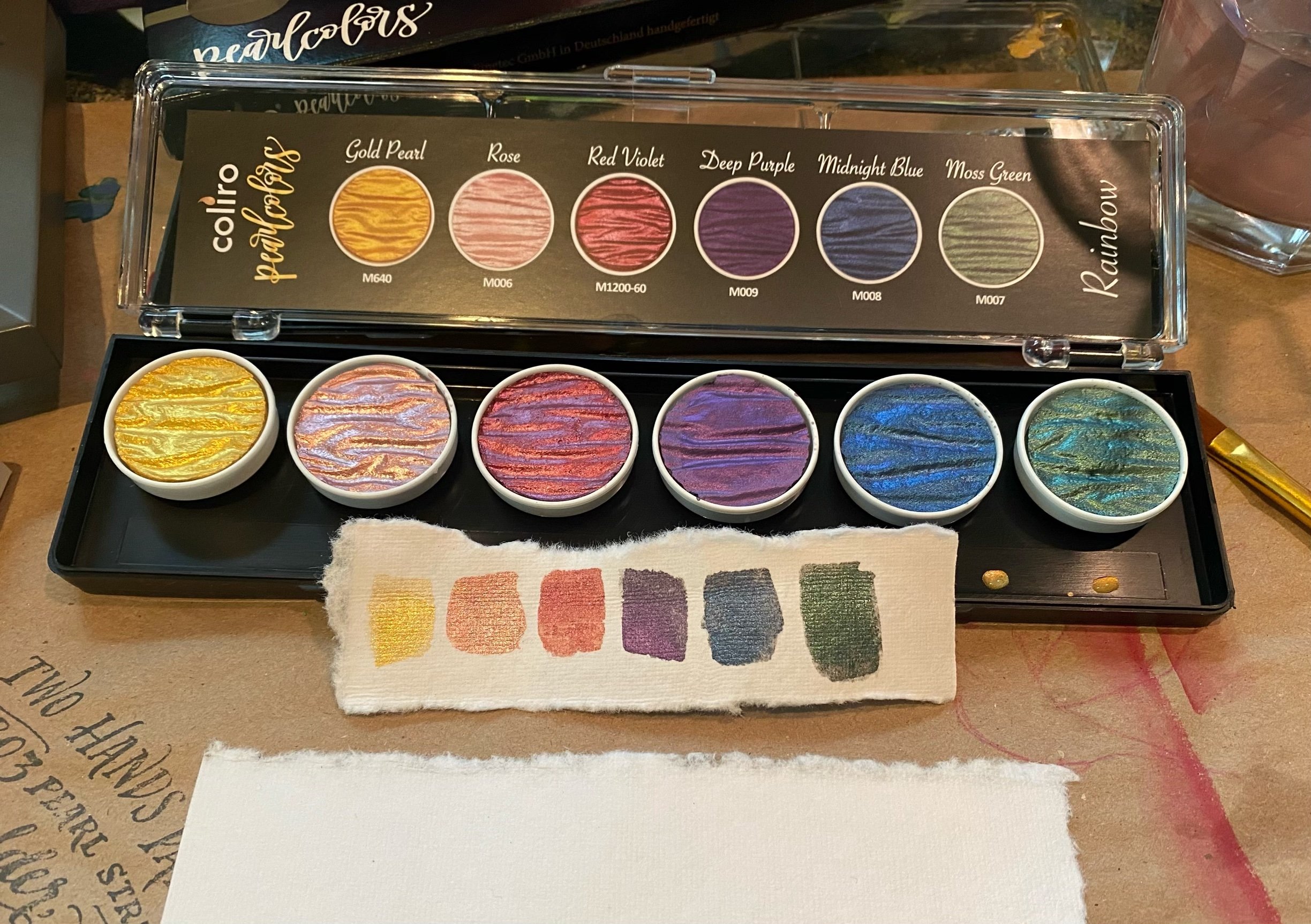
For me personally, it is fun and useful to make palettes of what each color looks like like in the photo above. This helps me understand what the colors look like on paper - sometimes it can be a bit of a surprise but with these particular colors, there’s nothing too shocking. Coliro also provides palette examples of what the colors look like on both black and white paper.
Depending on the lighting, these watercolors photograph a bit differently and I found it was a good idea to take photos in different lights, different times of day.
The particular paper that these watercolors are on is handmade paper made from recycled t-shirts, and it has a decent amount of tooth and depth - the pressing on the paper resembles canvas, which creates extra texture and shadows.
In different lights, the light may or may not fill all of the tooth on the paper, and this can affect the way the iridescent watercolors look.
I made a second, larger rainbow trout with almost exclusively the Coliro Iridescent colors - the only color below that is not Coliro is the black for the fish’s eye and spots.
Overall I really like these watercolors and I think they are definitely worth trying. I bought 2 sets and also a couple singles for palette diversity’s sake. The colors also mix and layer well with other watercolors and gouache paints.


