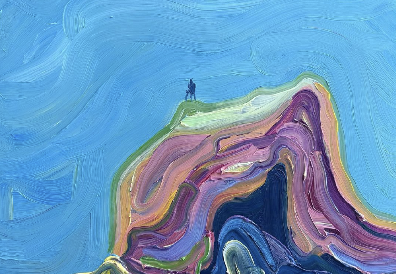
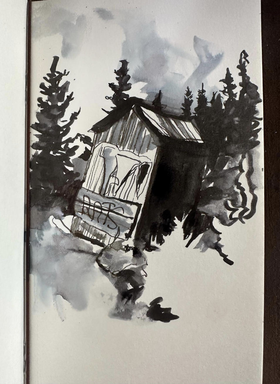
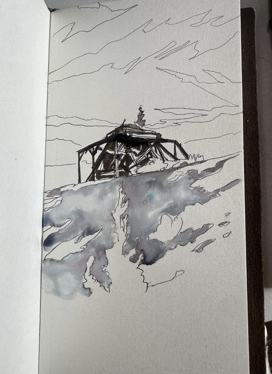
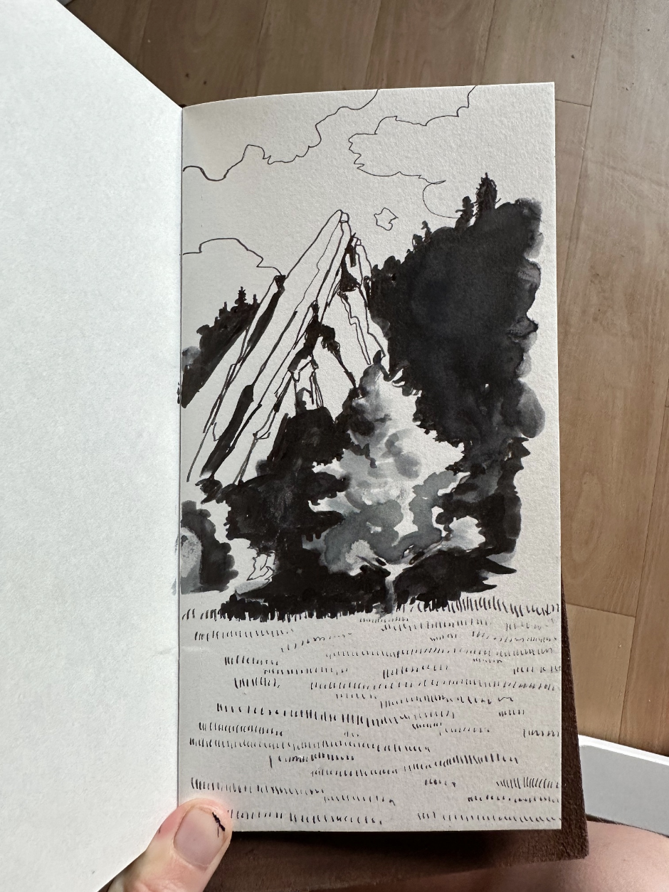
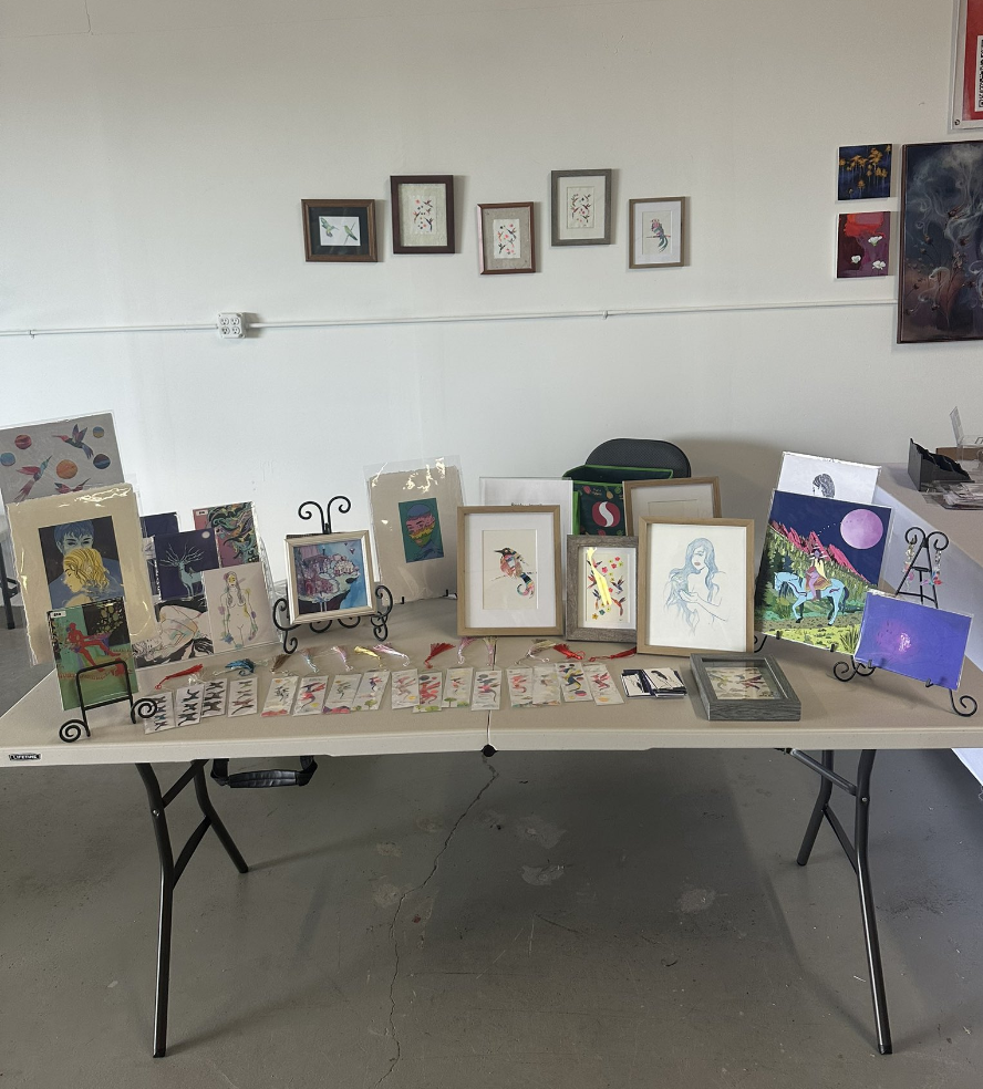
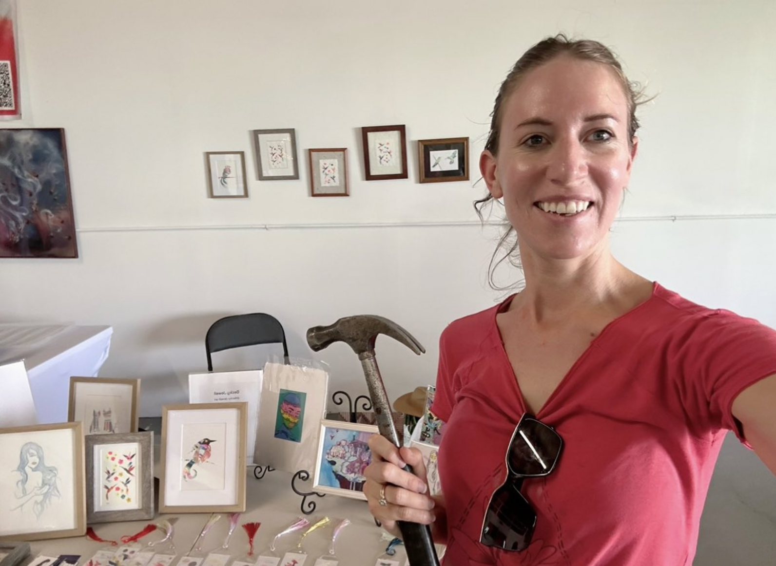
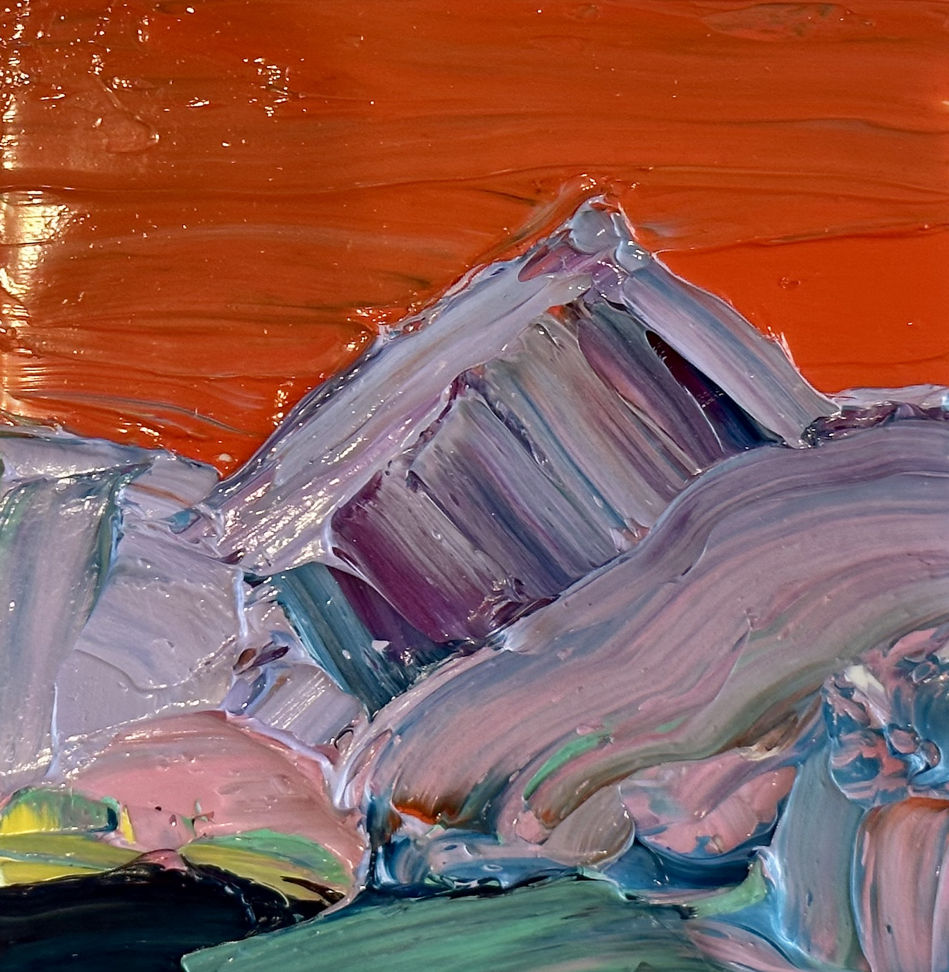
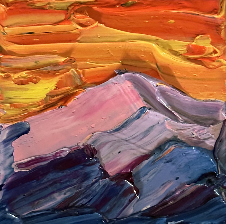
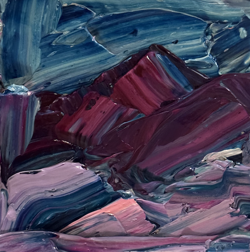
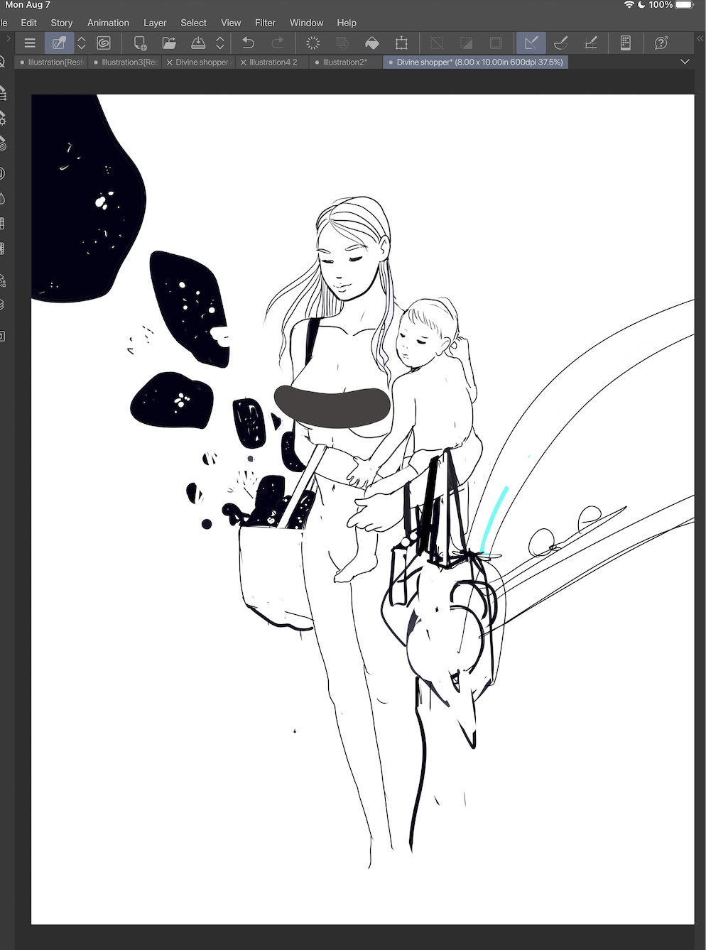
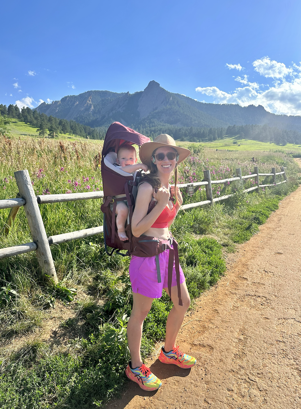
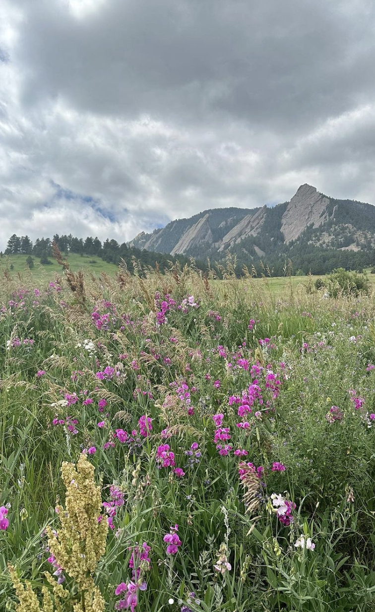
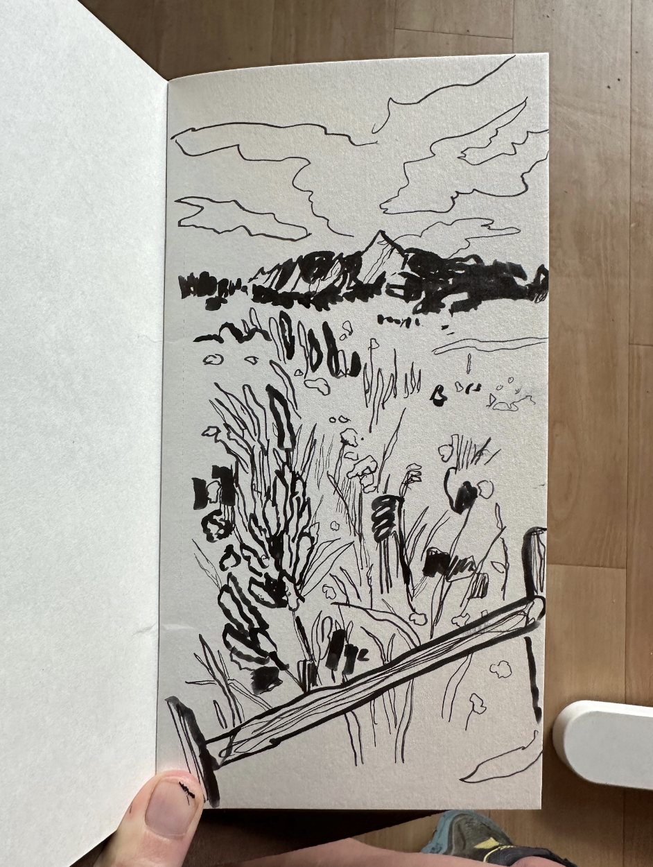
Creating an art space within your apartment isn't just about carving out a corner; it's about curating a place where your imagination can thrive, inspiration can flourish, and self-expression can live. This ApartmentGuide article which I am featured in will share expert tips for you to create the perfect art space in your apartment. Be sure to check out Artistic Oasis: 15 Expert Tips to Create the Perfect Art Space in Your Apartment.
Sketchbook Confessional January 2024
In January 2024, Boulder had a run of shockingly warm days near the end of the month. I realized it was so nice out that it would be silly to stay indoors, so I got out for a bit and did plein air on the Mt. Sanitas trail.
I think for many, Mt. Sanitas is an exciting and beneficial climb, for my purposes it’s certainly fun, and I go incredibly slow and only maybe 1/4th of the way up. There are many colors to see in the rocks on the trail, because the rocks are red and gray, and often covered with bright yellow-green lichen. There are also deep shadows on the rocks and glaring white mica. I find myself using a complete range of values of paint when I am painting around here.
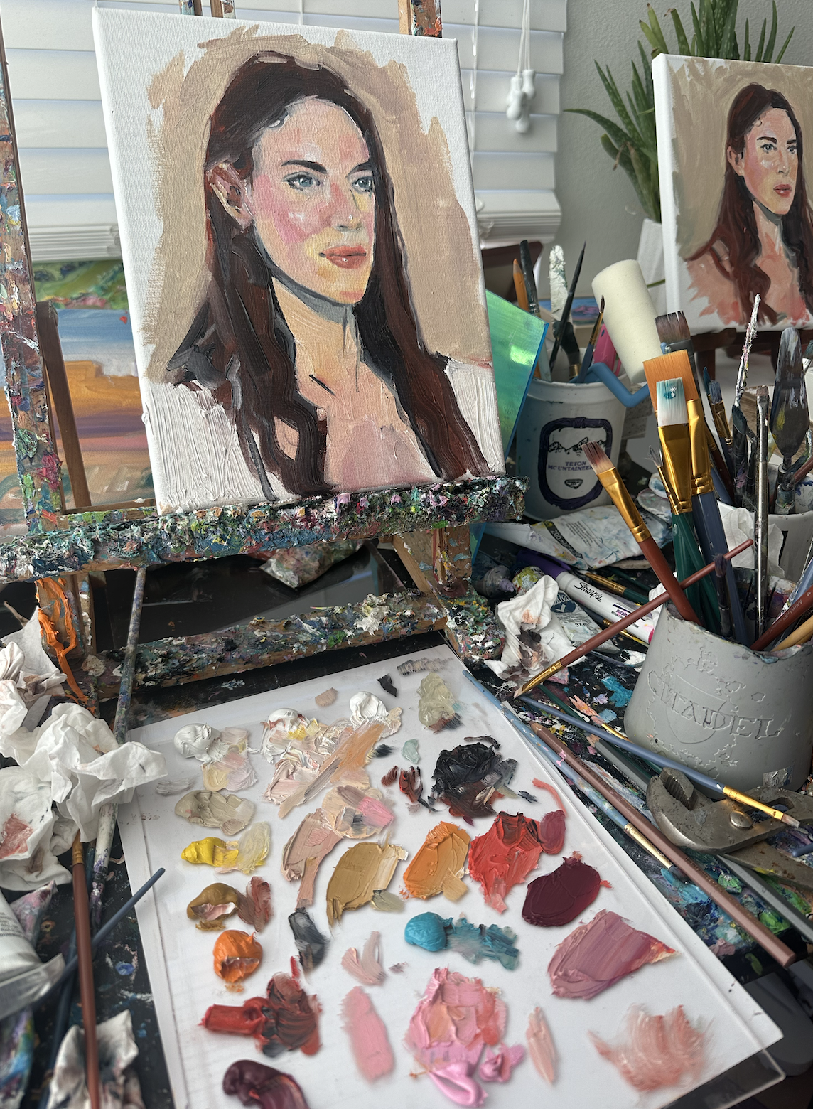
Aside from landscapes, I worked on portraits a bit too, which I go into in detail more in this blog. I was happy with how these turned out.
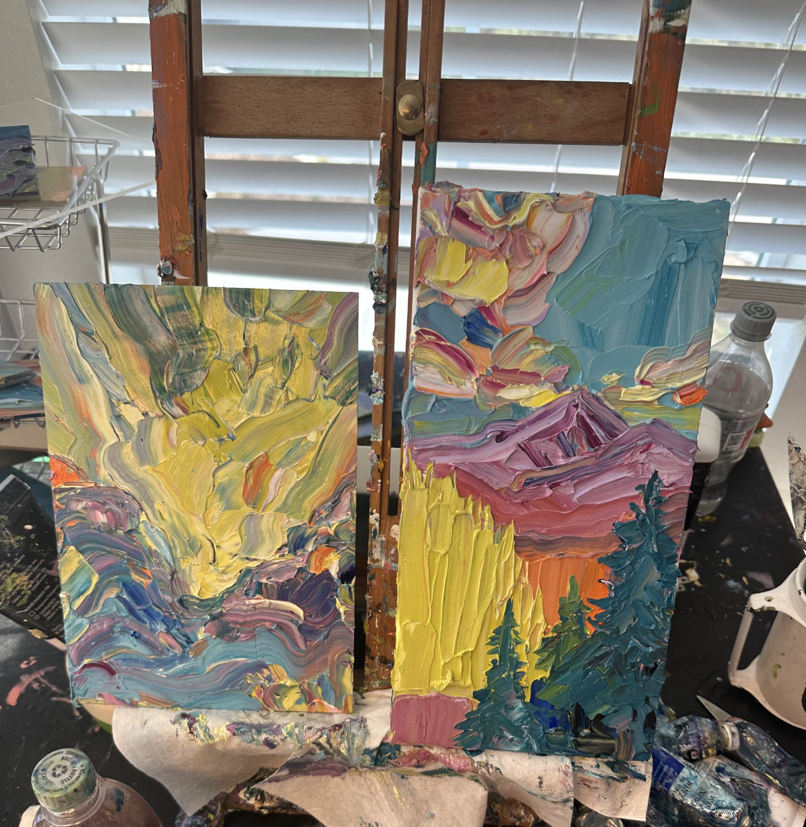
I also made several flower and mountain paintings in January.
I made a few other lupine pieces that aren’t shown here, but I think there were about 5 of them total, mostly of small size.
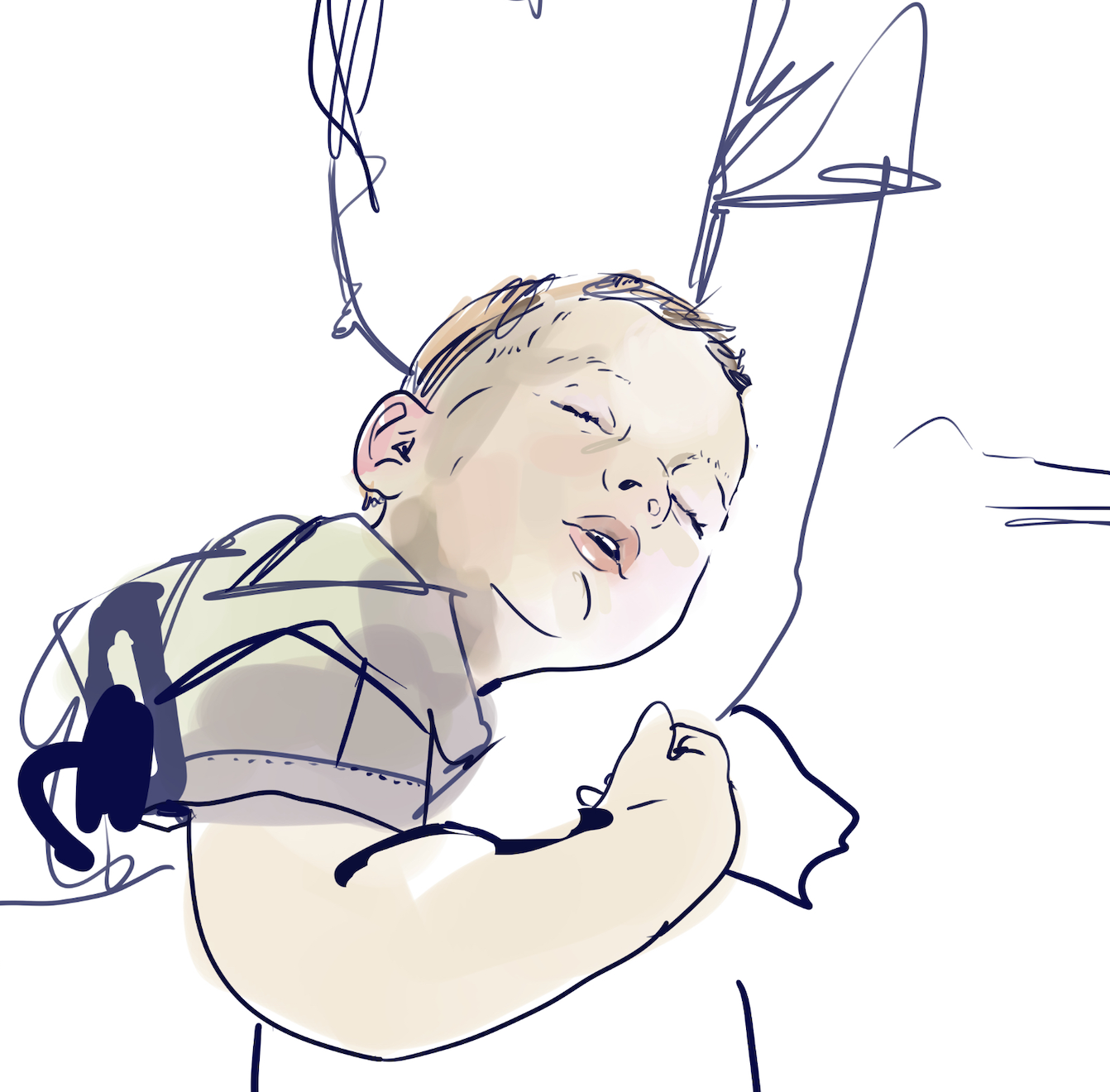
I’ve been able to do some ‘collaborations’ with my 18 month old, it’s been very fun. He scribbles a bit and I make a drawing. It’s fun to do these on canvases from Michaels because they are durable and survive all the spills, footsteps, and other mishaps that paper cannot.
In January I also made some non-collaborations of art of myself and Bebe. We’re right on the line between being able to still call him Bebe, he’s more of a toddler now I suppose.
On the digital art side of things, I finished Glass House Man, a piece I’ve been working on for a while
Anyways, that’s what I got for January!
Portraits in Oil January 2024
Lately I’ve been working on painting portraits in oil, and it’s been a fun journey so far.
Every now and there there are old cigar boxes for purchase at the creative re-use center in Boulder, Art Parts. I usually buy a few of them if I see them so I can put my paint tubes in it. I suppose cigars and paint tubes are roughly the same size, so these kinds of boxes work really well for table-top organization. They wouldn’t be terrible for plein air painting either,
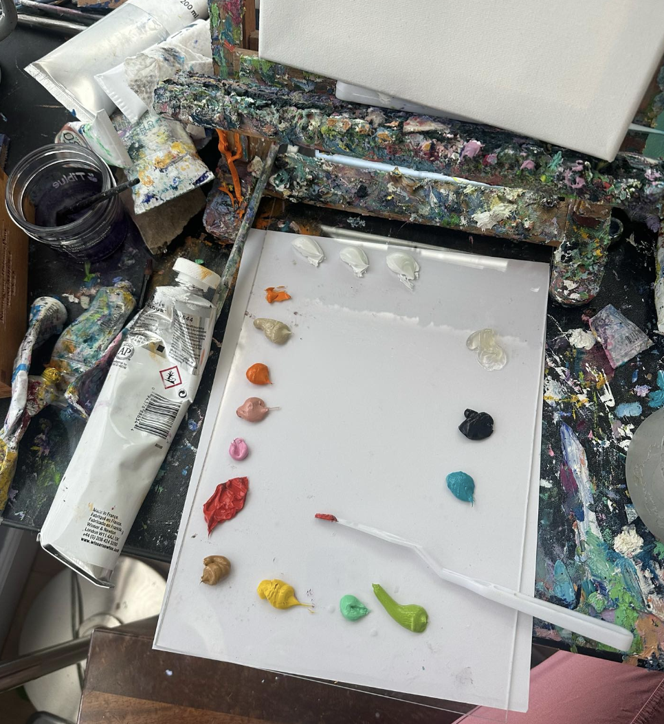
The other thing I often get at Art parts are sheets of acrylic plexiglass. These are great to get from the creative re-use center because they don’t have to be any special size or even clarity, and they are usually a dollar or less. I usually either turn the acrylic plexiglass into paintings themselves, or I place white paper/cardboard underneath them and use them as palettes, like below. My palette for portraits is as follows:
Here we have 3 daubs of white and a series of mostly-warmer colors on the left, followed by cool and dark tones on the right. The jelly-like substance that you see in the upper right is gamblin solvent-free gel. It’s the only medium I utilized for these portraits, and I use it pretty sparingly. It helps brushes glide more easily across the canvas, while extending the paint throughout. Just about every paint stroke eventually has a little bit of medium, unless I am working on details where I don’t want the brush to slip or glide too much.
What I found out while working on these portraits of myself is… I am very pink. My face is almost pink everywhere in fact and seems to be either pink or yellow when I really look at it. I didn’t have any cool tones except in my neck and in my eyes. My ears took up a bunch of cadmium-red hue colors and they seemed to be either red or orange.
I also don’t seem to be green, at all, I seem to only have pinks, oranges, or yellows. I looked hard and couldn’t find any usage for green in the original photographs that I utilized to paint these portraits.
After making each painting, I loaded the above photo into Clip Studio Paint and took several eyedropper-tool pulls from it. The colors seemed to stay in the carnelian-orange-red area.
I thought maybe if I kept eye-droppering the photo, eventually I would find some sort of surprising color, like green or purple, but I tried it maybe a few dozen times in promising areas and it seemed to be red/orange each time. I guess maybe one surprise is that my skin in the photo never registered as actual pink, it only ever registered as light red or light orange. So I suppose what I said a few paragraphs above isn’t true at all, I’m not pink in any way, I’m simply very orange-red with different levels of white.
To get the dark tones of each portrait, the color I utilized was Payne’s Gray. To me, Payne’s Gray appears like more of a mid-tone gray when printed on the tube, but in reality, it is quite dark compared to the printing. It made a good default unmixed color for deep hair shadows and pupils, and mixed with red it was a good hair-shadow color.
Once a good mix of colors is on my palette, it looks a lot like the photo above. You can see the heavy use of Payne’s Gray (dark blob on the right) and the somewhat more sparing use of the three white daubs. I guess in working these paintings, I wanted different whites so I used different daubs of white for different mixes.
The second photo I worked from I liked a bit more because I could see different colors in my face, like purples.
Overall I made six portraits of myself, three from the 3/4ths angle and 3 from the front-ish angle. I liked all of these for different reasons. In some situations I think I nailed down certain areas better than others.
Sketchbook Confessional 2023 - My Year in Art
Each month I write a blog called The Sketchbook Confessional, which is a recap of everything I completed in a month. The Sketchbook Confessional is a ‘done’ list rather than a ‘to-do’ list - it’s an objective look at things I completed, a way to keep myself focused and understanding towards my own output, rather than mythologizing myself as making more or less art than I actually did.
2023 is the second year where I am writing a recap of my entire year, 2022 being the first. So here we go:
I started out January by making some watercolors of rainbow trout.
In January/February I put together many ‘Dragon Families’ or Guardian Dragons. It’s been fun to make these. I make them out of hand painted paper. Usually I paint them with gouache, and sometimes, shiny watercolor such as iulie watercolors.
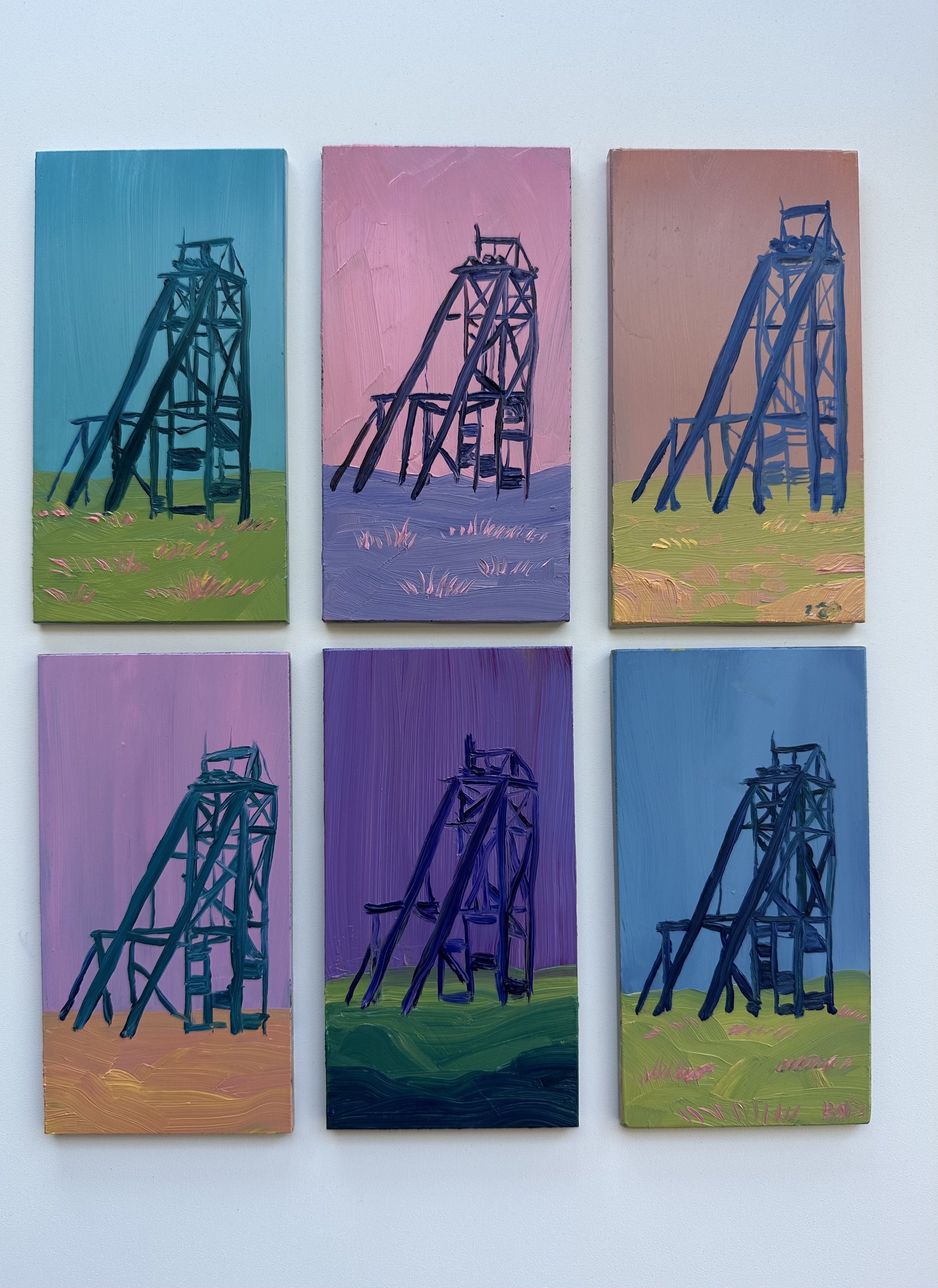
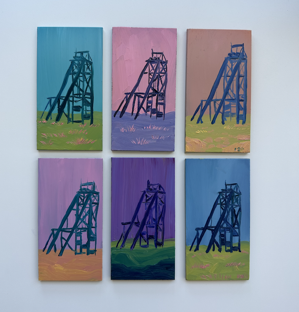
I made a series of a mineshaft at the Robert Emmett mine in Leadville, or just east of Leadville up on 5th Street near the Mineral Belt Trail.
It was fun to paint these in a series and work with straight/straightish lines.
Another series type that I started in 2023 was a series of oil paintings featuring a lone hiker, sometimes two hikers, on fantastic imaginary landscapes or rock features.
This was one of my favorite series of the year. I wanted to work with the idea of traveling the unknown and the immensity of nature, and also use my typical bright color palette.
Here’s me in Leadville at Harperrose Studios with a few of the Hiker series paintings.
As usual I made several paintings of Mt Elbert in Leadville, I think this was my favorite:
On the realism side of things, in early 2023 I did finish one nude painting that I really liked. I started a few other more realistic paintings but haven’t finished them or I won’t finish them on purpose.
For some reason I was really proud of her knees in this. It is interesting how skintones can have shades of green and blue in them.
As the weather cooled off in the fall I returned to making more art out of paper, such as these paper dragon bookmarks.
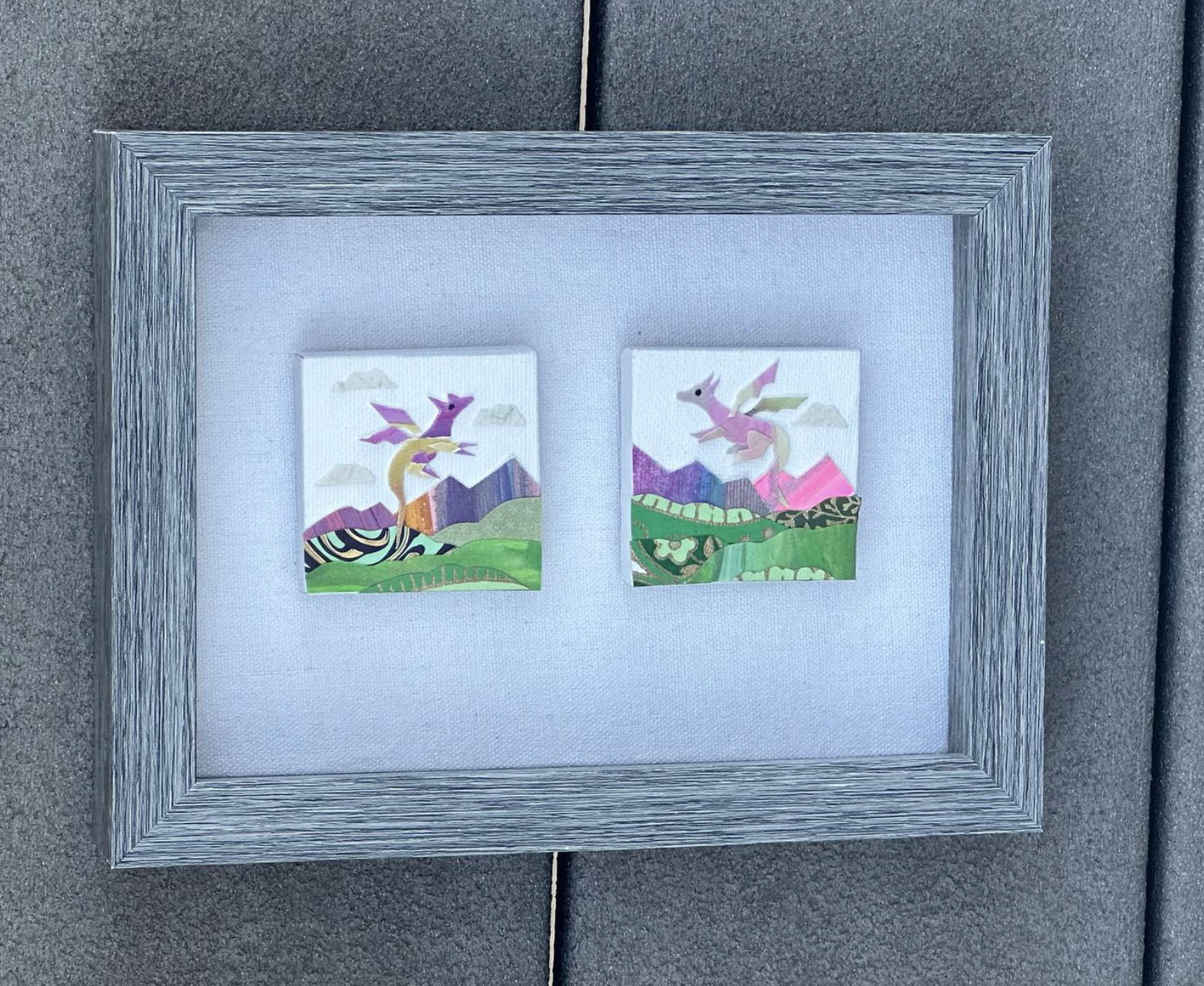
I began to put paper dragons on mini canvases as well - the above are 2 x 2 inches each. Making each of these is very fun for me, I enjoy layering the mountains and landscapes with each dragon.
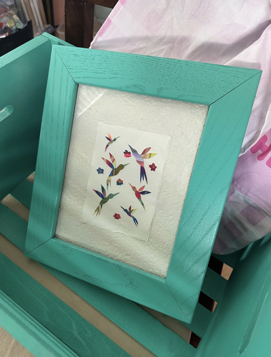
On the papercraft side of things I also made several hummingbird pieces:
It turns out 2023 was a bit of a cowboy/Western themed year for me. I began working with a series about night riders in deserts, with a galaxy of stars in the sky above.
In keeping with the Western theme, I started making these watercolor-ish drawings, where they are really made of acrylic ink from Winsor and Newton. One could probably make the very same thing from watercolor but they are in fact acrylic ink.
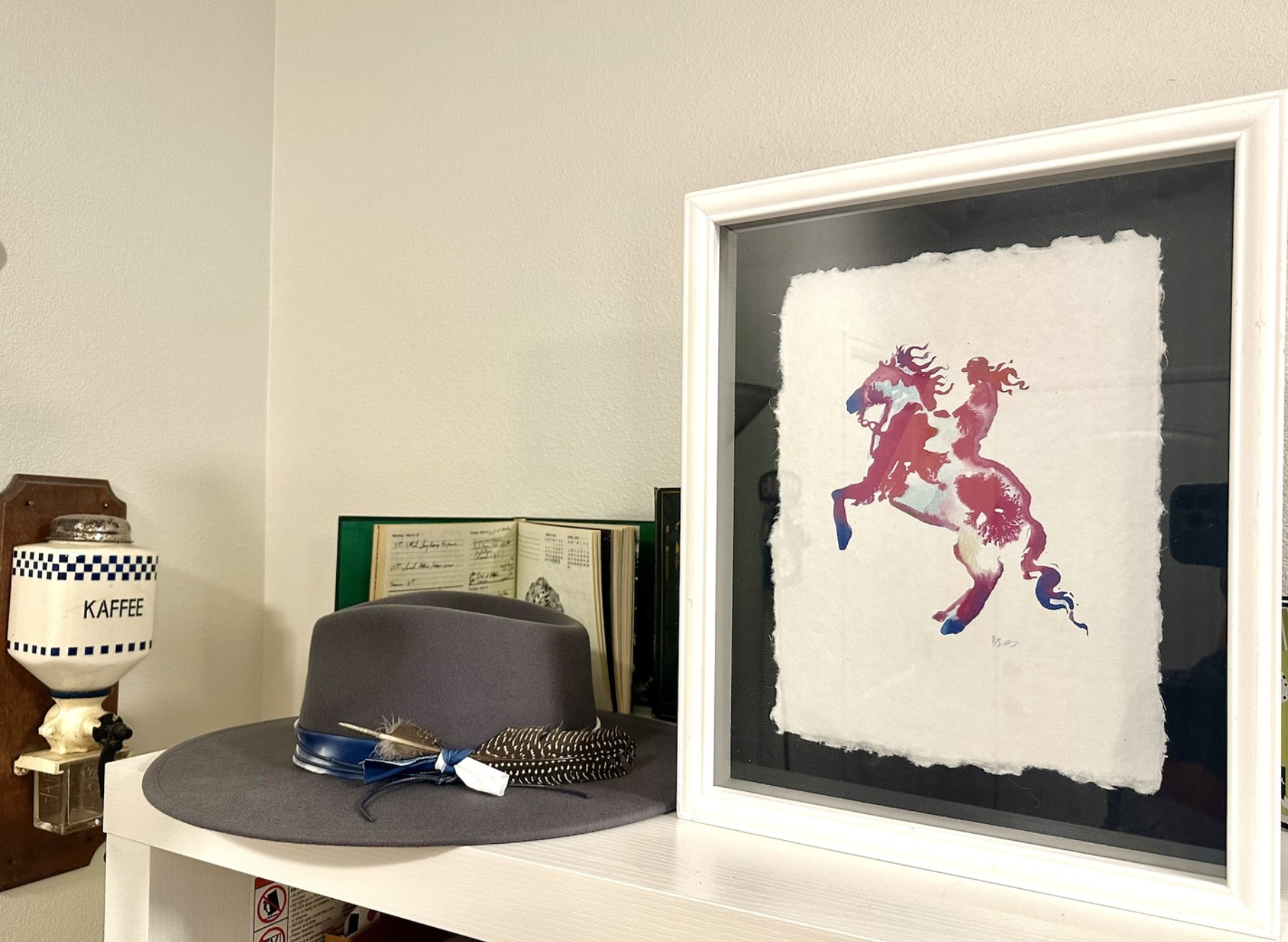
I made a couple more bigger cowgirl drawings and made archival prints of the drawing on handmade paper made from recycled fabric/cotton. These turned out well, one of these prints is below. Each one is so unique I’d call them 1/1.
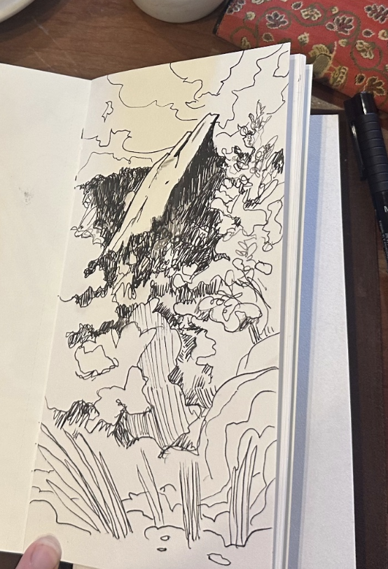
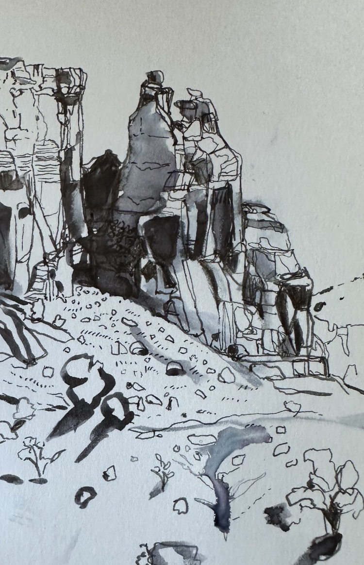
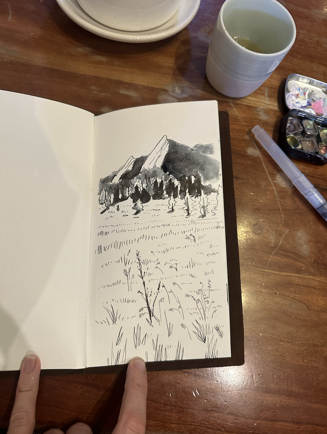
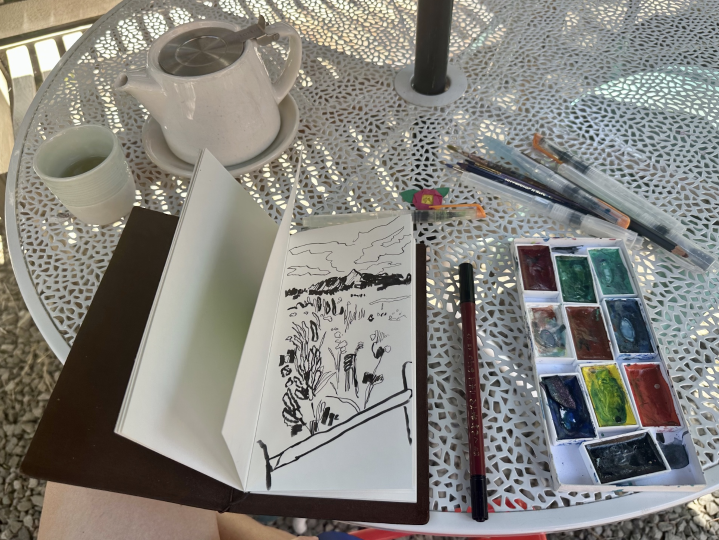
In addition to paintings, I did many drawings in 2023 in my Traveler’s Notebook. To make these, I used a Kuretake no 55 double sided pen and a Chromatek water brush pen. Here are a few of these drawings.
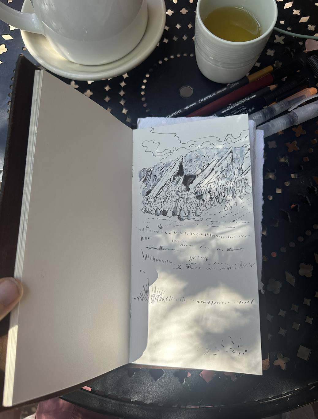
For many of these I focused on the Boulder Flatirons, but I also drew areas around Ghost Ranch in Santa Fe and a few scenes from around Leadville. It was fun to work with limits for these, not just the limits of ink but also the limits of color and value. They helped me get more creative.
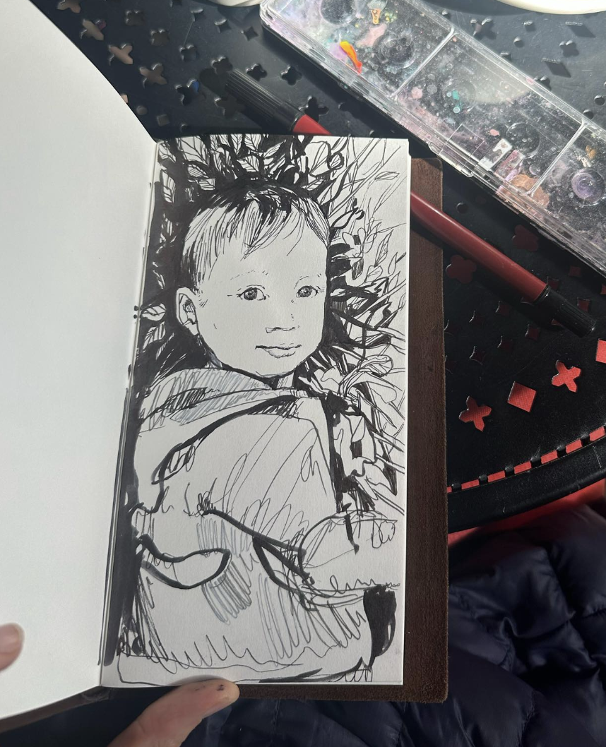
A new character appeared in my art in 2023. I made several paintings and drawings of my baby-now-toddler. Since he is a redhead, he makes for a fun subject in color, though I also did some drawings of him in black and white.
It’s been fun to learn to paint and draw my favorite (very) young person.
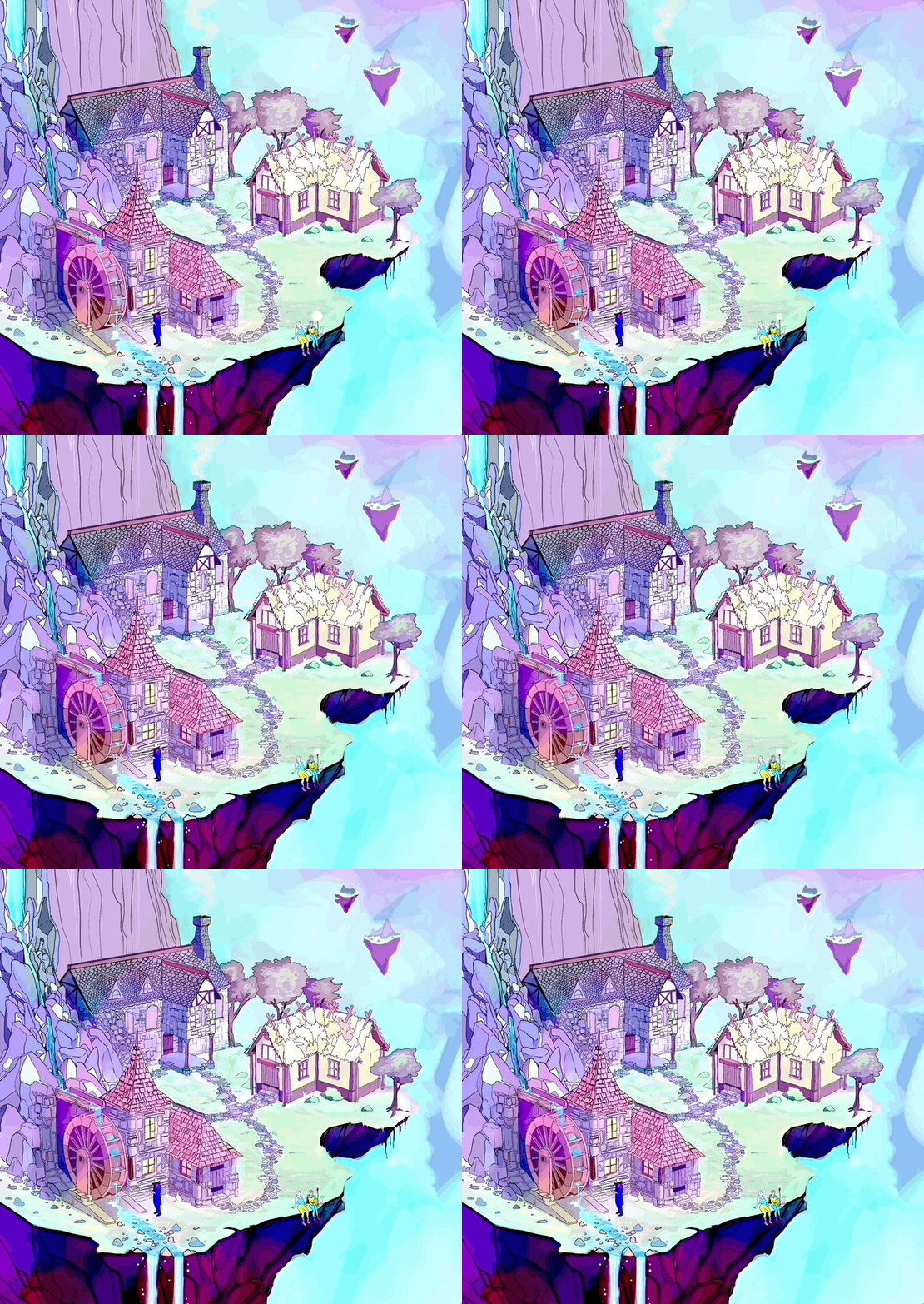
On the computer side of things, I had tons of fun with digital art in 2023. The piece I am most proud of is this animation involving a waterwheel, of a floating island environment.
I made this one week in August where I had a cold. After drawing all the bricks and buildings and finishing the static version of this piece… I was still sick with some non-covid thing, drinking theraflu like there was no tomorrow, and couldn’t go outside or run because I felt so bad. So, I decided to push this piece a bit further, and add animation to it.
Here is the animation on Instagram: https://www.instagram.com/p/Cwf_KpdA73-/
Animating a wheel from a 45 degree angle … where there is water involved …. completely by hand … is what I would call difficult. The wheel is rigid but the water is not. It’s a good mix of movement. Maybe it’s even perfect as an assignment to oneself. This was a breakthrough exercise for me because it was so challenging and varied. I’m sure if I had used 3D modeling software to animate the waterwheel, it would have been much easier. I’m glad I spent the time to do this by hand, however. As it is, I used Clip Studio Paint and Procreate both to make the animation.
More digital art:
I made another piece I really like, featuring the ‘back’ of the Boulder Flatirons near the trail to NCAR. I was running out in this area one day and took a pic of where I was, realizing it was the back of what I usually look at each day driving through Boulder on my way to McGuckins or whereever. The idea of the back of a landmark, like the back of Mt. Rushmore, or the Niagra Falls from the other direction, made me think of making this piece.
I also reworked some motifs from earlier years, like the piece below.
Also in the digital category, I tried out a couple AI apps and sent my modeling photos into the app. This one below is from an app called Prequel.
Being someone who has made drawings and paintings my whole life, and also someone who models, I have a lot of thoughts about AI image creation, and recorded some of the thoughts here. As time goes by and more technology is sharpened, as as I hear and read more artist stories about AI, my thoughts change, and I will do my best to keep them updated. For the moment, it’s certainly not only visual artists and models who are (unwillingly) providing content for AI, it’s everyone and everything with an image on the internet, I’d say.
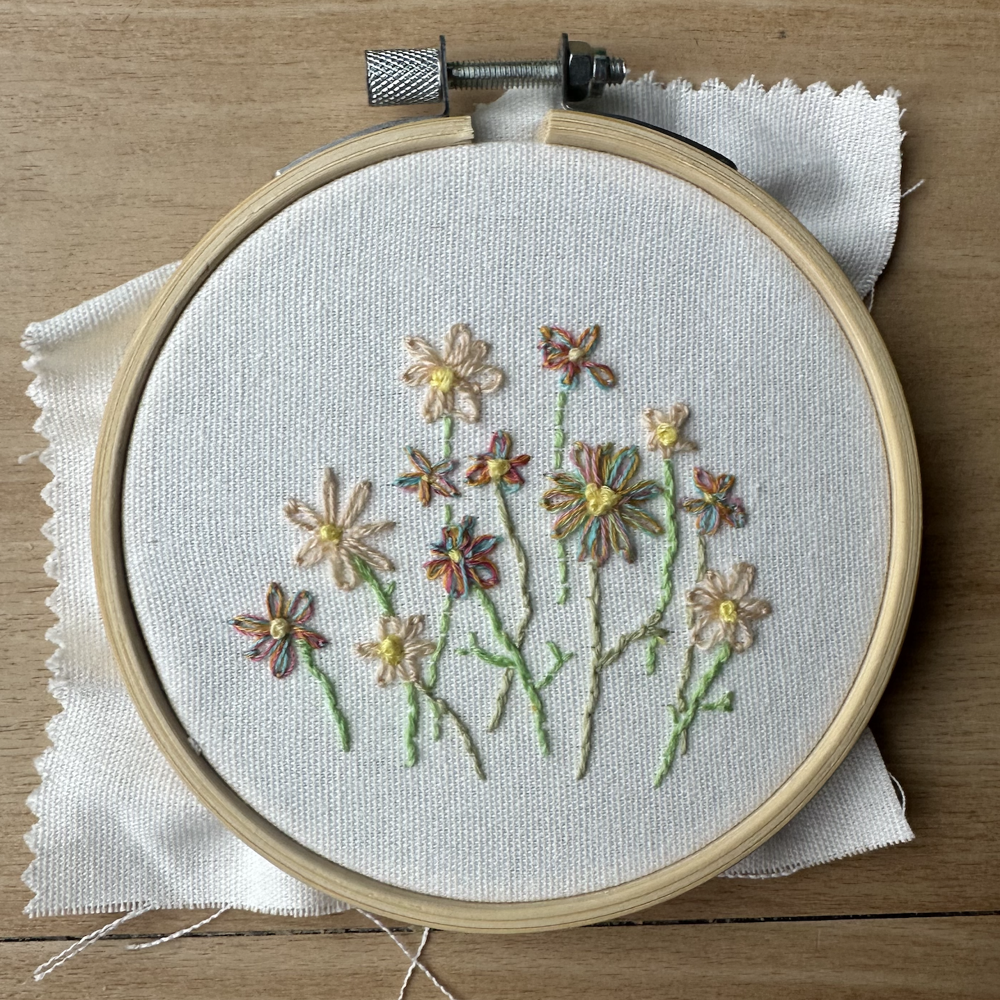
A new medium for me that I tried this year was embroidery. I enjoyed embroidery quite a bit and found it to be very fun, like painting or drawing with thread. I hope to try a new medium every year.
I started out 2023 hoping to count every painting I made. I lost count shortly after making the watercolor rainbow trout in January. I didn’t have the best system for tracking this. Maybe in 2024 I will be able to do this, but perhaps just the idea of counting paintings is a good enough idea to kickstart a year of art.
Until next time, See you, Space Cowboy ….
My journey into embroidery
I started embroidering this year and I have been loving it! It’s like drawing and painting with thread.
I’m by no means perfect or even ‘good’ at embroidery. Since it’s new for me, I find myself focusing on every stitch. I forget everything else except the stitch, so it is very zen as an activity. Maybe embroidery is like this for people who are very good at it, I’m not sure.
The cool thing about embroidery is anything can be embroidered, especially after making a plan and identifying the right techniques
Sometimes I find myself thinking about other stuff while drawing or painting, I think this is because I’ve spent so much time mastering drawing and painting that my brain, sometimes, doesn’t need to focus as much to make what I am hoping to make. While drawing a face I can very easily start thinking about chores or traffic or some kind of drama. It’s not always this way but sometimes it is.
With embroidery, it’s not this way - if I drift off in thoughts it’s usually to a neutral space where I’m not thinking about other things. It’s a chance to focus evenly.
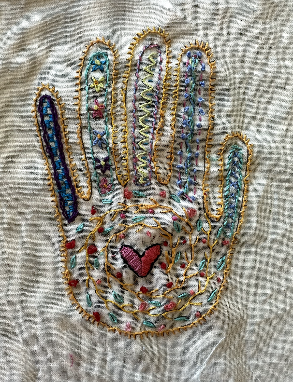
I took a local class on embroidery and learned a few different types of stitches. This 3 hour class was a good way to get started and to learn various techniques and also to just sit down and focus for a bit on learning something new. The hand above is what I made in the class. I’m pretty happy with it - I learned quite a bit while making this hand, which employs many different stitch types, and a high frequency of each stitch, so that anyone making it learns the stitch type very thoroughly.
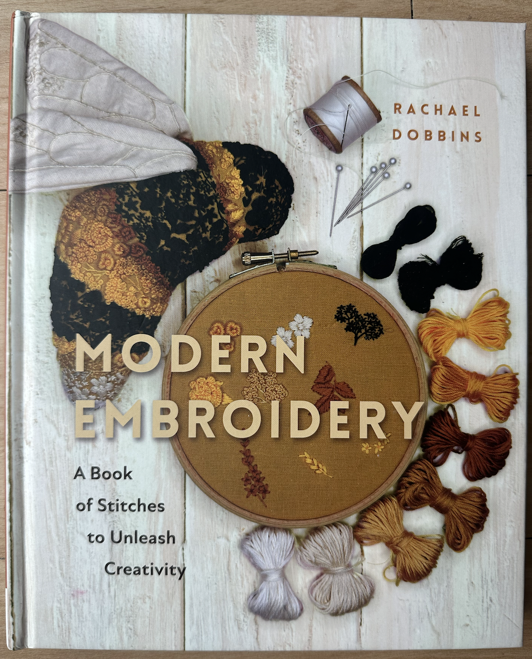
As far as books I have read or flipped through to find techniques and patterns, I have been loving these two: The Royal School of Needlework’s Book of Embroidery and Rachael Dobbins’ Modern Embroidery.
Both of these books are full of ideas with new things to try as well as useful information about traditional embroidery. I found myself reading through Modern Embroidery quite a bit and appreciating the writing and images. One might think with books like this that they are all about the images, but I really appreciated the clear writing in this book. It can be hard to fully understand stitches through writing and images alone (hello youtube!) yet I found myself understanding everything very easily with this book.
One of my favorite patterns I’ve made so far is this one, which I found online by googling “Winter scene embroidery”. I didn’t draw the pattern on this or anything, I just looked at the image on Google and copied it in thread, and put my own spin on a few things here and there.
All of the embroideries pictured here are small except for the hand - they’re about 4 x 4 inches. I am putting each one on my christmas tree this year as ornaments. I think they will be great decorations in the years to come, maybe heirlooms if I am lucky, we will see.
Until next time!
The Go Gopher
Today I made a version of the Go Gopher out of paper! I think it will be a fun gift.
Touching up Frames using Furniture Repair Sticks
A very front-of-mind occupation that I have as an artist is finding and paying for frames for my artwork. I’m probably like many artists - I love making art most of all, and I want my art to look it’s best, so it’s worthwhile to me to seek out the best frames possible for my art.
Even though I know that framing is a worthwhile pursuit, I still like making art most of all, so, framing can risk being a bit of a chore. Restoring frames has made the chorelike task of framing more fun for me, and it’s also very economical. Restoring frames that are scratched or damaged taps into the problem-solving aspect of my creative practice.
So very many options for framing lay scattered across the internet in various shops and channels, yet a resource I’ve come to appreciate over time is finding frames at local yard sales and estate sales.
The frames I find at yard sales are 90% wall-ready frames, yet, they’ve usually been moved into a yard or driveway or piled together with other items. They’ve been bumped or scratched.
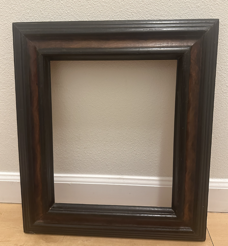
Restoring frames that I have found at yard sales has been easy and inexpensive, but finding out the best way to do this did take me some time. The best way to repair scratches on frames is to use furniture repair sticks, like this one below:
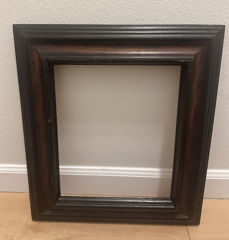
In this example frame, you can see below some of the scratches the frame has. Most of the wood structure looks very good, yet there are small chipped or scratched areas on the frame.
The photo above is the entire frame ‘before’ my wax stick coverage of the scratches and bumps. Below is an after of a specific area:
Here is the before and after together:
Like I mentioned above, the frame in the before photo looks 90% wall-ready, all it needed was a few touchups to be truly ready for prime time.
To do what I did here, especially if you’re new to restoring frames or you’d like to spruce up some old frames and save money, I recommend buying a set of furniture repair sticks online or from your local tool/home improvement store. These are wax sticks where you can run the stick over a frame, smooth down the wax after it is applied, and voila, your frame looks like it’s brand new. Scratches are now repaired by the wax.
What I liked best was getting a set including several colors of wax sticks to make sure I could repair any frame I came across. A range of different browns, reds, and cream colors is what will have the most application.
Before finding wax sticks as a solution to fixing up frames, I went through all sorts of other ideas in my head to repair the wonderful frames I’d found for 50 cents or sometimes even free. Should I paint the frame? Refinish it somehow?
While I have run into frames that need a full repaint, it’s pretty rare. 9.5 times out of 10, wax sticks are the way to go to repair the frames that I’ve found at yard sales or estate sales.
In addition to saving money and time, this process also rescues frames from the landfill. I remember one estate sale that I went to on a Sunday afternoon, where the sale was ending soon and the seller was eager to get as many items as possible cleared off of their property - the seller gave me a box of a dozen old-timey frames for free. I fit them into my car - barely - and wasn’t sure what I would do with them all or if I could even come close to fixing them. They were such nice, wonderful frames! Some of them surely had cost over $200 when they were originally purchased. Yet all the frames had the 90% problem. They were A- or B+ frames at best. It was this experience that led me to go down a research path towards finding the wax sticks and the best way to repair the frames. Surely if I hadn’t been to the estate sale at the last minute, and if I hadn’t been so tenacious at researching frame restoration tactics, the wonderful frames would be in a landfill right now.
As far as saving money, I can conservatively estimate that the original cost of all the frames I’ve salvaged this summer is around $1000. Who knows? Unconservatively, maybe it’s more like $2000. The wax furniture repair sticks cost me $7.
Good luck in retouching any frames you may have, and I hope this blog is helpful!
Sketchbook Confessional November 2023
Welcome to November 2023’s Sketchbook confessional!
The Sketchbook Confessional is a post where I round up all the art I made in a month. It’s a ‘done’ list as opposed to a ‘to-do’ list, a way to see what I shipped and did versus what I thought I did.
I tend to minimize things I’ve completed, so this kind of post is very much helpful in keeping my viewpoint objective as far as my own completed works.
So here we go! In November, I made a few dragon collages. It was very fun to make these. All of these dragons are in their new homes.
This month I finished a few ink drawings of buildings around Leadville.
In November I began working on what I am calling the Ghost Rider series, a group of works painted in water and dripped with ink.
Here is an instagram reel with more on how these are made:
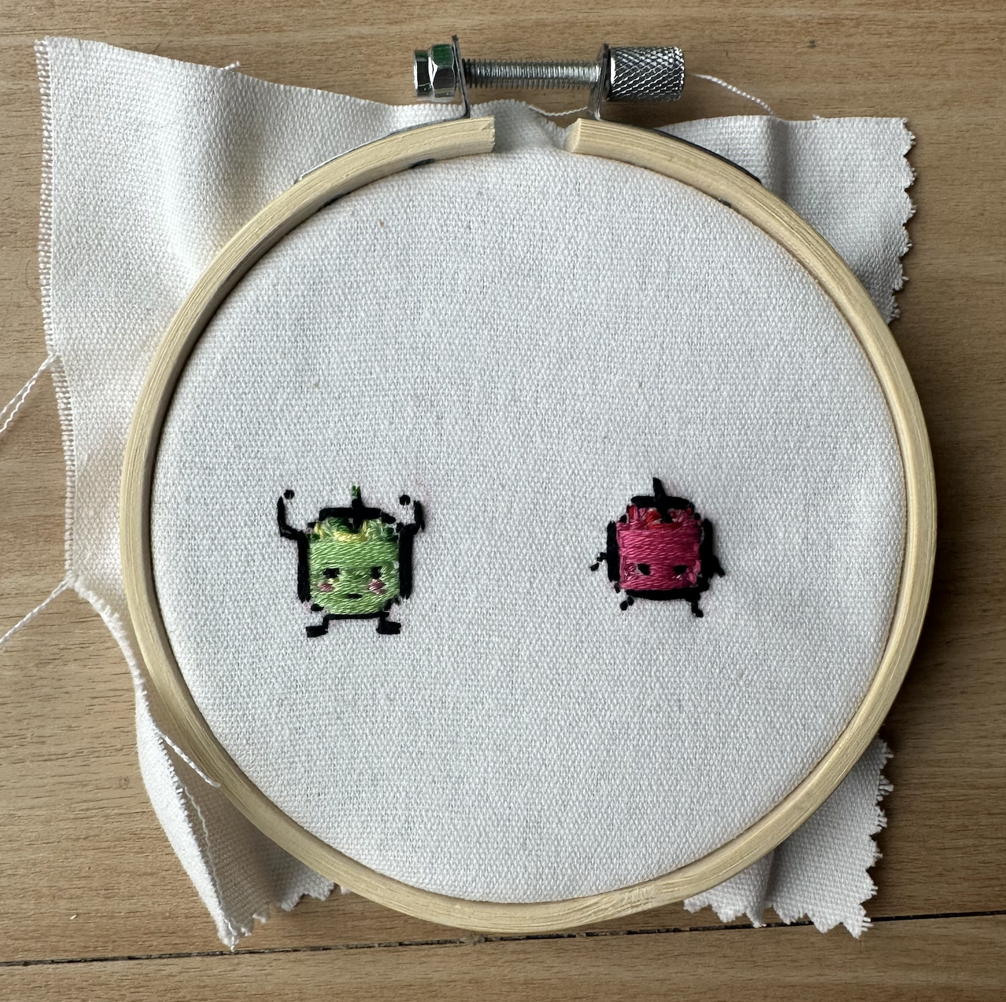
In November I revisited working on embroideries and I embroidered some Junimos from Stardew Valley, and also a winter cabin scene that I found online as a template. My plan is to create about 10-15 embroideries to decorate our family Christmas tree.
I certainly wouldn’t say I am the best at embroidery, yet that is what I like most about it. I’m at the point with embroidery where I must focus on every stitch, or I risk something bad happening to the piece. This means I stop thinking about everything else. It’s really relaxing for me.
Reading:
In November I finished “On Blue’s Waters” the first book of the Short Sun cycle from Gene Wolfe. I finished “Book of the Long Sun” I think in October, and finished “Urth of the New Sun” in March. It’s been a great year of reading Gene Wolfe. I appreciate quite a bit about these books, and they’re fun to read as an artist because there are so many highly visual moments where there are exciting interpretations to build.
I did a few illustrations from Long Sun in November.
plan on doing many more illustrations of the Long Sun Cycle.
In terms of reading comics, I finished “World of Edena” by Moebius in November. I loved it. What more is there to say?
I feel Gene Wolfe and Moebius are related in terms of content and mastery. Reading both is like reading the best of the best. Everything else is hard to get used to after reading these. It’s like being on a space ship with them and then landing on earth with everyone else. If I find others like them I will be sure to keep you posted.
In November I also read a book called “Unf*ck your friendships” and enjoyed what it had to say about developing better friendships. I’ve been working hard on this dimension of life as we move through our post-crisis-level covid environments. Sometimes I forget that I can just call or text someone, like I’ve internalized that hanging out is off-limits, so its a good exercise to me to read about creating and developing friendships.
Running:
In November I got a few shorter runs in, mostly to the tune of 2-5 miles. I hope to run more in December.
That’s what I got for November 2023! Catch you next month!
Sketchbook Confessional October 2023
In October 2023 I was able to do a fair bit of ‘Inktober’ as I put it in quotes because I often use ink no matter what month it is!
My Traveler’s Notebook got some usage and I filled up a couple watercolor-style notebook refills.
Since watercolor paper for the Traveler’s Notebook is so popular, the shop ran out of the large/tall format paper and I was able to get this small, passport-style booklet. It was a fun size to work with. What I ended up liking most about this size is that it is less tall and skinny than the full-size paper in the photo above, but not square.
I enjoyed seeing so many fall colors in Boulder this year. I think I sort of missed/forgot about fall last year since I was living with my brand new baby. I remember getting outside last year but not as much as this year.
Speaking of Bebe, I was able to make some fan art of him in October.
In October I branched out a bit and took a local embroidery class. It was very fun to learn different stitch types and ultimately make this patterned hand, where each element of the hand was comprised of different types of embroidery stitches.
All in all, a wonderful October! Catch you next month.
Sketchbook Confessional September 2023
In September I was able to go to Ghost Ranch in New Mexico - I’d never been before! It was a friendly and fascinating place to go. During the same trip I went to Santa Fe, which I’d been to before and seems to have not changed much - still incredibly charming. I suppose cities that are hundreds of years old are like that.
On the way to Ghost Ranch I definitely recognized the mountain that Georgia O’Keefe painted often. It felt a lot like my trip to Paris, where I would turn a corner and recognize paintings that I’d seen for years, but never in person.
September’s first friday in Nobo was a hit! It was very toasty but I did end up surviving! It was great to meet everyone at this First Friday.
I finished several dragon bookmarks in September. All of these were fun to make.
I also finished a few oil paintings of Mt. Elbert in September.
I had a goal to make three large-ish Mt. Elbert Paintings between July and October 1 and I ended up getting them done all at the end of the personal deadline I had set up for myself.
Some small-ish paintings I made - each is about 5 x 5 inches:
Most of these are Mt. Elbert but one is kind of a mystery.
Reading:
In September I finished reading Calde of the Long Sun. I loved this book, there’s little more to say at this point since I’ve been reading Long Sun all year and I’ve posted about it in a few of my other monthly recap blogs. It’s been a fun series to both read and finish. I like how the world of these books slowly materializes. It’s like a painting that slowly fades into view, becoming sharper with each stroke. It’s going to be a good re-read in that way. Maybe a lot of art is like this, it’s a bit confusing the first time we see it, then if we read 1000 pages about it, it has a different feel. It’s almost like two different works in this way. It’s like the difference between seeing Starry Night at age 12 and Starry Night at age 36.
I’m still reading The Aeneid and The Letters of John Steinbeck. I thought I would finish these sooner but it seems like I fly through books a lot faster on Kindle, and I have both of the above in paper form.
After reading The Aeneid’s depiction of the underworld in Book 5 or 6, Dante’s Inferno makes a lot more sense. There is an order to everything in The Aeneid’s underworld, different people go different places, and not all of it is about punishment, as there is a heaven-ish place as well. I found this pretty interesting.
Running:
I’ve been taking a break from running this summer but with the cooler weather, I think I’m ready to make a comeback! We will see how the fall goes.
Sketchbook Confessional August 2023
In August it was very toasty in Boulder, I ended up staying inside a bit more often than not and making iPad drawings.
For the drawing below I thought about how I’m often shopping with my baby, and it feels like sometimes I am buying a universe of things for him to eat, wear, and play with. In a way, the things will become his universe.
I also did a quick sketch portrait of my baby as well. He grows so much every day. I try to soak in every moment.
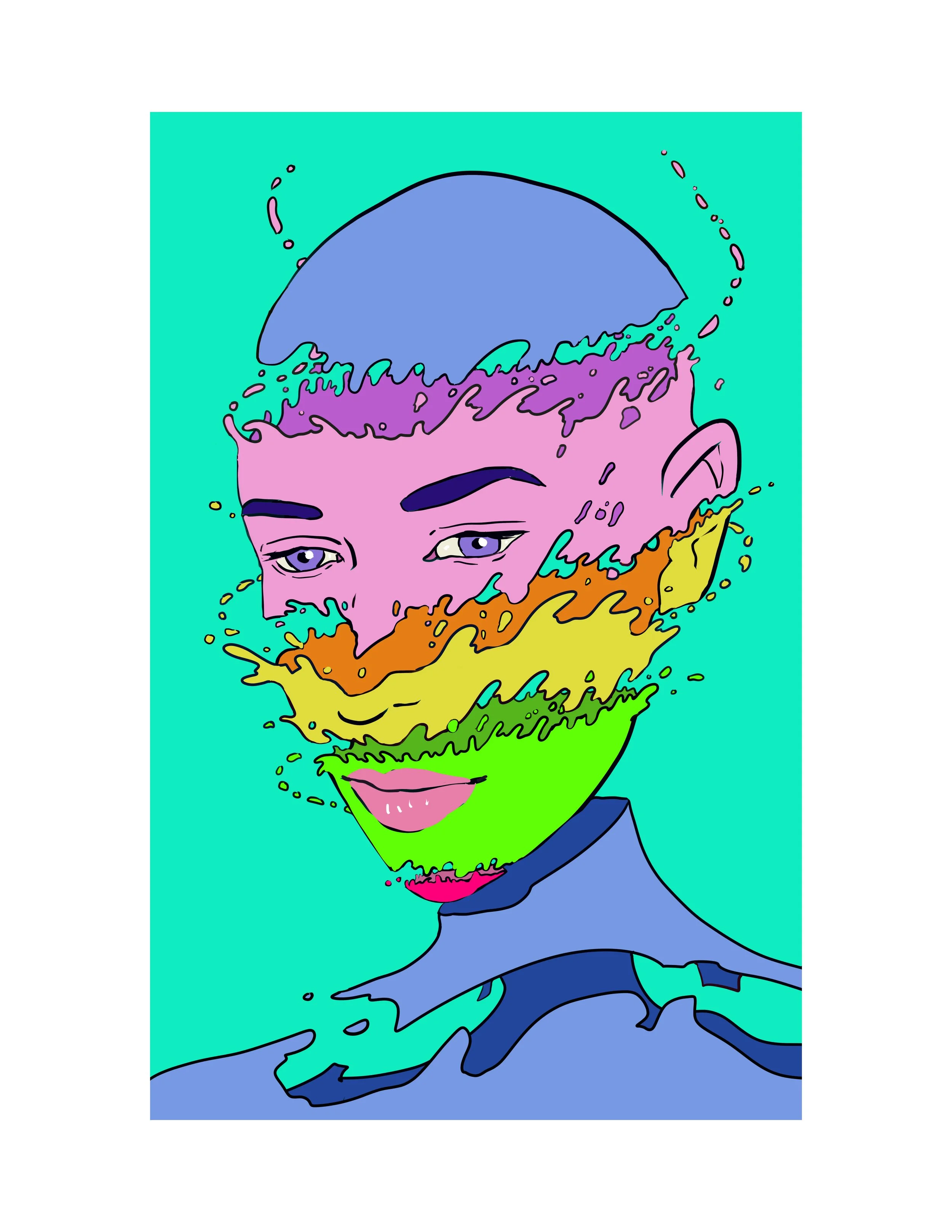
For this drawing, at first I was thinking about a head that was an island of some kind, then I turned it into a series of layers of fluid.
This digital piece ended up printing well too!
I thought a bit about illustrating moments from games that I hadn’t seen done before. This one where Celes goes fishing came out of that effort. I wanted to do a strange angle and also make the place look idyllic, even though it’s effectively the end of the world.
She’s a weird character, maybe every character in FF6 is weird. At the beginning of the story, she’s working for the other side. She joins up with the resistance force, then stars in an opera? I guess. Anyways I forgot how sad the fishing moment was, I forgot that after fishing for the old man, Celes gives up all hope. Only after that does she see the bandana, and has hope again. What I think is significant though is that Celes can still fish, while the old man cannot.
In August I had a few hours on a couple days to hike, run, or draw while some family looked after my baby. It was fun. I ended up making a few drawings of things I had seen around Boulder.
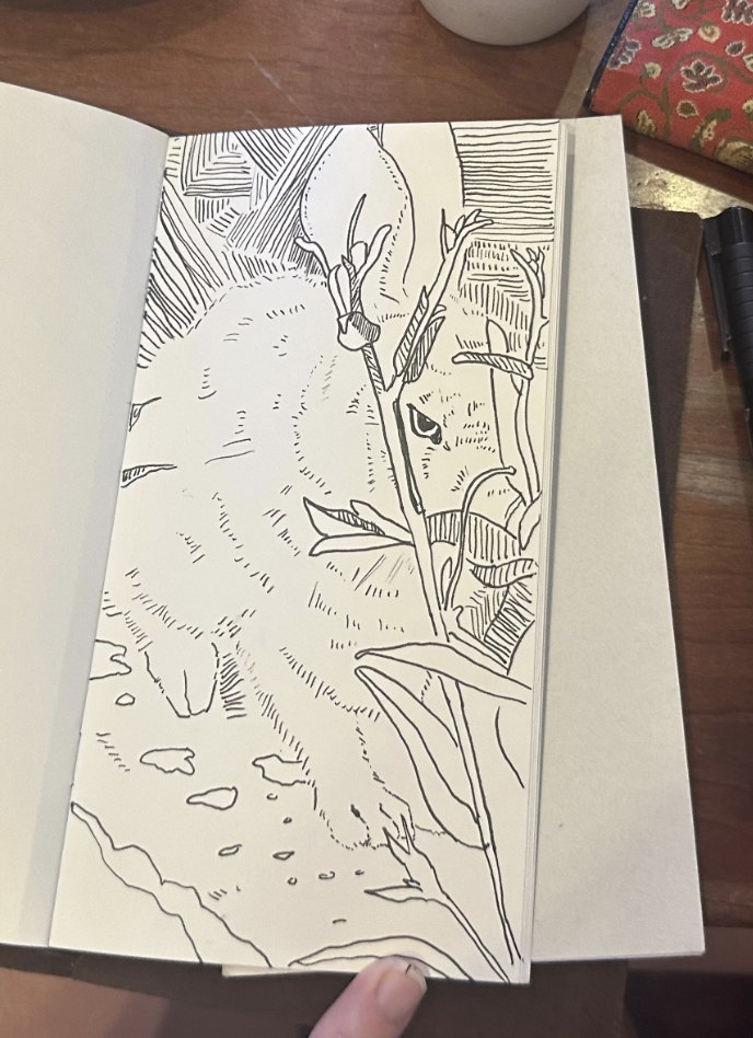
With these drawings, I have some extreme limits in play. I have limited time to work on them, and I only use ink mediums for them. This, I think, gives them a kind of energy that can be hard to replicate without the limiting factors at play. I think if I had 8 hours instead of 20 minutes to draw a rabbit, I probably couldn’t make a better one, or one that I was happier with. For these, it continues to be fun to draw with the Kuretake double-sided ink brush pen. The above drawing of a rabbit was made with a Faber-Castell pen though.
Another digital piece I worked on in August is what I am calling the floating village. It was drawn using Clip Studio Paint models.
I had a cold at the end of August, so, both me and Baby Jewell were inside quite a bit. I worked on this piece for something like 5 days. Since I worked on it for so long, I decided to animate it, taking 2 more days to complete about 6 frames of art for a full second of unlooped animation.
The animated island village took me most of a weekend between trips to the store and other errands. I had fun doing this and learned a lot about animation, namely, animating a wheel from a 45 degree angle, and finding other ways to make the animation interesting.
The animation had to be compressed a bit for it to be uploaded to this blog but here is the static image, much crisper.
Also here is a link to a higher-res animation. https://www.instagram.com/p/Cwf_KpdA73-/
To back up a bit, at the beginning of August I was a part of North Boulder’s First Friday, which was very fun. Thanks to everyone who stopped by!
Reading:
Steinbeck’s Letters
In August I dove into Steinbeck’s letters more than any other book. It’s interesting to read about the problems he has, that he expresses to his friends, publishers, lawyers, and his wives/girlfriends. In a way, they’re like Marcus Aurelius’ writings, not in such a philosophical note-to-self way, but in the way that Steinbeck could not have predicted at all that they would someday be printed as a collection, to be read by potentially millions of people. That said, he writes in a way that isn’t embarrassing to himself, he has a noble and direct demeanor privately and publicly. It doesn’t seem like the editors had any trouble finding wonderful letters by Steinbeck because there are hundreds of them, and hundreds of pages to read. By ‘wonderful’ I mean well-written, clear, and very descriptive about what he is up to. On the back of this book, there’s a quote that says this is arguably his best work. I’d have to agree, though I DNF’ed Grapes of Wrath, maybe it’s too sad, and really have only finished the delightful Travels With Charlie, because, poodle solidarity. I guess you could say that what I like most about Steinbeck is his nonfiction, even though so much of his fiction was based on his environments and realities that were very close to him. His life is very interesting to me, even though he wrote about the lives of others in his fiction, I think his life is the most interesting of what I’ve read of his.
The Book of Long Sun - Gene Wolfe
I love this book so much. It’s less brutal than New Sun, so there’s much more to love, in my opinion. There are parts of BOTNS that are quite hard to read, reading BOTNS, every time I thought I was over the worst of it, Severian sees or does something terrible again. But I did like Urth of The New Sun. Anyways the Long Sun series is like New Sun but much happier or lighter. I guess you could say my take is that BOTNS is like Game of Thrones and Long Sun is like Wheel of Time. Long Sun is just a smidge more comfortable, and still a fantastic fantasy … thriller? There’s still danger and adventure, but just a smidge less brutality.
The Aeneid - Virgil - Sarah Ruden Translation
The introduction I liked a lot, and it revealed a few things I never knew about The Aeneid, most of which is that it’s unfinished. Maybe everyone knew that, but I didn’t. The Aeneid now goes into my brain category of unfinished epics, a space also occupied by the Faerie Qveene.
The Aeneid feels like an interesting turn, it’s like a sequel abut the other side. Virgil knows this at several points, and through Aphrodite, he asks Aeneas to not hate the wars of the world, but to hate the gods who make the wars. Virgil and the gods alike know that ultimately the Trojan war leads to the founding of Rome, so none of it can be truly bad, but of course this is not how it looks to Aeneas, who loses most if not all of his friends to war.
When I think about Virgil I can’t help but think about how Virgil is Dante’s guide in the Inferno. It’s really funny in many ways. It would be a bit like me writing a book and saying I wanted Dante to be my guide, but that’s probably not old enough. Virgil lived about 1400 years before Dante, so maybe it would be like wanting King Arthur to be my hellguide. In a weird way the Inferno like any tv show or movie where someone meets their hero from the past, like Abraham Lincoln, or Shakespeare. This too is a bit like who Aeneas was to Virgil, a heroic person from long ago.
Gustav Klimt: The Complete Paintings - Tobias G. Natter
This book had a lot of wonderful writing and background on Klimt in addition to pictures of his paintings. I learned some interesting things about Klimt that I never knew, that he had a brother who was also an artist. He was also loved and sort of hated in his own time, as the writer says, Klimt belonged to modernity and tradition at the same time, and this gave critics enough to be ‘divided’ about. I bought this book for the images but ended up loving the writing. It does take some flipping back and forth to get the full effect or to see which paintings the author is referring to, but worth it.
Running:
In August I decided to take it easy a bit on running still, though I finished two runs on a trip to Leadville, which was no easy task.
Catch you next time -
Time and art and motherhood
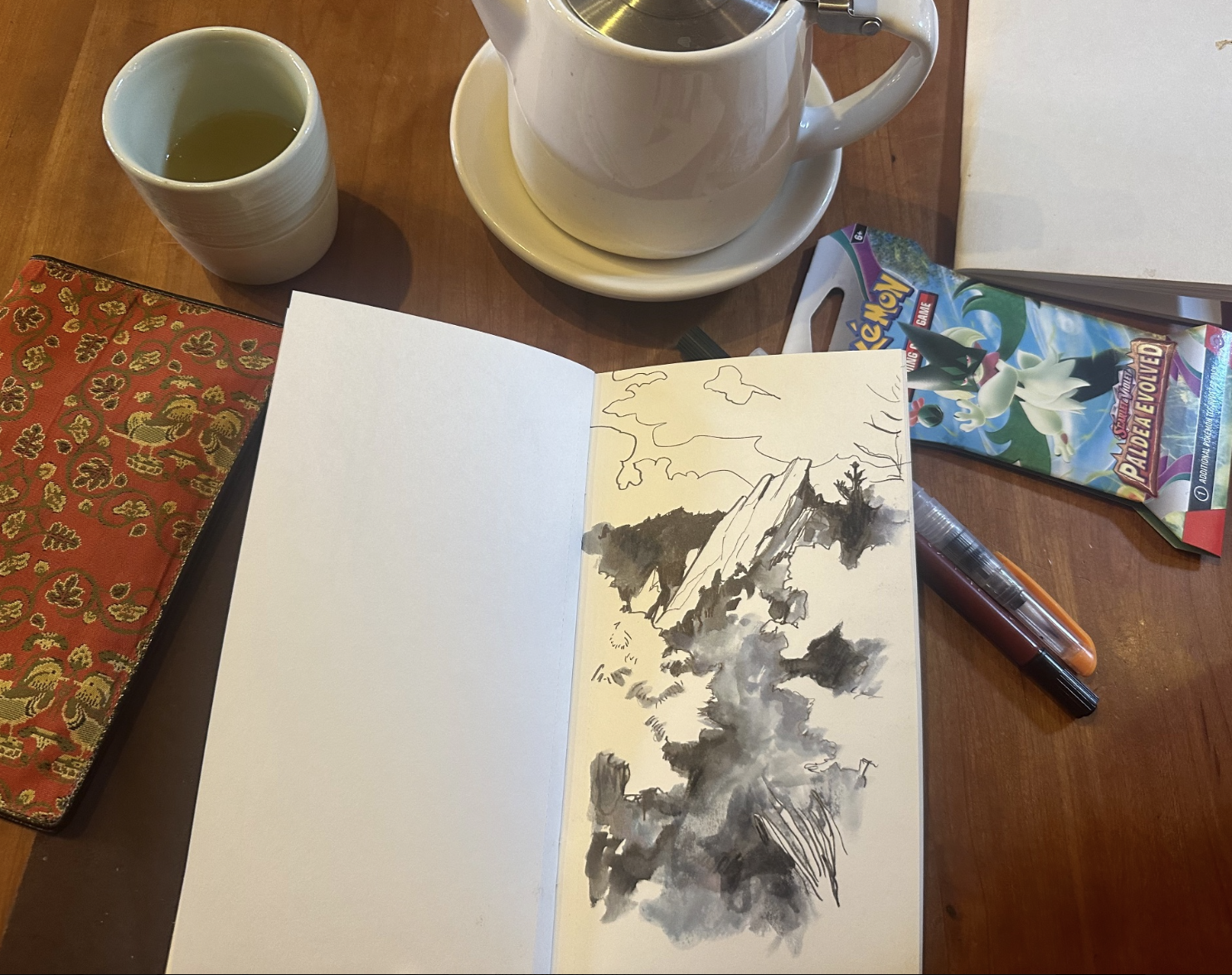
At least one day a week my MIL or my mom will stop by to watch Asher and I will get a few hours of alone time. I usually head to Trident, a coffee shop in Boulder, to drink green tea and make a drawing or two.
I think time limits are good for art, in my case at least, maybe for others. If I have only 1 or 2 hours to make a few drawings, I usually make drawings I am happy with. I think it was a big question for me, what my art would look like after having a baby, all I got is that it looks even better. Dozens of tiny deadlines each day add up to piles of completed drawings.
Artists and many other knowledge workers often seek flow states and David Lynchian Deep Work, which are supposed to emerge in isolated environments without interruptions. Basically the opposite of having a baby at home. But I think the traditional idea of flow state can be expanded, it’s possible to be like a river that flows and still be taking care of family duties and dozens of little disasters at the same time.
Sketchbook Confessional July 2023
It’s July 2023’s Sketchbook Confessional! The Sketchbook Confessional is a blog where I review all of the art that I made in a month. Rather than a ‘to-do’ list, the Sketchbook Confessional is a ‘done’ list, where I can objectively see what I made.
In July I worked on quite a bit of paper art, including making handmade paper for backgrounds for pieces.
I enjoyed making these hummingbird pieces and am happy to say they are all shipped out of my home, either to collectors or to Harperrose in Leadville. I’ll be sure to make more soon.
In July I made a few ink drawings in my Traveler’s Notebook of scenes around Boulder, which have been very nice to look at this summer, with more flowers and taller grass than I have ever seen before.
To make these, I’m still using the Watercolor paper for the Traveler’s Notebook, and a double-sided Kuretake pen. It’s really the only pen I need lately. Usually I don’t get too excited about supplies or gear but this is a pen I will be buying again and again for the future. I think they’re about $5 each if you buy a pack of three of them online.
To make some of the smokier elements in these drawings, I am using Chromatek water brush pens to draw out the ink of the Kuretake ink pen and make grays. I had some watercolors ready to go for these, but I decided I liked them best in black and white.
I haven’t gotten out for any plein air painting lately as it’s been a bit too hot. I can only slap on so much sunscreen before I feel like the extra-close Colorado sun melts it off and I’m getting too toasted. My goal for August will certainly be to find more shaded places to paint.
Playing:
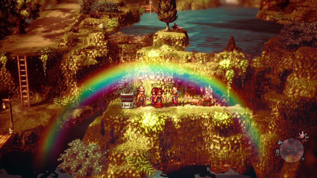
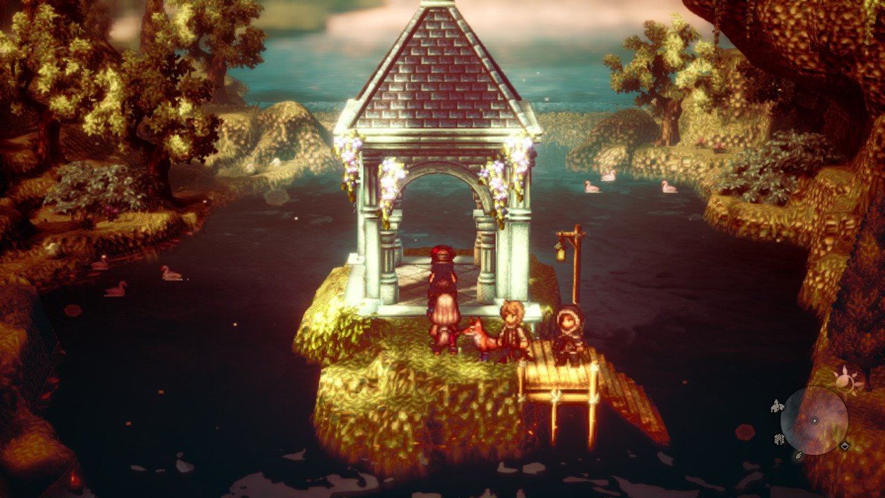
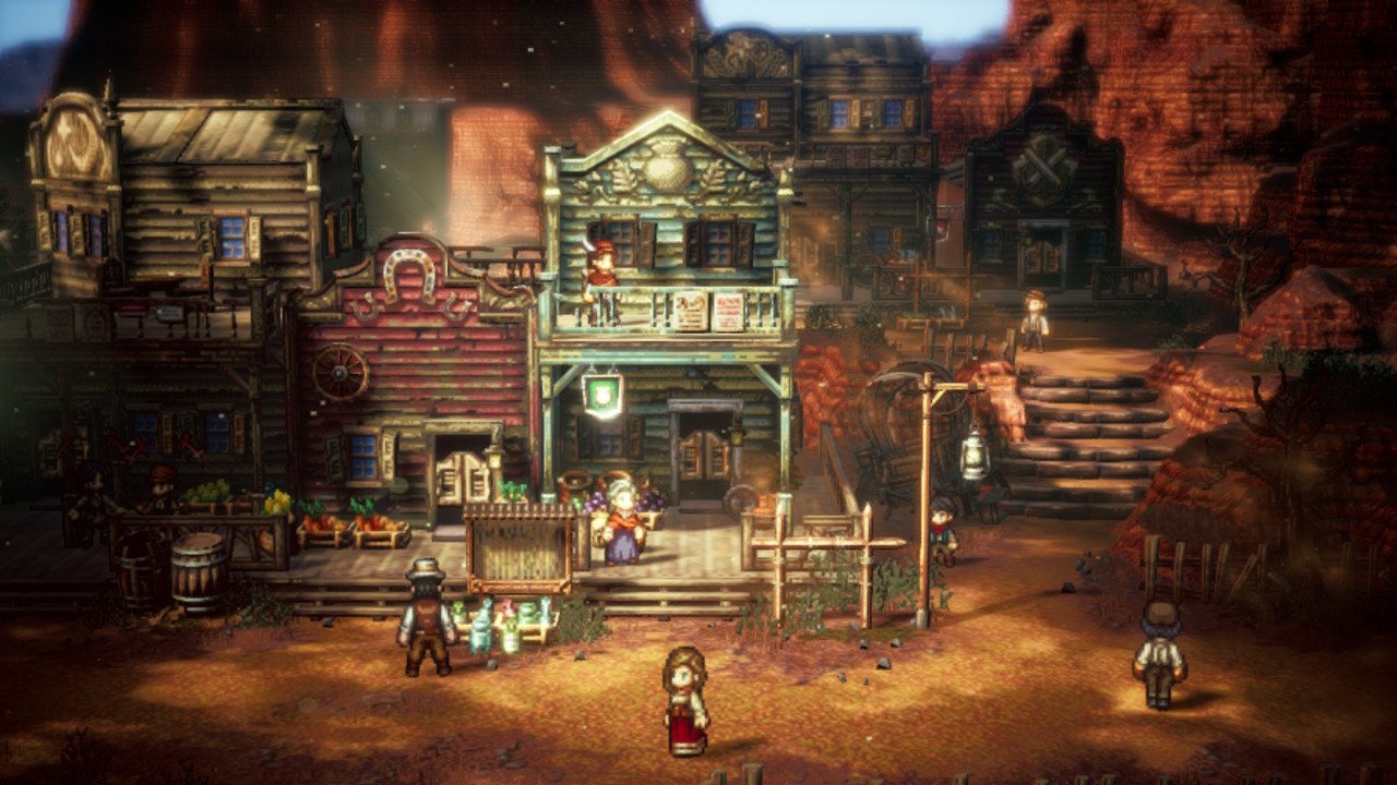
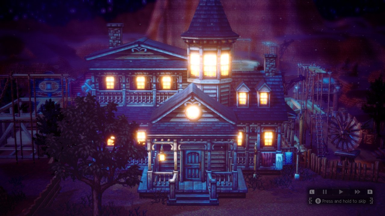
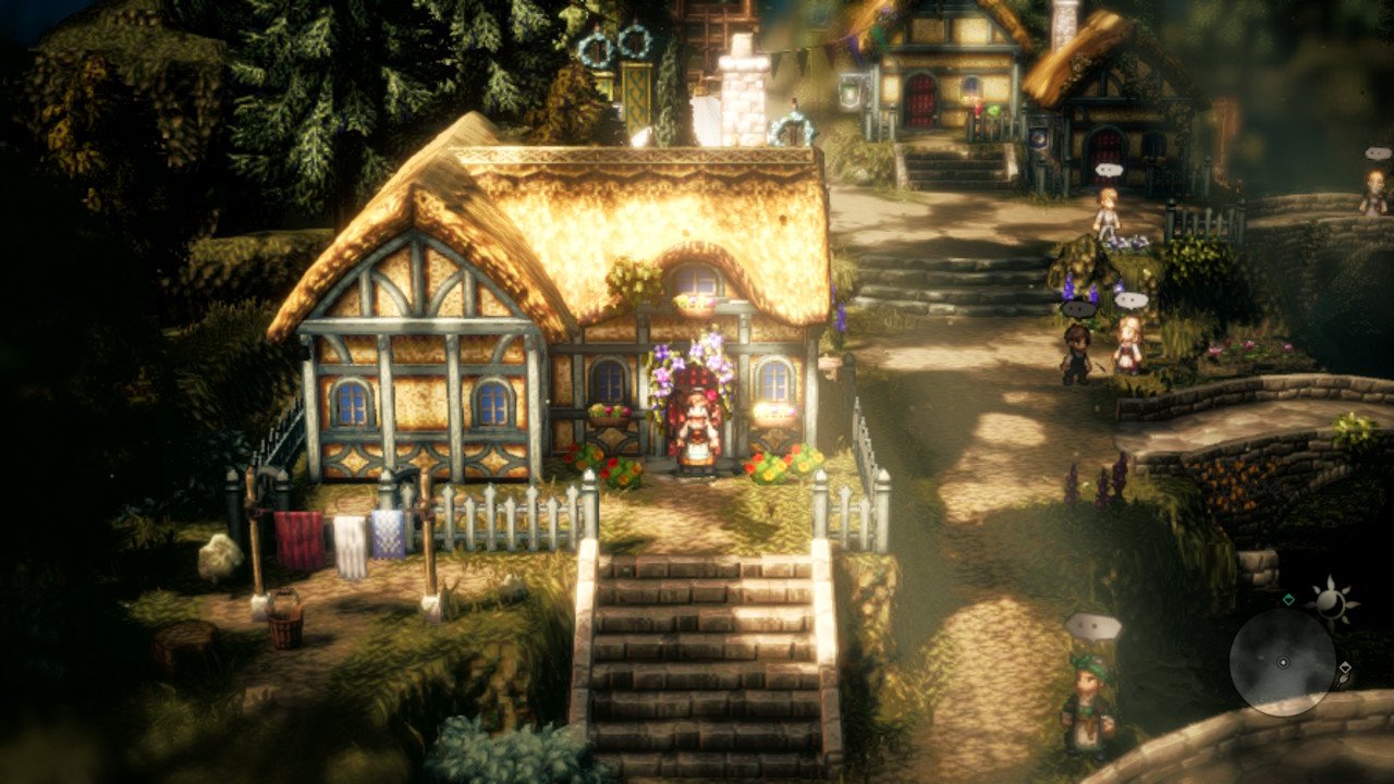
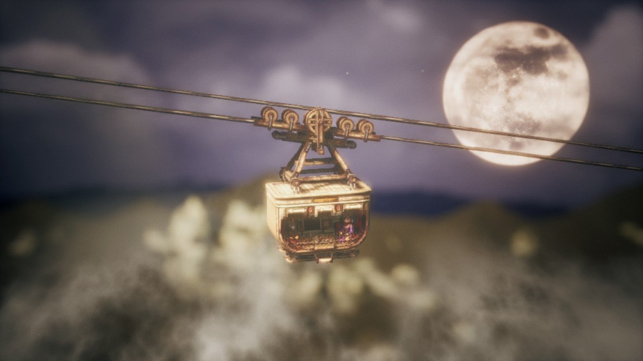
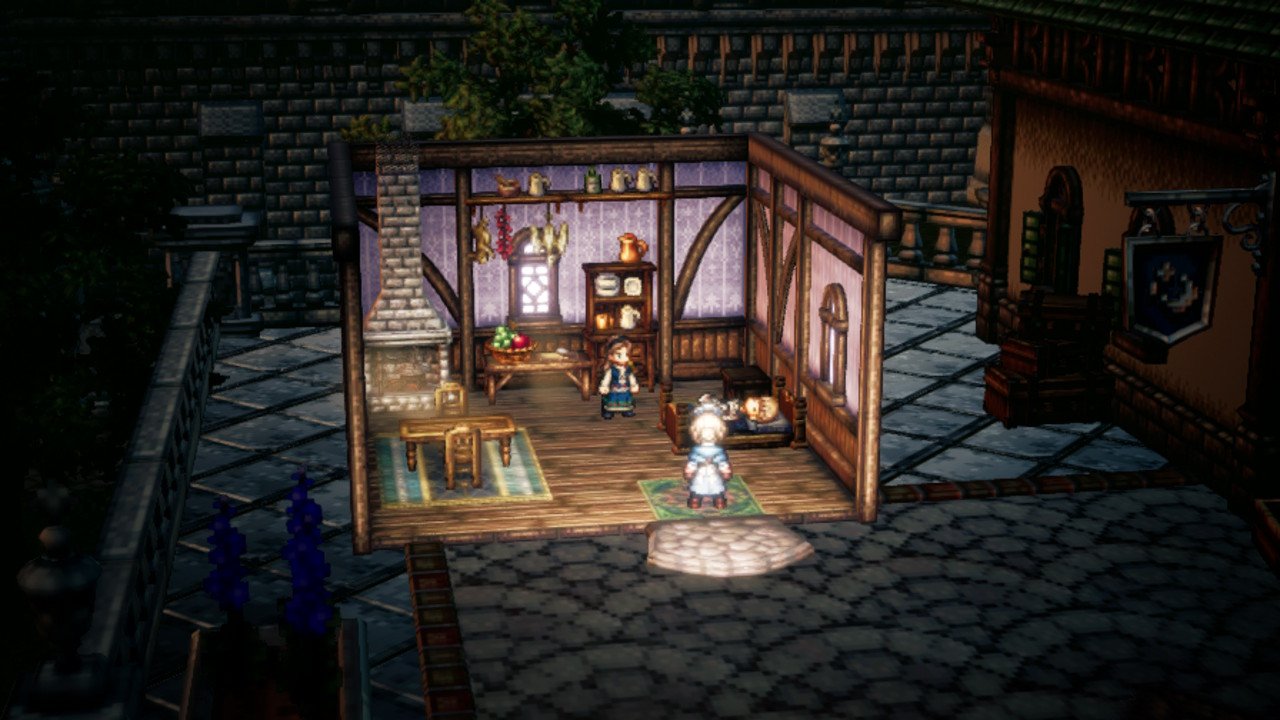
In July I played quite a bit of Octopath Traveler 2, I enjoy the set design of this game quite a bit, and I get attached to the stories as well. They’re a fun way for me to spend time when I am taking it easy from art, running, or baby care. Here are some of my favorite moments, there aren’t too many spoilers in these other than what the scenes look like.
I’ll get excited about the little houses and things like that in this game. I think the details are very easy to appreciate. Even the wallpaper in the shot above is a nice moment.
Running:
I’ve been taking it easier on running ever since finishing the Leadville Heavy Half in June. This has been great timing because it’s been a bit too hot to run most days. Now I’m usually just hiking or taking Baby Jewell out to playgrounds to play. Also, Baby Jewell is now 1 year old! He’s 25 pounds so he definitely keeps me strong as I lift him dozens of times a day and carry him around town for all of our errands. I can safely say being a mom hasn’t slowed me down at all, in fact it’s probably made me fitter than I was before, even in 2021 when I was doing things like half-marathon distances every weekend.
Since I’m taking a break from running and plein air, my process for July was very much about going on hikes and getting photos to draw later. It’s been a fun way to work, which I hope to continue.
That’s what I got for July 2023! Catch you next time!
Sketchbook Confessional June 2023
Welcome to June 2023’s Sketchbook Confessional! The Sketchbook Confessional is a blog where I review all of the art that I made in a month. Rather than a ‘to-do’ list, the Sketchbook Confessional is a ‘done’ list, where I can objectively see what I made.
June was a month where I did utilize my sketchbook a bit more than not. I’ve been very into the Traveler’s Notebook, which is a leatherbound journal that has refillable pages to be filled out.
With my baby, it’s a little hard for me to travel, because I don’t want to put myself, my baby, and other people through air travel involving lots of crying. I had ear infections when I was a kid and I still remember the pressurization in my ears when I flew as a young girl, and that being painful. But at least I could pop my ears, I guess babies can’t exactly do that. Anyways! I’m living my ideas of travel through my Traveler’s Notebook, and I put together some scraps from my 2019 Tokyo trip (below). It’s been a fun way to look back on the trip, though I hope to have more trips to look forward to in the future.
Since June was an event-heavy month and very planning heavy, I wrote shorter blogs in June covering all of my creative things I was up to.
Making a Prompt Jar for Creativity
Leadville Harperrose Studios Expansion!
Painting on Tile in oil and gouache
Traveler’s Notebook Pages from my 2019 Japan Trip
Kuretake Double Sided Brush Pen No. 55
Denver Fan Expo
Denver Fan Expo was June 30th-July 2, and it was awesome for the first two days, as of this blog’s writing there is still one more day to go! It was fun to get everything together for this expo. Most of June was all about ordering display items, prints, and stocking up on things for the con.
I had been to Denver Fan Expo as a fan before but not as an artist. It was wonderful to meet everyone who stopped by!
Now reading:
Lake of the Long Sun - Gene Wolfe
This is my favorite Gene Wolfe book yet. The second book in the long sun tetrology, there are secrets and memories of other Gene Wolfe books that appear in this one that make it quite rewarding. It’s also quite an adventure. There are many sci fi concepts and characters to enjoy and the writing is, as always, unparalleled. I finished Lake of the Long Sun in June and started the next book in this series.
Deep Work - Cal Newport
I’d read the similarly titled David Lynch book and thought I would give this one a try. The book opens with anecdotes about how writers and thinkers like Carl Jung accomplished their best work in isolated states. The book tackles the trap of visible busyness, and also internet-centrism. Since it was written in 2016, there’s no way it could have predicted 2020’s pandemic crisis and the mental health and connectivity issues that persisted throughout. Physical isolation became more of a norm for more of us than anyone could have expected, and I think what we found out in 2020 is that not everyone is meant to be isolated. Maybe creatives like me can’t wait for a few hours alone, but many, many people, including me, aren’t built for weeks and months of being alone in a tower like Jung was.
At one point the author does admit that people in roles involving people, like sales, probably perform much better when hyperconnected. The initial idea of ‘Deep Work’ might be limited to people who run databases, do computer programming, or write academic articles or fiction books, but I think it can be extended to practices that concern me, like art.
Building a Second Brain - Tiago Forte
Deep Work seems to suggest that electronics are the gateway drug to multitasking, the opposite of Deep Work. Building a Second Brain is more encouraging towards utilizing a computer to take notes.
I like both. I keep hobonichi techo day planners and also a Traveler’s Notebook for drawings. I think this blog is my Second Brain type organization system.
The thoughts in these books are important to me as I navigate life as an artist and a mom. The way I take time is totally different now that I have a baby and I am making every effort to stay on top of things.
Running:
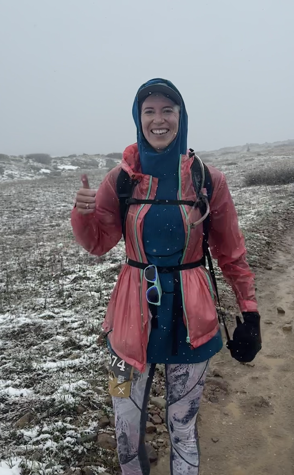
I finished The Heavy Half in Leadville with a time of 4:44. It was a fantastically fun and exciting race, with snow happening for most of the race up high. At some points, it was like running uphill through a creek, as water was coming down the trail in large volumes. We’ve had such a rainy spring and summer all over Colorado. It’s strange to see so much water in places that would normally be dry, but that’s what is happening. Rain, on top of snowmelt, has made the season this way.
That was my big exciting June! Catch you next time!
The Leadville Heavy Half
The Leadville Heavy Half is 15.7 miles up to Mosquito Pass above Leadville. The start of the race goes straight up 6th street from Harrison Avenue, and winds through some of the historically scenic parts of the old mining parts of town.
In 2023, The Leadville Heavy Half had the special challenge of being snowy. On June 17th.
This was a race where preparedness was a decent component of the race, because at high altitude, there was still snow on top of the large rocks. Near the top of the race, which was adjusted for 2023, we were all running uphill in what seemed like a mud river, with rocks that would easily loosen and turn over underfoot.
Things I brought:
Osprey water pack
Filled a bit less than halfway with Scratch Labs powder. There were aid stations so no need to take a huge amount of water for the Half.
Frogg Toggs Rainjacket
This is a lightweight rainjacket. It’s inexpensive and doesn’t breathe very well, but this is what I wanted for this race. If I needed it to breathe a bit I could open the front. The important thing is that it kept rain and snow off of me.
Melanzana sweater dress
I like this dress because it has a hood. My mom got me this blue sweater dress years ago and it’s my favorite.
T shirt
A basic t shirt that I often wear. It has a lotus on it. I think I bought it at the Galleria when I lived in Houston.
Sportsbra
Underneath it all, Victoria’s Secret, more like Victory Secret.
Shorts
I had these in my bag and I never needed them. I wore leggings the whole run.
Leggings
Athleta leggings, they were warm and didn’t soak up too much of the snow.
Ice spikes
Like chains but for your feet. I didn’t end up using these, but it wouldn’t have been a bad idea if I had not had my Brooks Shoes below.
Brooks shoes - Pure Grit 6
I got these at the thrift store in Leadville, they don’t seem very special other than that they have nice gripping elements on the bottom. I chose the grippiest shoes I had for this race, and it was a good choice. At several points in the race, it was like running uphill through a river. There were many loose rocks and several inches of flowing water for many many yards near the top of the race.
Sunglasses + Hat
Funnily enough I have done a race where I forgot my hat. I couldn’t find it on race morning and I sweated off all my sunscreen so you can guess how that ended up! Luckily this time I had a pretty well-built list and I didn’t get too scattered before the race, so I remembered. The sunglasses I have are the first goodr lenses I ever bought, also at a Leadville race event in 2019. They have a bit of paint on them but I like them better that way.
Honey Stingers + Gummy Bears + Gu
I only recently discovered Honey Stingers and really liked them. My other MO for fueling on long runs is gummy bears. For 13 mile or half-size runs in the past, I usually eat an entire medium-sized bag of gummy bears, or 600 calories worth. This isn’t really enough though, so I took the Honey Stingers too, which to me are like giant-size gummy bears. The race was sponsored by GU so I enjoyed eating exactly one of those during the race. It’s a little unusual but I ate some Honey Stingers the night before to load up on carbs. I didn’t eat any during the race since I ate gummy bears instead.
Some of my fueling choices
So that’s all my gear I had!
As far as night-before fueling, while driving up to Leadville from Boulder, I drank as much water as possible where the water had some Scratch Labs in it. This may have been one of the more important steps for me of the race. Carbo-loading and fueling is something that I see other runners talk and write about often. For Leadville, I recommend… hydro-loading? It’s a bit more than simply ‘staying hydrated’ it’s purposely drinking almost more water than is comfortable on the way to high altitude. This helps me personally avoid headaches from dehydration. It may not be as important to do this for people living in Leadville and racing, since I lived in Leadville for about 18 years before going to college, and I don’t remember thinking as much about water back then.
I ate some oatmeal and quesadillas for dinner because that is the most carbo-rich thing I could think of. I ate oatmeal again for breakfast the next day. My opportunity to fuel is the day before, because I struggle to get energy during races. I theorize that my body works so hard at running, that it stops digesting or doesn’t actually digest. Almost everything i eat during a race, I end up throwing up later after the race. I always feel better afterwards, I wish I could keep food down, though. This is no dis on any of the foods I eat. It’s a total me-thing, not because the gummy bears are bad or whatever.
As far as the running I did to prepare, I pushed my baby in a stroller for many of my training runs, to the point where when I didn’t have the stroller, it was like running after pushing a sled. I sort of fell forward. The most I can put my baby through for a stroller run is about 5 miles, after that, I think it’s a bit too long for him to be in the stroller and I get him home so he can crawl around. My other runs on Strava were 10 or 13 mile elevation-gain heavy runs. I knew I wasn’t going to win or place high in the Heavy Half, my goal was to finish.
For a few days I thought The Heavy Half was the easiest race in the Leadville Race Series, it turns out with the Leadville 10k included in the series, the Heavy Half is probably the second easiest race. It’s hard to explain Leadville to those who aren’t familiar with it. I guess, one way to think of it is that everything in Leadville is hard - even driving there can be hard if you don’t hydrate right. The Heavy Half isn’t the hardest race you can do, but it’s still pretty silly. Running up a mountain from Harrison Avenue? 7 miles straight uphill, the last miles of which are covered in snow?
The Heavy Half doesn’t qualify as a half marathon because it’s too long. It might have been the hardest half marathon in the United States, but it can’t be, technically, because it’s 15 miles instead of 13.1. It’s aptly named, in this case. The Heavy Half is the heaping serving of a half marathon, it’s the cup that overfloweth, a weird outlier race that happens concurrently with a distinguished marathon. That said, there’s very little that is ‘half’ about it - I would say it’s entirely heavy.
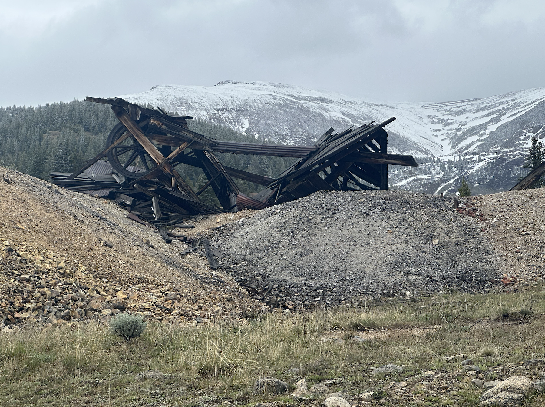
As for what’s along those almost-16 miles, most people probably aren’t thinking about the closeup scenery of the mining relics, however the close scenery was all we had in 2023’s race, which was wrapped in sheets of falling snow.
I frankly loved this. Being a person who has painted a mining structure from part of the race, I couldn’t get enough of the old mining shanties and buildings along this race.
Even outside of the Heavy Half, whenever I see these structures, I think to myself “What on earth were people doing here?” and I start to get an understanding of the determination and obsession that was mining. I imagine scores of miners traveling up to 12000 feet almost daily to search through the earth for ores, run machines made of wood and rope, and pump water along refining sluices. All of us in the future are enjoying life with metals that were probably still in the ground 200 years ago. I’m writing this blog to you via my computer, basically electrified rocks, and I drove to this race in a car that almost certainly made use of molybdenum, the key mineral at Climax mine in Leadville.
As for how I felt during the race, I felt good most the time, and I was in good spirits. It was certainly hard, but I knew I could finish it.
I ended up getting 556th out of about 770 people. The above is my strava map, but I must have derfed something up about it, because my official finishing time was 4:44 and the mileage should have only been 15.7. Maybe I went out of service briefly and that was it. Who knows though, maybe a short walk back and forth around an aid station, or stopping to take photos of mining relics added some extra mileage, and maybe I accidentally paused Strava somehow, or it lost signal and the other 30 minutes of my race. Either way I am happy with my 4:44 time, it’s so easy to remember!
In a word, that was huh-huh-huh-HEAVY
Kuretake Ink Pen - Double-sided Brush Pen No.55
When I visited Tokyo I happened across a pen I really liked, and luckily it has many variations. The pen was a Kuretake brush pen, though it took me a little while to figure out what it was, as almost nothing on the pen was written with roman letters or English.
The Kuretake No.55 is an excellent double-sided brush pen. I like how it was a bit smoky, it was a lot like drawing with water on a Buddha Board. Here is a detail photo of a warmup drawing I did, where you can see the smokiness of the ink pretty well:
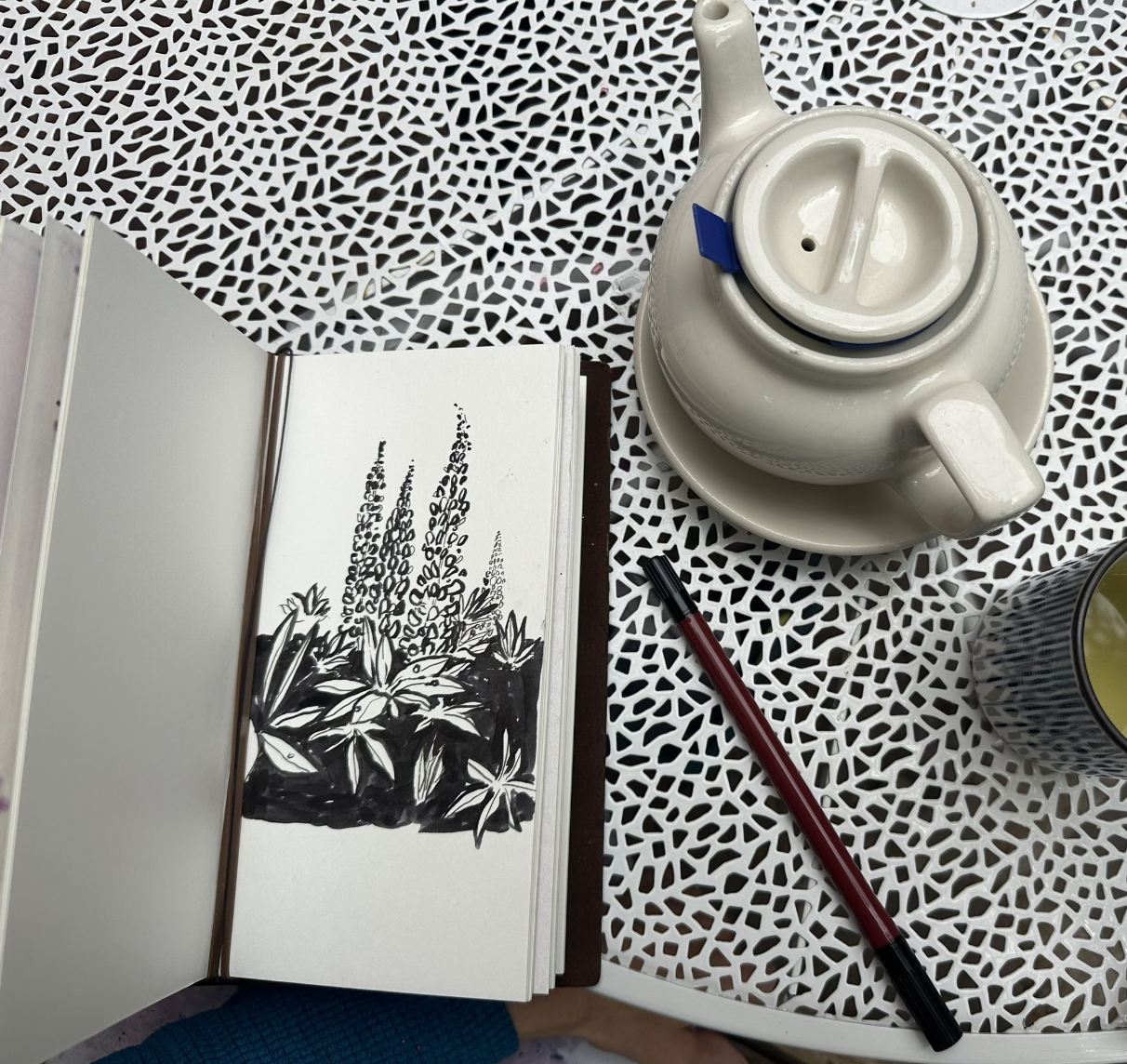
I went on to make this drawing of lupine with the pen:
What I really like about this pen is that the two nib sizes are about all one really needs to make a good drawing. The ultra thin brush is nice to do detail work, and the larger brush on the other end is good for shading or blacking out large areas, and larger linework. And it’s just one pen, so it makes working much quicker.
The ink does take a bit of time to dry so it’s a good idea to work from left to right in a drawing (if you’re righthanded like me, if you’re lefthanded, the opposite of what I just said), or to not draw on the right and then switch to the left quickly, because the ink got on my hand pretty easily. But I actually like that it dries slowly. I think it’s what gives the ink it’s smoky, pretty look.
Here’s the other Kuretake pen I’ve used that I really liked - it was an impulse buy when I was in Tokyo. I didn’t know or understand anything about the pen, something about it just felt right and it looked cool, and it wasn’t so expensive that I felt it was out of reach, so I picked it up:
This is the other kuretake pen I’ve tried, a. much thicker, darker pen with very black ink. A very nice pen to use for drawing. Making finer lines with this pen requires a very gentle, delicate touch
Kuretake offers many other pens, and they also make eyeliner pens and other cosmetics? (Seems like a fair enough product diversity offering). The pen I got in Japan was a single-sided deep black pen, but I liked this double sided pen quite a bit more. It felt more versatile and is smaller, so easier to use.
Traveler's Notebook Scrap Pages
I finally got around to putting some of the scraps I saved from my 2019 Tokyo trip into my Traveler’s Notebook. I loosely pasted these into watercolor refill pages using gel medium.
The tickets are one thing I am very glad I saved, because I went to so many museums, and in many cases, the tickets for each museum or art show were like little art pieces in themselves.
The ticket above that says “Independent” on it was one of the cooler shows I saw, it was featuring work by new and living artists and some art students. A few photos of the show are on my instagram. It was such a big floorspace that I wandered through it for an hour or two.
The rainbow ticket above is one of my favorites. They seemed to have gone all-out for that ticket. I have the larger brochure saved for it too.
I ordered a few prints of my photos from Inkifi and pasted them into each page.
The Traveler’s Notebook is a fun way to scrapbook like this. Eventually I may add writing to the tickets too, to explain what they are inside the book. Pasting the tickets into the book is a fun way to remember the entire trip. I think I will do this on future trips as well. It’s hard not to when the little scraps of paper that I seem to get are so artful.
Chromatek Water Brush Pens
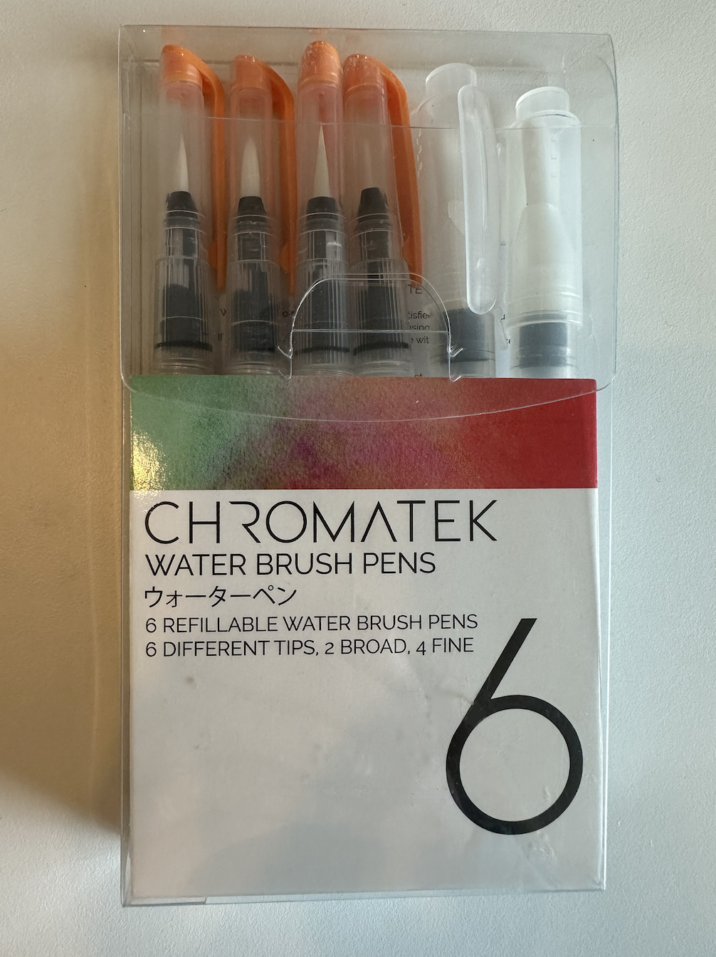
These water brush pens are a fun and easy way to create watercolors from pigment or from watercolor pencil linework.
The pens unscrew the opposite way that machines and screws usually twist on and twist off, they’re lefty-tighty righty-loosy, if that makes any sense. I’m not sure why they are this way but it’s pretty funny.
The brushes work pretty easily:
Unscrew the water container end (lefty-tighty righty-loosy)
Fill with water
Screw the water container back onto the pen
Squeeze the sizes to get the water into the pen reservoir
Draw with water!
For this drawing, I made an ink drawing using a Kuretake pen, the double-sided no.55 Kuretake. I gently ran one of the water brushes on the edges of the drawn lines, which were already dry for about an hour, to create the effect around the flowers,
For this drawing, I made a drawing with watercolor pencil, and then ran the water pens over the pencil. This is on Traveler’s Notebook Watercolor paper.
Another way to use these is to put them in pigment and then draw with them until the pigment is cleared from the brush. I thought this was the best way to get large areas of color. The broader brushes seem to be made for this especially, because finer lines can be made with watercolor pencils, but I like the finer brushes in pigment for this too. In this case, the pigment I used was Himi Gouache. Gouache could be put on a brush and applied on it’s own without water, but I often leverage the watercolor-like aspects of gouache, so I gave it a try with these brush pens.
Lastly, I found these were pretty easy to clean, or they were self-cleaning. Unless there’s very aggressive pigment loading, pigment doesn’t get into the reservoir of these pens, so the water cleans out any pigment on it’s own. Instead of dipping a brush in water to clean it, if I needed a new pigment on a similar brush, i could either just dab the brush on a paper towel for a bit, or let the color run out on it’s own. I squeezed the pens to remove more of any color that was still on the brush. Despite what I thought was pretty hard squeezing, the water didn’t run out in the pens very fast.
I think these pens would be great for plein air painting, or maybe it could be called a combination of painting and drawing. They’re lightweight, they don’t run out of water easily, and they are fun and easy to use on paper with pencils or paint. I haven’t tried it, but they’d probably also be very fun with acrylic ink or india ink.
To summarize
Chromatek Water Brush Pens are a fun and easy tool for creating watercolors from pigments or watercolor pencil linework. They can be used with gouache and ink too.
The pens have a unique unscrewing mechanism, once you get the hang of it, it is straightforward, but the first time opening them can be a bit tricky. (righty-loosy)
The pens are easy to pack and clean. The water doesn’t run out quickly.
Medium Moment: Painting on Tile
I’ve enjoyed painting on tile lately, and I’ve made probably about 20 tile paintings so far. Here is what I have learned about making paintings on tile.
A tile might be thought of as a nontraditional surface, yet it works so very well! It helps me to remember that a canvas is simply the best surface that people in the past could come up with at the particular time. Thousands of years of artists painting on rock, wood, canvas, and paper coalesces in canvases being what we largely think of as the best or most common art surface to paint on.
It turns out that painting in oil on tile is easy! I personally didn’t have to prime the surface at all for the kind of painting I do, which is usually impasto-style painting of laying down a thick layer of a neutral color like white or offwhite, and then painting into that layer with deeper color.
Since oil paint is very much made to stick, it doesn’t peel or chip off the tile. If you’ve ever painted on glass, it’s a lot like painting on glass. The paint doesn’t really fall or sink into any canvas, it sits on top of the glass surface and is easy to move around. This is why I think it’s great for impasto painting. It’s sculptural at some levels but still very much about painting and color.
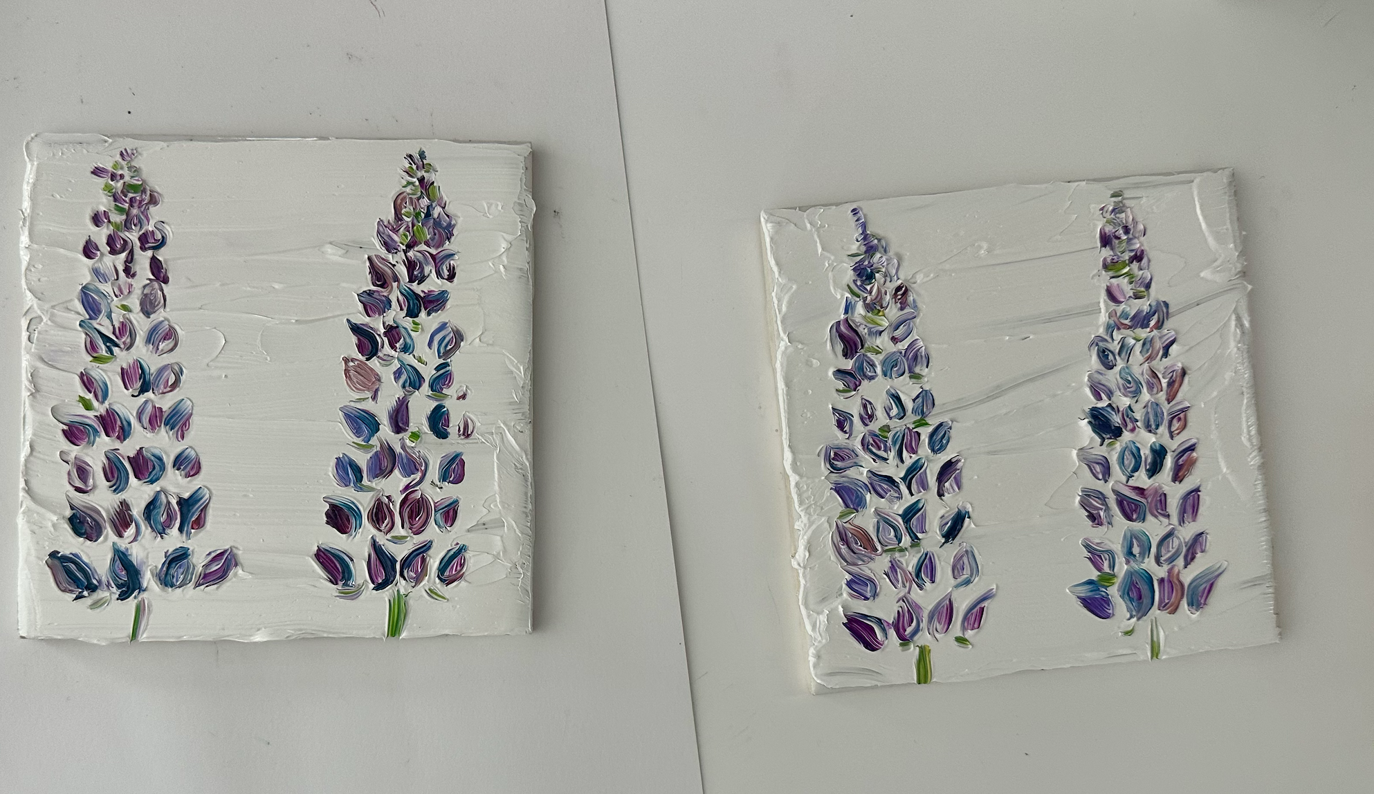
Here are two lupine paintings I made with oil paint:
Oil on tile is awesome.
To paint in gouache on tile, I primed the tile with a thin coat of clear gesso. I am sure white gesso would also work well, I only happened to have clear gesso on hand so that is what I used.
I decided to do priming for gouache painting after attempting to paint without any priming, and this was immediately not a good idea. Maybe if the tile were less smooth or if it were more porous, one wouldn’t have to prime the tile, but I definitely had to prime every single type of tile I’ve had for gouache painting, and I’ve probably used about 4 different types.
These are oil paintings on tile samples
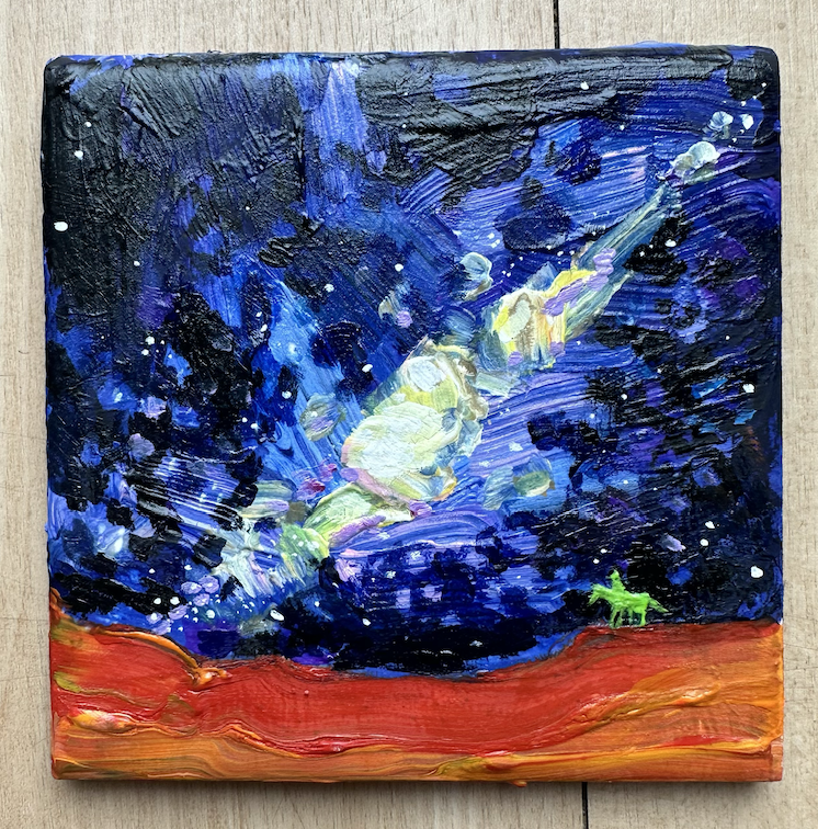
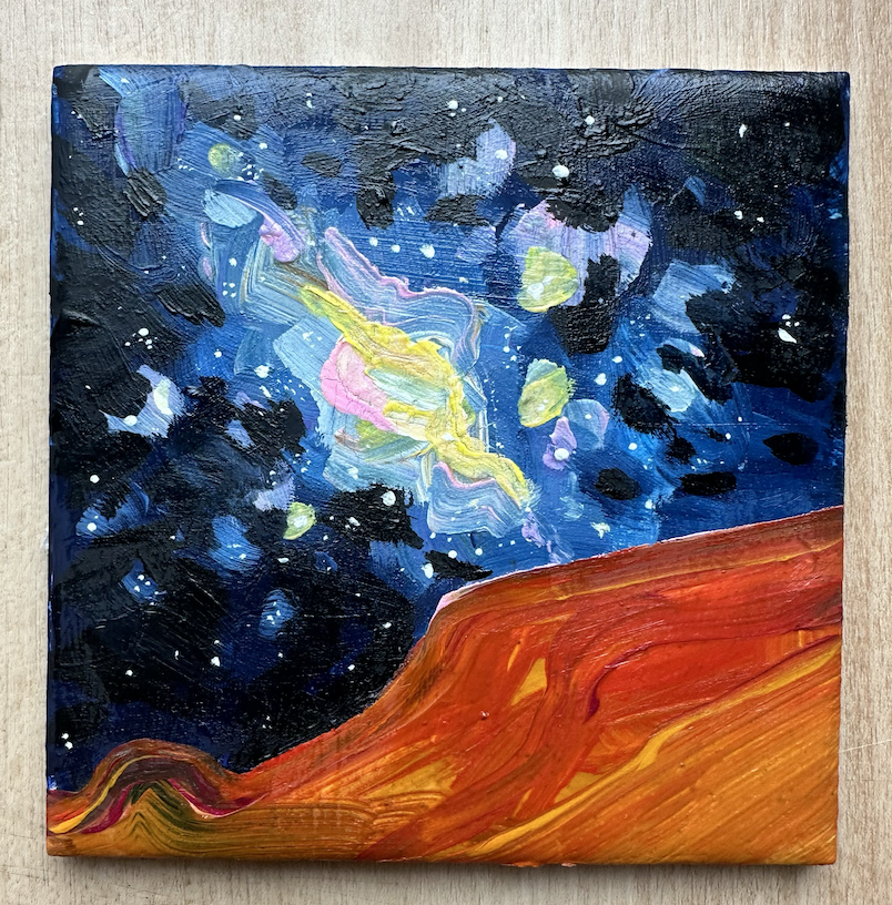
In the spring I had an idea to make paintings of desert night scenes with fantastic galaxies and nebulas, and having a tiny cowboy in the painting somewhere. I call this series the Space Cowboy series, overtly about the ending tag of each Cowboy Bebop episode.
I really enjoyed making these oil paintings on tile. The space cowboy paintings didn’t utilize too much impasto even, I think most of the paintings were pure oil with maybe a bit of liquin mixed in.
The paintings above are oil on tile, the paintings below are gouache on tile.
I eventually sealed the gouache with a thin layer of acrylic gel medium, to give the paintings the shine and apparent body of my oil paintings. I don’t think it’s hard to tell between the gouache and oil paintings, but if I weren’t so versed, it might be a bit hard to tell, because the finish is so similar.
If I layered the gouache too thickly, it would sometimes crack. I assume this is because the gouache can’t really sink into anything, so it forms a layer and loses structure, where gouache is designed to sink into paper and not be thickly layered. Given the cracks, I wasn’t sure how to fix this. I would try to thin out the cracked layer with water application or with another thin layer of paint (probably a bad idea) but it was hard to get those cracks out. Maybe even some particular colors of the gouache I was using cracked more than others. I’m not sure. After seeing the cracking, this is why I figured it would be a good idea to seal the gouache tile paintings in gel medium, which as far as I have seen is pretty much immune to all kinds of cracking and damage.
Another reason that I think we love painting on canvas is that a finished canvas is relatively easy to display. Nobody really frames a tile - tiles are meant to be stepped on, or meant to be put on a wall in large groups.
I found that shadow boxes worked really well to frame and display paintings on tile. I adhere the painting with a removable-but-strong tape strip to the shadow box backing, and let it sit in the box. I really like how this turned out. The glass protects the painting surface from dust and showcases the tile in an elegant way.
To sum up:
Painting in oil on tile is straightforward and doesn't require priming. The paint sticks well to the tile surface, allowing for impasto-style painting.
Gouache painting on tile requires priming with clear gesso to improve adhesion. Different types of tiles may need priming as well.
Shadow boxes are my recommendation for displaying painted tiles, providing protection and an elegant presentation.
Art life and Mom life
My baby is teething. As I write this, last night I put my baby to sleep at 8:30. I glued paper cats together for about 30 minutes. He woke up at 9. I fed him and rocked him a bit. I glued more bookmarks and primed a canvas. He woke up at 10. I rocked him. This time I crawled into bed, hoping for the best. He woke up at 11 and 12. He slept until 2 after that and until 4. I know that a 2 hour block is happening if I have a dream.
Time as a parent for me is certainly different than time as a non parent. To make the art I want to make and to work on the projects that matter to me, time is now like a high-intensity workout. It’s not like a 10 mile run at any speed, stopping to snap photos of flowers and trees - it’s a 10 mile tempo run that MUST be finished in a certain time.
I have a very loose schedule with my baby. I don’t envy people who have each hour of their day planned out on a calendar, and I’ve never been this way with any part of my life. I find that for me, just because I have timeblocks labeled, does not mean that I control my time, or that I use my time in the best way. In fact, the less labeling, the less expectation, the better I seem to do. When I’ve traveled, I have no itineraries other than getting to the airport at the right time. Given this, if I had a schedule like “My baby eats at 9:30, 12:30, and 5:30” I think I would go insane or feel disappointed, because the schedule would be broken every single day. The one thing I keep to is bedtime for him each day at about 8 pm.
I also don’t have any hard rule like “I must work on my art 1 hour a day.” I don’t track this at all, but possibly this is because I’ve already put in so much time for art that I’m in a maintaining mode at this point. If I was trying to learn or do something totally new, I would try for 1 hour a day.
I took the Clifton Strengths assessment a few years ago and scored into the Maximizer trait. I never felt like a test classified me so well, even when I found out I was a Libra Rising ;). Being a Maxmizer means making the most of any situation, bringing the best out of other people, and creating value from almost nothing. Maybe a lot of people from small towns end up with this kind of trait, because it takes creativity and utility to survive a place where there’s not many people. Something I thought was relevant was I had Connectedness as my top Clifton trait, so, no matter what I do, I make the most of it, and in everything, there’s a purpose for me. Everything and everyone matters to me deeply, it might be a bit weird to others though because I simply don’t need it to be in a schedule.
Overall I think that motherhood has been wildly good for my art and my particular situation. The little time I do have is more high-impact. I seem to get more done in shorter amounts of time, because short amounts of time are all that I have.
Both right now and before motherhood, I tend to work in 1-2 week sprint-like efforts, a behavior which is fairly easy to witness on my Instagram. I’ll work on a series or style, crank out several paintings or drawings, and then change to a new series relatively quickly. It’s a fun way to keep things new with my art practice. Last month I made 12 mine paintings on glass. The week before the mines, I worked on four oil paintings of nudes. The two weeks before that, I almost didn’t remember what I was doing, but now I remember it was abstract mountain paintings on plexiglass.
I didn’t know about this sprinting pattern at all before observing myself more closely. Now that I’ve observed it, I don’t plan on either fighting it or leaning into it, I’ll just sort of let it be. I will continue to be in the moment of art.
I made the art below while being a mom of a not-yet-1 year old
These are just a few pieces, I made so many more that I have trouble counting and I keep track of everything I do in my monthly Sketchbook Confessional blogs.
What I’m most excited about is I haven’t really flagged on skill. I had a weird couple moments while pregnant where I thought I would lose some of my drawing ability if I didn’t use it. It turns out everything is ok. I think I haven’t lost any skills because I have a drive to retain them.
Something I’ve enjoyed doing with my baby now that he can sit up is I take him to restaurants where I make a drawing of a photo I took in my Traveler’s Notebook.
He really enjoys looking at all the different people at each restuarant or coffeeshop. When I thought about this, I realized I never was around so many people growing up in Leadville in the 90s. It was simply a smaller place, so if we ever went out to eat as a family, the most packed anywhere would be was with five other families. So, I think it’s good for my baby to get used to seeing lots of people, and people of different ages and cultures.
For these drawings I use a Sharpie of only one color for each piece. It’s fun to work with limits like this. Not only is the color limited, but the size of the pen is limited too, so this keeps my traditional art skills, (I must avoid saying sharp), well-tuned.
Interspersed with my time spent on art itself are art-related support tasks like writing on this website, cleaning and organizing my studio, checking out local art shows or galleries, running, talking to other artists, and shopping for new art supplies.
About a year ago I had the luck of reading the book “The Obstacle is the Way” by Ryan Holliday. I tend to like all of his books that I read, I have read I think about five of them but nowhere near all of his books. I even read Trust Me I’m Lying a long time ago. I think that, in the purest form of the phrase, The Obstacle is the Way with my baby, except I wouldn’t go so far as to opaquely call him an obstacle, he’s certainly a challenging kind of entity. I run with him in the stroller instead of running alone. Pushing 25 pounds plus whatever the stroller weighs up a hill is no easy task. After doing this, I am so strong its a little dumb, it’s a little surprising.
Endurance is a good word for parenting, isn’t it? I am able to endure so much sleep deprivation and lifting of my baby that it’s a bit suprising. Maybe it surprises a lot of parents.
The rocking of my baby that I described in the first paragraph of this blog has completely stopped, he’s fully sleep-trained now and he falls asleep on his own within a few minutes. It took me several weeks to make entries into this blog, sentence by sentence, moment by free moment, where I wasn’t committed to doing other stuff like painting, baby care, running, slacking, tweeting, whatever blue-sky posting is. I feel like I do dishes and laundry 4000 times a day. In the scraps in between, I get art and writing done. With my sleep-trained baby, I do miss the rocking a bit, but not the sleep deprivation. As much as my baby needs me, he now needs me a bit less. It’s a funny feeling. Whenever someone steps in and watches after him for a few hours, I almost don’t know what to do with myself. I guess that I, too, am now trained in a way.
As some might know who are reading this blog, I’ve kept a Hobonichi Techo planner for about 4 years. On June 10th in the 2023 planner, this quote by Shigesato Itoi appears:
It’s hard for me to really say how much I needed this quote as a new mom. As a painter, I deeply realize there are few things in life that have rewarded me more completely than deep uninterrupted work. My mind privileges deeper work as better, but I find what I am doing now is just as good as hours of non-interruption. Maybe it’s even better. Perhaps what is most true is that the deep work of my past is still there, and this is what allows me to complete paintings in short bursts of free time. I’m operating on a foundation that won’t move or change, no matter how much the future changes. Now I am off to do some dishes.


