Lately I’ve been working on painting portraits in oil, and it’s been a fun journey so far.
Every now and there there are old cigar boxes for purchase at the creative re-use center in Boulder, Art Parts. I usually buy a few of them if I see them so I can put my paint tubes in it. I suppose cigars and paint tubes are roughly the same size, so these kinds of boxes work really well for table-top organization. They wouldn’t be terrible for plein air painting either,
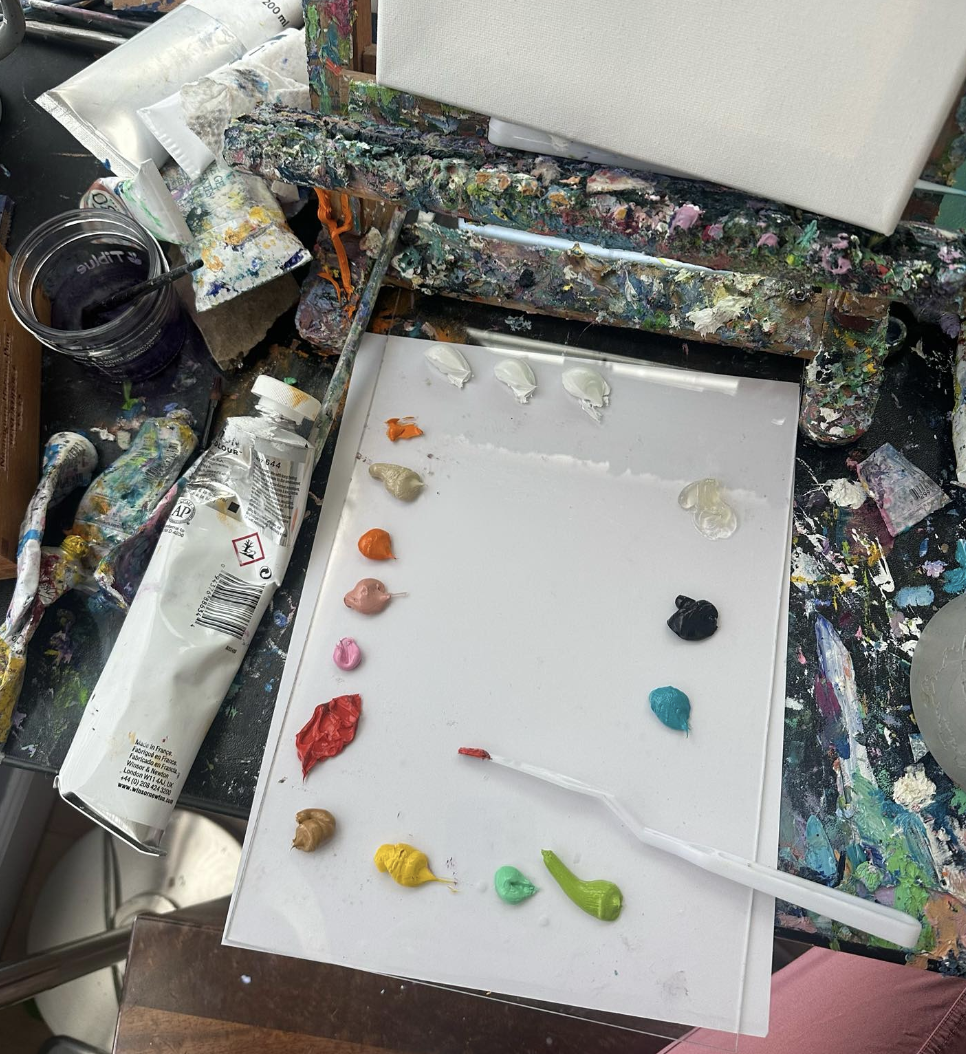
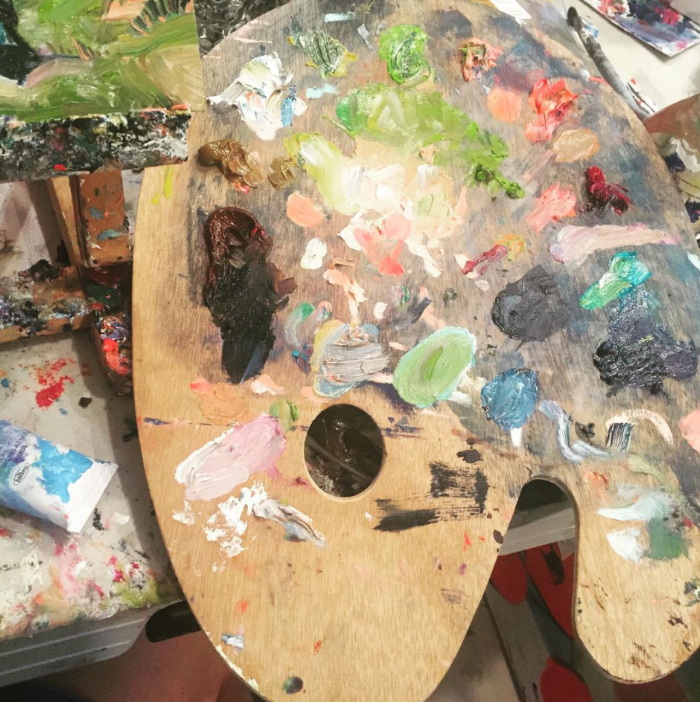
The other thing I often get at Art parts are sheets of acrylic plexiglass. These are great to get from the creative re-use center because they don’t have to be any special size or even clarity, and they are usually a dollar or less. I usually either turn the acrylic plexiglass into paintings themselves, or I place white paper/cardboard underneath them and use them as palettes, like below. My palette for portraits is as follows:
Here we have 3 daubs of white and a series of mostly-warmer colors on the left, followed by cool and dark tones on the right. The jelly-like substance that you see in the upper right is gamblin solvent-free gel. It’s the only medium I utilized for these portraits, and I use it pretty sparingly. It helps brushes glide more easily across the canvas, while extending the paint throughout. Just about every paint stroke eventually has a little bit of medium, unless I am working on details where I don’t want the brush to slip or glide too much.
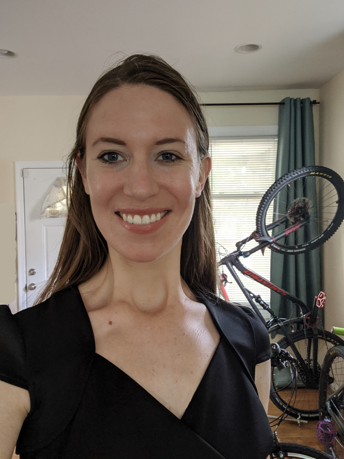
What I found out while working on these portraits of myself is… I am very pink. My face is almost pink everywhere in fact and seems to be either pink or yellow when I really look at it. I didn’t have any cool tones except in my neck and in my eyes. My ears took up a bunch of cadmium-red hue colors and they seemed to be either red or orange.
I also don’t seem to be green, at all, I seem to only have pinks, oranges, or yellows. I looked hard and couldn’t find any usage for green in the original photographs that I utilized to paint these portraits.
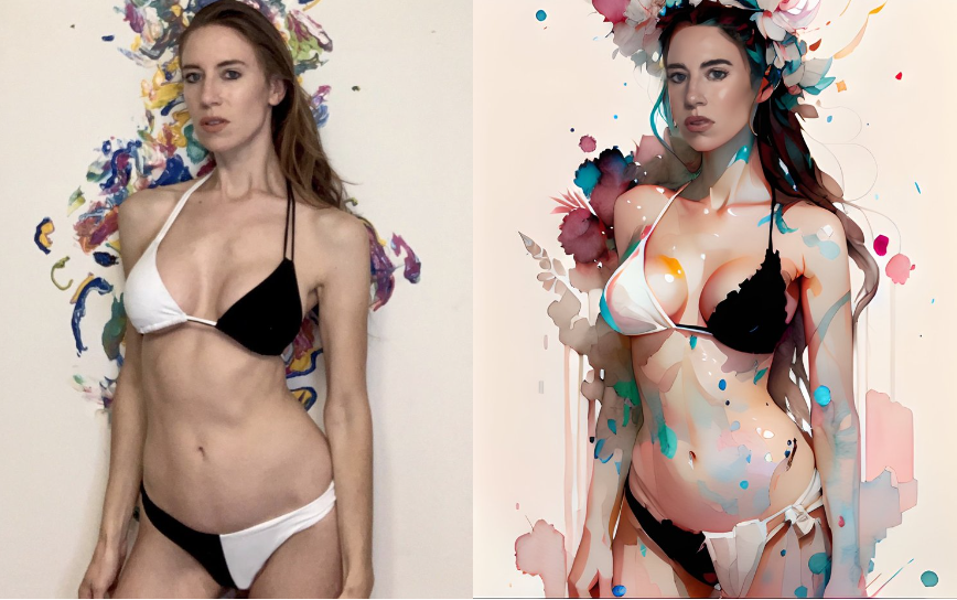
After making each painting, I loaded the above photo into Clip Studio Paint and took several eyedropper-tool pulls from it. The colors seemed to stay in the carnelian-orange-red area.
I thought maybe if I kept eye-droppering the photo, eventually I would find some sort of surprising color, like green or purple, but I tried it maybe a few dozen times in promising areas and it seemed to be red/orange each time. I guess maybe one surprise is that my skin in the photo never registered as actual pink, it only ever registered as light red or light orange. So I suppose what I said a few paragraphs above isn’t true at all, I’m not pink in any way, I’m simply very orange-red with different levels of white.
To get the dark tones of each portrait, the color I utilized was Payne’s Gray. To me, Payne’s Gray appears like more of a mid-tone gray when printed on the tube, but in reality, it is quite dark compared to the printing. It made a good default unmixed color for deep hair shadows and pupils, and mixed with red it was a good hair-shadow color.
Once a good mix of colors is on my palette, it looks a lot like the photo above. You can see the heavy use of Payne’s Gray (dark blob on the right) and the somewhat more sparing use of the three white daubs. I guess in working these paintings, I wanted different whites so I used different daubs of white for different mixes.
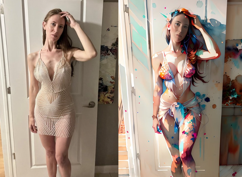
The second photo I worked from I liked a bit more because I could see different colors in my face, like purples.
Overall I made six portraits of myself, three from the 3/4ths angle and 3 from the front-ish angle. I liked all of these for different reasons. In some situations I think I nailed down certain areas better than others.


